| |||||||||||||||||||||||
| Public Boards/Intermediate | |||||||||||||||||||||||
|
thesolarwinds
(Feb 1, 2006)
wheee... it sucks... |
| ||||||||||||||||||||||
|
mx
(Feb 1, 2006)
i must be going mad
hideyourface (Feb 2, 2006)
INTERESTING
thitheth (Feb 3, 2006)
you missed the A...updated and changed
|
| ||||||||||||||||||||||
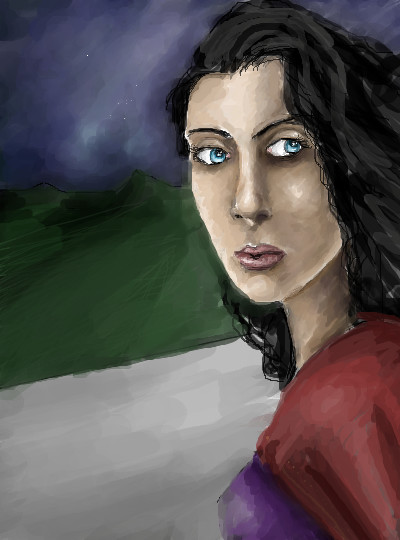
|
TaCO
(Jan 30, 2006)
I don't feel like finishing this, so I'll call it done.Sorry i just get bored with pics. I used a ref, but I changed it around Alot!!!!!! And the time is way off
Opium (Feb 20, 2006)
Very nice! she has that red clay feeling to her. Artistic, yet greaceful. Good job Derrick :)
Anna (Feb 25, 2006)
This is really good, Derrick. It reminds me of the same softness that's in redpanda's technique.
Renuar (Mar 8, 2006)
Very dream like. Alluring...i think so. Good work
davincipoppalag (Mar 8, 2006)
You should do more like this one Derrick |

| ||||||||||||||||||||||
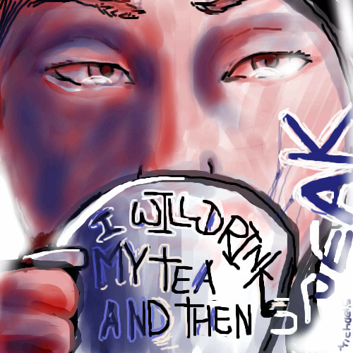
|
hideyourface
(Feb 1, 2006)
C'est moi
staci (Feb 1, 2006)
this is pretty cool. the definition and shape are great for the seemingly few strokes you used. it should have more comments.
TaCO (edited Feb 1, 2006)
I love the strength of his expression.Very cool pic!!!!! I'm Glad to see you drawing again.
hideyourface (Feb 1, 2006)
thanks for the comments.
terracotta (Feb 2, 2006)
It's a very expressive self portrait. |

| ||||||||||||||||||||||
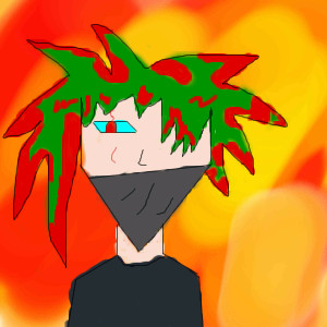
|
SYTHE
(Feb 1, 2006)
I wanted to do this picture for a while, I'll have to add the referance link later. |
This is hidden because it is rated 18+. Edit your privacy settings to make it visible.
| ||||||||||||||||||||||
| Public Boards/Beginner | |||||||||||||||||||||||
|
vertex
(Feb 1, 2006)
bananas!!!!!!!!!!!!!!
hideyourface (Feb 1, 2006)
DATS SUM PRETTY MESSED UP HAIR YO
vertex (Feb 3, 2006)
lol ya
killerbunyy (Feb 7, 2006)
It's like someone murdered a palm tree.
vertex (May 20, 2006)
xD thx i got a little uh creative with the hair :S |
| ||||||||||||||||||||||
| Public Boards/Intermediate | |||||||||||||||||||||||
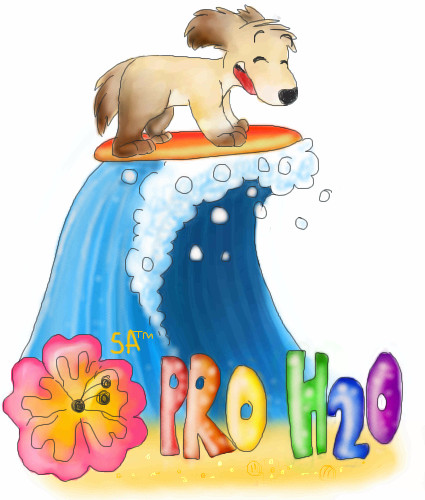
|
Becksie
(Feb 1, 2006)
Its a logo for my graphocs project me and my friends are doing (me katie and steph) and in the lesson we have to create kool names for these hotels that we are designing (omg its so fun!) and I thought that we should call it Pro H20 because ours is a water sports on so it works pretty good :B and then we kept on brainstorming more ideas so then I got bored and started making aloud of rhymes up with the word sensations... illuminations.. sdfdshfskations... accomodations. Perfect.. Sentsations Accomodations xDD So that name is now the chain that Pro H20 belongs too. Were just awesome :D then we started to create logos.. and my idea won again.. hehe so now Im drawing it like this so we can get extra marks. I dont have to make the anatomy brill for this project.. cause Im only 14 and at our age our work doesnt have to be perfect so you can laze off abit :D We have a Cafe where you can by some Kay-Tea Yum (hense Katie my friends name) Omg we had such a laaaugh in Graphics today.. we have never laughed so much in that lesson! :3 |
| ||||||||||||||||||||||
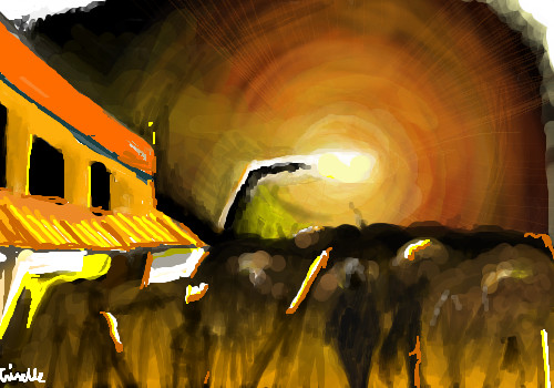
|
PolythenePam
(Jan 31, 2006)
I thought maybe it was finished but then I thought about it some more.been in my studio forEVER.
I'm going to the Rolling Stones tonight, cool, eh?
Lucy (Apr 18, 2006)
this is wonderfull!! *___*rolling stones? my dad is thier biggest fan ( i swear they're not together anymoe o-o)
PolythenePam (Apr 18, 2006)
they're not together anymore? pretty sure I've just spent the last two hours watching them be awesome.
shults (Aug 13, 2006)
absolutely love this. the light above the crowd gives me a feeling of inferiority. and i like that torn piece look. |
| ||||||||||||||||||||||
|
Jervy
(Feb 1, 2006)
Experimenting with coloring. Crits and comments are welcome.
Jervy (Feb 1, 2006)
Thanks for all the C&C everyone.I usually have problems drawing noses but I probably shouldn't have "outlined" it like I did - makes it pop out too much. Will try to develop more on this style on the next one. DBA: At first I thought you meant the rules of this board but no...I was denied posting on some other board because I didn't do photorealism (rules were kind of unclear in that place)...
DeadlyBlondeArcher (edited Feb 1, 2006)
No, I meant the general "art rules" you learn as you go...the ones it's okay to break once you know them, :) not the rules here. I still think the whole thing is fine, it flows and the main attention is drawn to her beautiful eyes.. and, of course, the biting of her lip. I wouldn't have noticed anything about the nose at all if someone hadn't mentioned it. I wish I were capable of doing something well besides photorealism. It gets really tiring at times. I like your style.
Jervy (Feb 3, 2006)
Yeah that's pretty much what I thought you meant there! I just get annoyed when people think that an artwork is "good" only because it looks like a photo. I know it takes alot of work and is very difficult to achieve but in general it's something I don't particularly find interesting but there are always exceptions to that... I think that everyone is capable of forming their own style but style in itself is hard to define. If you are really getting tired of it, you might want to stray away from photorealism for awhile...
davincipoppalag (Feb 3, 2006)
This is wonderful. I wish I had the talent to try anything but semi-adequate photorealism. |

| ||||||||||||||||||||||
| Public Boards/Beginner | |||||||||||||||||||||||
|
kejoco
(Jan 24, 2006)
I drawled a karrot
JK-Arts (Jan 24, 2006)
Better be on the lewk out for wabbits that carrot looks mighty tempting. Good Draw it has realistic parts to it and parts that apear a bit like plastic. but over all i say that is a very good realism draw.Looks better on black
hideyourface (Feb 1, 2006)
I really like the lighting on this. Best karrot I've ever seen.
Violette (Aug 21, 2006)
It ... looks like ... a worm tail. |

| ||||||||||||||||||||||
| |||||||||||||||||||||||
| 2draw.net © 2002-2025 2draw.net team/Cellosoft - copyright details - 1.21sec (sql: 41q/0.77sec) |
drawn in 13 min