| |||||||||||||||||||||||
| Public Boards/Intermediate | |||||||||||||||||||||||
|
two-na
(Jun 28, 2005)
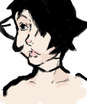
60 degreesmirror three triangles bend light square increase circle's size decrease circle's size from enough distance it is a dot it is a hyperplane |

| ||||||||||||||||||||||
|
solve
(May 29, 2005)
for a friends ljand done.
Xodiak (Jun 29, 2005)
Very nice sir! <:)|XOD|
hideyourface (Jun 29, 2005)
lovee your line work, and that eye. |
| ||||||||||||||||||||||
| Public Boards/Beginner | |||||||||||||||||||||||
|
brenndurdrykkur
(Jun 7, 2005)
sun burns
hideyourface (Jun 29, 2005)
I am commenting on this because it deserves at least one comment. You draw faces very well, mhm. |
| ||||||||||||||||||||||
| Public Boards/Intermediate | |||||||||||||||||||||||
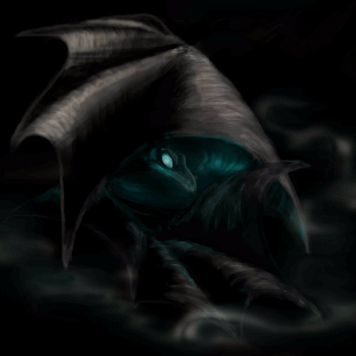
|
Kraisa
(Jun 28, 2005)
I drew this on paper first...it didn't come out the same....but I still like it.
Cianteed (Jun 28, 2005)
or what two-na said XD
hideyourface (Jun 28, 2005)
I like it, but it's heard to tell what, and where it is.
Cianteed (Jun 28, 2005)
its fine on my computer, then again... windows xp and above have lighter screen settings, so dark pictures are more visable.
davincipoppalag (Jun 29, 2005)
I couldn't see this at work..home it looks great! I love the darkness and that evil glow from within.. nice one |
| ||||||||||||||||||||||
| Public Boards/Advanced | |||||||||||||||||||||||
|
DeadChinaDoll
(Jun 27, 2005)
a tribute to Zep.
Pence (edited Jun 29, 2005)
Wow. This is really pretty, something about it really draws me to it. I love the face.
WhoopsieDaisy (Jun 28, 2005)
youre incredible...but im sure you know that already...wow...i think this is my new favorite of yours
HunterKiller_ (Jun 29, 2005)
Fantastic joker/polker person. |

| ||||||||||||||||||||||
| Public Boards/Intermediate | |||||||||||||||||||||||
|
Cianteed
(Jun 28, 2005)
The creepy, gap-toothed, korn frontman who we all love so dearly.
Urei-sama (Jun 28, 2005)
i like his teeth :)
hideyourface (Jun 29, 2005)
at first it looked like a samurai, with the hair..
mazi (Jun 29, 2005)
impressive! love the line work and the coloring. |

| ||||||||||||||||||||||
| Public Boards/Beginner | |||||||||||||||||||||||
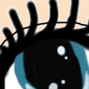
|
RandomAri
(Jun 28, 2005)
This is just a random eye. I don't know if it looks alright. i have an issue with colours.
hideyourface (Jun 29, 2005)
the black, being the pupil, should be smaller. And the eyelashes should either be drawn with many thin lines, or with a thicker layer of black with points coming off it going to the side, above the eye.
RandomAri (Jun 29, 2005)
o.O; It's supposed to be very cartoony. I did it the way I wanted...
hideyourface (Jun 29, 2005)
well you said you didn't know if it looked alright, so I gave my input.
RandomAri (Jun 29, 2005)
I meant because of a slight problem with colourblindess. x-x;;;; |
| ||||||||||||||||||||||
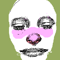
|
hmm.........dunno why the HECK i drew this, but who wants to coulor it???
13 comments
– latest 4:
hideyourface (Jun 23, 2005)
haha. the colouring makes this soooooo much better.Not that the original was bad >.>
renire (Jun 23, 2005)
haha, its ONLY the couloring thats good!
bumpinthenight (edited Jun 23, 2005)
Xod, you are amazing... You transformed yucky, poorly done lineart into a masterpiece... Renire, next time, please spend more that 7 minutes on your work... A good time for a beginners drawing should be 30 minutes... At least... Thats the only way that you will better your work :|
Cordelia_Pink (edited Jun 29, 2005)
Wow, this is actually quite good! yes, i agree with the rest of you, Xod's coloring made this wonderful but hey, with her lineart, it does actually make this picture quite interesting and comical. The coloring also put more emphasis on the word: 'No!' |

| ||||||||||||||||||||||
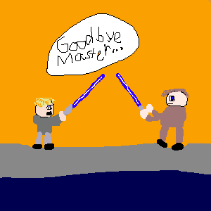
|
Fulgore
(Jun 28, 2005)
This is another picture of one of the things my friend likes :D HAPPY BIRTHDAY
hideyourface (Jun 28, 2005)
so much emotion in this picture.
Kloxboy (Jun 28, 2005)
I agree, it took my breath away. You can really sense the tension between these characters.
Fulgore (Jun 29, 2005)
Thank Xodiak you always know what to say not to crush other peoples feelings :D |
| ||||||||||||||||||||||
| Public Boards/Intermediate | |||||||||||||||||||||||
|
Silver_Note
(Jun 28, 2005)
Just a drawing of a flower, going back to my original style. I like this way better. This isn't all that great....I promise I will be better next time, I haven't been on here in forever...just trying to get back into the rythm, I got lost in the moment, I am trying to catch back up with this beat.
hideyourface (Jun 28, 2005)
I think this is beginner ;obut that other flower you drew is much better.
Linwe_lover_1990 (Jun 29, 2005)
i like the flower Kels, but i like your description even better. do a double take and see what you wrote. so poetic! |

| ||||||||||||||||||||||
| |||||||||||||||||||||||
| 2draw.net © 2002-2025 2draw.net team/Cellosoft - copyright details - 1.19sec (sql: 39q/0.79sec) |
Great picture, hehe! <:D
|XOD|