| |||||||||||||||||||||||
| Public Boards/Intermediate | |||||||||||||||||||||||
|
hideyourface
(Feb 1, 2006)
C'est moi |
| ||||||||||||||||||||||
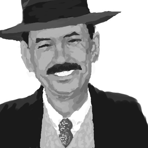
|
hideyourface
(Jan 31, 2006)
he is
gore_vision (edited Feb 1, 2006)
what a beautiful mustache |
| ||||||||||||||||||||||
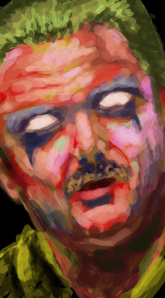
|
hideyourface
(Jan 31, 2006)
too many colours? |
| ||||||||||||||||||||||
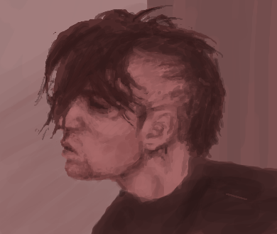
|
hideyourface
(Jan 31, 2006)
I just like his face.
friend (edited Jan 31, 2006)
For some reason i do too! its a cutie. Great draw!
woah_pockster (Jan 31, 2006)
FREAK. rofl JK the chin/cheek on the left side looks a bit thin -_0 add more meat to it maybe? :P HIS NOSE IS ORGASMIC btw. <3 |

| ||||||||||||||||||||||
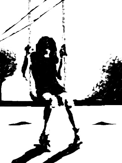
|
hideyourface
(Jan 29, 2006)
.
DeadlyBlondeArcher (Jan 29, 2006)
I don't want to grow up. :(
staci (Jan 30, 2006)
i like this. while its kinda crude technique-wise , you definately captured the emotion/action going on here. which, even when copying straight from a ref is difficult at times.
SYTHE (Jan 30, 2006)
I love these little tiffs, they're always so funny. That's why I love this place! I still say I like this peice, so there! :P
TaCO (Jan 30, 2006)
Yes It is a great pic, but he needs to draw more!!!!!!I'm tired of waiting for him to draw new pics. |

| ||||||||||||||||||||||
|
hideyourface
(Dec 3, 2005)
I dont like itsomewhat better.
woah_pockster (Dec 4, 2005)
:0 cute. His eyebrow looks like it needs to be tilted down ward a bit, and his earlobe is too bigg, it goes up in a sharp slant in the photograph, and under the eye there's too much cheek showingg, the right eye looks like it needs to slant a bit more tooo. maybe shape his forhead a bit more?it does look better <3 and I wanna see this done sooooon <3333 *kissy face*
Gigandas (Dec 6, 2005)
More stuff to look into:Bring in 'his' left eye, cause his eyes are currently too far apart (which also means it calls for you to shift 'his' whole left end of the face over to adjust to the shifting of the eye...assuming you fix this). 'His' left eyebrow needs to be lightened up both a tad bit on the front end and back end (look at the ref and I think you'll see what I mean).'His' right eyebrow is too thick, so subtract some off the top. Take a look at the negative space on 'his' right side of the forehead going into the sleeve. You'll see that the shape isn't right (I think what you have there is hair , but it doesn't go in quite that far). Also look at the sleeve that goes below 'his' right eye. Again, look at the negative space surrounding the eyebrow, the shadows on the nose and the sleeve. I'd point that out more directly, but it's kind of hard to explain, so the best advice there is to pay more attention to the negative space. Anyway, hope some of this stuff helps for further editting...
frootcake (Jan 8, 2006)
i really like your comments Gig, i mean i don't have a clue what negative and positive space are but you've made me look it up :) such a perfectionist. |

| ||||||||||||||||||||||
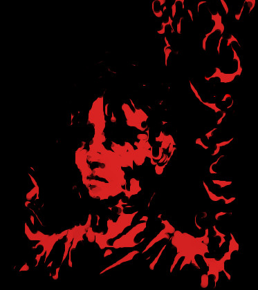
|
hideyourface
(Jan 5, 2006)
.
davincipoppalag (Jan 5, 2006)
Did you draw this with the black on a red bg or did you draw it with the red on a black bg.. its cool looking
Renuar (Jan 6, 2006)
Goood choice of colours. Simple, but very nice like that.
hideyourface (Jan 6, 2006)
red on black. thanks.
Gigandas (edited Jan 6, 2006)
Considering that black is all colors, I think that any color goes well with black. But I have to say my fav combinations are red & black and green & black. |
| ||||||||||||||||||||||
|
hideyourface
(Jan 5, 2006)
.
waffley-daffley (Jan 5, 2006)
Aw, that's pretty darn awesome. :) Love the simplicity of it and the high contrast.
Jessor (Jan 5, 2006)
I like how this looks simple with just the blotches of black as shadows.. very nice.
davincipoppalag (Jan 5, 2006)
Very nice picture here , conor.
frootcake (Jan 6, 2006)
yea this really is something special |
| ||||||||||||||||||||||
|
hideyourface
(Dec 22, 2005)
this damn tablet just makes my work messier and slower
DeadlyBlondeArcher (edited Dec 22, 2005)
I like this... the "broodiness" of it.
julietjuniper (Dec 26, 2005)
this is what i look like in real life. conor y u so gud?
woah_pockster (Dec 28, 2005)
pffftttt you buttface banana eater >:O I thought you said you weren't going to get one.! looks great and I like his forehead. <3
kristine (Dec 30, 2005)
looks like Mohandas Gandhi =] i like! |

| ||||||||||||||||||||||
|
hideyourface
(Dec 22, 2005)
move dis shiet to beginner.
Ghost-of-the-past (Dec 22, 2005)
that looks really cool.
Punky (Dec 22, 2005)
I like the neon pinks and purples. And the flower in the background. Nice. :)
brenndurdrykkur (Dec 22, 2005)
why, this is just splendid. i have a thing for german shepherds
DrsFan (edited Dec 22, 2005)
WOW is it a germen shepherd?!I love it! |

| ||||||||||||||||||||||
| |||||||||||||||||||||||
| 2draw.net © 2002-2026 2draw.net team/Cellosoft - copyright details - 1.64sec (sql: 27q/0.82sec) |
it should have more comments.
Very cool pic!!!!!
I'm Glad to see you drawing again.