| |||||||||||||||||||||||
| Specialty Boards/Contest! | |||||||||||||||||||||||
 |
Kloxboy (edited Aug 14, 2006)
Contest Week 24: Distorted Anatomy (2 weeks long) Your goal this week is to draw a distorted human figure. It can be a drawing of a full body, half of a body, a portrait, a hand, a foot, as long as it's human and you've distorted it somehow (please, no aliens, cyborgs, anthropomorphics, etc.). You may only draw 1-2 figures/people in your piece. This drawing can come from your imagination or you can use a photo reference to draw from (just don't forget to distort the anatomy some how). ...
39 comments
|
||||||||||||||||||||||
|
patienceisoverrated
(Aug 3, 2006)
omigod gender neutral? |

| ||||||||||||||||||||||
| Public Boards/Advanced | |||||||||||||||||||||||
|
Roytje
(Jun 6, 2006)
:)
brenndurdrykkur (Aug 4, 2006)
really inspiring work, both pieces
davincipoppalag (Aug 4, 2006)
Two in one! What a transformation..this one is nice too!
frootcake (Aug 6, 2006)
must say, i really like this
Deino (Aug 12, 2006)
I've been wanting to comment this one, but every time I tried, my computer crashed >_> <-< Anyway, this one really apeals to me Roy! The colors are lovely, the sky is gorgeous. |

| ||||||||||||||||||||||
| Public Boards/Intermediate | |||||||||||||||||||||||
|
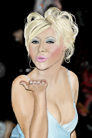
Harry_Kewell
(Jul 25, 2006)
Christina Aguilera at Vanity Fair picture used for reference.Moved the chin over a bit so its more in proportion....sorta :P
shining_star_sam (Aug 9, 2006)
That's better. Well done Kyle! It's teh shex <3
davincipoppalag (Aug 11, 2006)
I think you did a fine job on this. I see her face there, and that hand looks great
Pantera (Aug 12, 2006)
wow, looks just like her, great job :) |
| ||||||||||||||||||||||
|
TheCrimsonKing
(Jul 31, 2006)
My friend's...mom.
squee (Jul 31, 2006)
This is a good piece. The small amount of color adds a good effect.I agree though, she does look a tad creepy. o_O;;
Sugarskull (Jul 31, 2006)
Very nice.
HunterKiller_ (Jul 31, 2006)
Great colours. The subtle flames/tenticles are cool.
sincity (Aug 10, 2006)
I like your friends mum. Does that make her a milf? Sorry, just saying Hi. |
| ||||||||||||||||||||||
|
Kayos
(Aug 7, 2006)
A group of inventers were trying to break the land spead record, and they stumbled upon a new kinda of purpulsion. This was a highly dangerus engen that was capible of incredible power. They mounted the engen onto a land rocket racer and did some tests at low power. They found it easy to break the current records, even at small amouts of power used. The piolet decided to try another run at much greater power. going across the salt flats at almost 10,000 mph, something happend to the vehical and started speading up out of control. A brilliant bright fireball hurlled into the distant mountains ant incredible spead. They recorded a spead of 15,000 mph untill the vehiclal disintergrated into multen metal. The force of the exeleration ripped up the ground and made a scar in the dirt that was 10 feet deep. Unfortunatly the piolets body was never recoverd.
frootcake (Aug 8, 2006)
love the fx
Miss_DJ (Aug 8, 2006)
this is super! (ok, try to imagine a different look at this, too...as if the exploding car is really a huge number of warriors on horses with spears...getting ready for battle...) looking at it that way makes it look like a BC Nowlan painting.
Sweetcell (Aug 8, 2006)
I recognize you from the oekaiki doodle site. Nice to see you sketching here.Looks to me like a spaceship skimming the surface and the force breaking up the rock. Love this piece. Too bad about the pilot.
two-na (edited Aug 9, 2006)
that description is pretty sweet! schwing!Am not saying the art sucks, I like that too! |

| ||||||||||||||||||||||
| Specialty Boards/Contest! | |||||||||||||||||||||||
|
zep
(Aug 3, 2006)
...last stage
woah_pockster (Aug 7, 2006)
Yayyy, this is fantastic zep! =]if there was a voting for this contest, I'd pick your's. definatly. <3
Deino (Aug 7, 2006)
Lo acabo de leer, y me parece facinante tu manera de trabajar: ¿Es acaso como improvisar? O dejar que todo fluya, sin pensarlo demasiado.
zep (Aug 7, 2006)
thanks a lot woah pockster (:y Deino creo que es un poco de ambas cosas jejeje...peor aun no utilizo referencias, entonces tiendo a dibujar siempre lo mismo y absolutamente desproporcionado jajaja, en general yo vivo de esta manera, un poco que fluya y un poco improvisar salud! |

| ||||||||||||||||||||||
| Main Forums/The Post Board | |||||||||||||||||||||||
 |
Renuar (Aug 7, 2006)
Here's a new site for my work. You can find it at this address: Any problems getting in, let me know.
6 comments
|
||||||||||||||||||||||
| Public Boards/Beginner | |||||||||||||||||||||||
|
Knockoff
(Jun 9, 2006)
Works perfectly when I just got done with a watermelon bomb pop popsicle.Supah cool. Enjoy.
staci (Jun 10, 2006)
woah! how yummy do they all look.
Ty854 (Jun 12, 2006)
what a treat!
starmarked (Jul 21, 2006)
Mmm that looks good KO, I think I could eat it!
Knockoff (Aug 4, 2006)
Thanks [:. |

| ||||||||||||||||||||||
| Public Boards/Intermediate | |||||||||||||||||||||||
|
cianteed2
(Jun 22, 2006)
Step 1: On layer 0, use a light colour, such as light blue, to make your preliminary lineart. It's easiest just to make broad geometric shapes in the same shape as your subject. This makes it easier when you go to "ink" your lineart, and ensures it will be proportionate (that is, if you DREW it proportionate!). Skipping this stage could cause your lineart to look disfigured, unless you've practiced enough to skip it.Step 2: Next, go to layer 2. Use the pen or pencil tool (or whatever else you prefer) to make your lineart. Its good practice to experiment with different colours of lineart, but black is usually a safe bet. You can now erase the preliminary blue on layer 0. Tips: If your lineart looks too dark or intense, use the erase rectangle tool on low intensity and shave off a layer of it. It will make the lineart look finer and light, and when you go to colour the lineart wont look as separate from the colouring. Step 3: On any layer lower than your black lineart, fill it in with colour! (but PLEASE dont use the "fill" tool. Not only will not work on a lower layer, but it looks ugly when people use it and it never goes to the edge of your lineart.) Step 4: This step is just shading and detail. I'd go further into how to shade, but this isn't a shading tutorial! I just have 1 tip: Avoid shading dark areas with straight black. Shadows aren't black, they're merely darker tones of the same colour. However, if it's your "style" to shade with black, by all means go ahead.
HunterKiller_ (Jun 22, 2006)
You deserve a cookie. (.':)
pandabarrie (Jun 23, 2006)
looks familiar :)this turned out nicely, good job!
sephiroth54321 (Jul 29, 2006)
But really, the shadow would be black wouldn't it? Only it is a bit transparent which is why it appears a darker shade of the same color...i dunno
cianteed2 (Aug 4, 2006)
actually theres no such thing as a black shadow. a shadow is just a lack of light, thus the subject's colour wouldnt turn black in a shadow - it would just be a darker version of its original colour. |

| ||||||||||||||||||||||
| |||||||||||||||||||||||
| 2draw.net © 2002-2026 2draw.net team/Cellosoft - copyright details - 4.08sec (sql: 40q/2.75sec) |
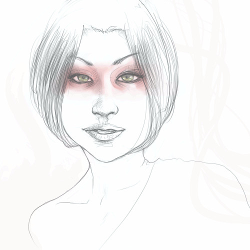
drawn in 20 min
Bad joke, sorry guys. ;D