|
| |||||||||
| Public Boards/Beginner | |||||||||
|
randomness
Ati
(Aug 10, 2004)
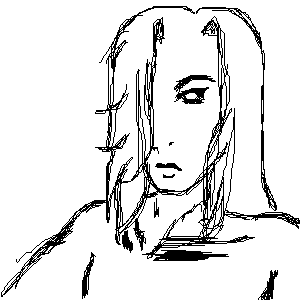
oi it's craptastic and I dont like it at all >.<
flamefirefox (Aug 10, 2004)
lol its an okieh randomness =3 hehe he needs more hair at teh top ^.^; |
| ||||||||
|
Derogatory1
(Aug 9, 2004)
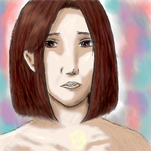
Ack, It's been a while since I worked on an Oekaki....and I started off by picking the wrong applet ;_; I was thinking about scrapping this, but liked it too much to bun it :/ This was supposed to look like me, but it doesn't xD Erm...and there is that weird yellow shade that I didn't notice til I submitted it...I'm not sure where that thing came from, but it's scary. Aeh...oh well. Be gentle please x.x oh yes and viewing at 200% is recomended...that's the size I drew it at ;3
flamefirefox (Aug 9, 2004)
oooh O___o;; i love the paintness ><;; it looks really good O_O;; lol.. hehe the yellow thingie looks like a tattoo.. sorta .. >>;; cool l ikes =3 great job on teh piccie ^.^ |
| ||||||||
|
flamefirefox
(Aug 9, 2004)
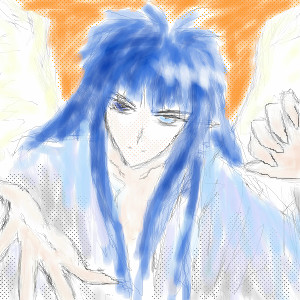
this is my craptastic pic for a contest entry on DA >_> yar .. cuz I'm too lazy to draw a real one ^_^ mousey goodness =D
Derogatory1 (Aug 9, 2004)
Hehe, crazy mouseyness :D It's so hard to use a mouse ;_; makes me frusterated. I love the use of Half-tones, it gives a cool effect. This would look really cool if you could make the outlines a little more bold :D lol unless you don't want them bold...then don't listen to me, I talk too much ^^;
flamefirefox (Aug 9, 2004)
fankie Ati ^.^
ami-kitsune (Aug 13, 2004)
I agree that bold outlines would look nice. ^^;;;;;;; But I love the way you made his hair look fluffly!!!! The odd-eyes are very neat, as well! ^___^ Keep drawing prettiness!
Maiko (Aug 14, 2004)
O_O IMOUTOOOOOOwhy did you not tell me you joined 2draw???? ;__; *oniichan feels unlove-ed* TT_TT first Kuma hime, then you... *sulks* |
| ||||||||
|
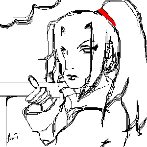
Ati
(Aug 9, 2004)
ish my demon, Shame. His real name is still in the works, so for now, I call him Shame. And yes, I have a thing for pretty boys
flamefirefox (Aug 9, 2004)
ooOOoohh he are teh purdy @_@;; lol lmao i lub his hair and his lipz... yar... |
| ||||||||
|
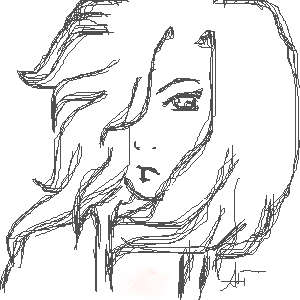
Ati
(Aug 9, 2004)
just practice, but I like the way he turned out.
flamefirefox (Aug 9, 2004)
hehe ^^ he looks very girly ^.^ me like =3 |
| ||||||||
|
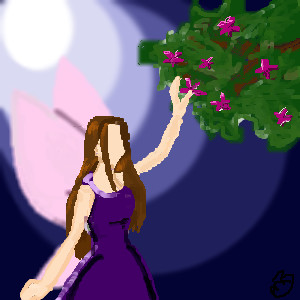
Silhouette
(Jul 6, 2004)
My very first picture! I honestly have no clue on what I'm doing... But, here's the background!Hey, I tried.
davincipoppalag (Jul 6, 2004)
Welcome to 2draw! I think this is a worthy first effort. It has depth, good compositon, and the colors are very nice. You still have some room to get back in, why not revise and do some more details like a face and blend some of the skin where you have the darker outlines. I think this is worth doing more on.
Gigge (Jul 6, 2004)
The wings and the mon are very nice on this. A few outlines to define the picture might help a bit.
flamefirefox (Aug 16, 2004)
hehe wow o.0 it's definitely interesting ^^ I like the fact that it doesn't have definitive outlines and features =3 makes it very unique! ^__^ |
| ||||||||
|
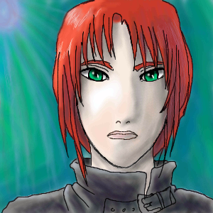
Derogatory1
(Feb 7, 2004)
Well, I'm a newbie...and this is a picy of a random woman type... thing xD Enjoy ^_^
sal (Feb 7, 2004)
cool pic... nice colourin... great bg
Ameraq (Feb 8, 2004)
wow, nice picture! oober nice soft shading. Reminds me an awful lot of Aya/Ran who's a badass assassin guy from weiss kreuz, exept this a woman. Great job ^_^
Alicia (Feb 8, 2004)
I like the green in the background , It draws more attention to the green eyes . It also brings her foreward to the forefront of your art.:)
flamefirefox (Aug 9, 2004)
oooh o_O lol youre awesome for a noob ^^ hehe =) no offense or anything ^___^ luv teh colors!! =3 the background ish teh coolness!! ^^!!! |
| ||||||||
| |||||||||
| 2draw.net © 2002-2026 2draw.net team/Cellosoft - copyright details - 1.77sec (sql: 23q/0.56sec) |
