| |||||||||||||||||||||||
| Public Boards/Beginner | |||||||||||||||||||||||
|
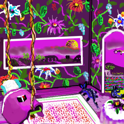
Untitled
lynnandcharlie
(Feb 8, 2010)
guest house on the land of the purple moon
miha_clau (Feb 8, 2010)
the people from the land of purple moon has a good house design
davincipoppalag (Feb 9, 2010)
pretty
firecracker (Feb 9, 2010)
That's a very bright and cheerful looking room.....I like it.....:) |
| ||||||||||||||||||||||
| Public Boards/Intermediate | |||||||||||||||||||||||
|
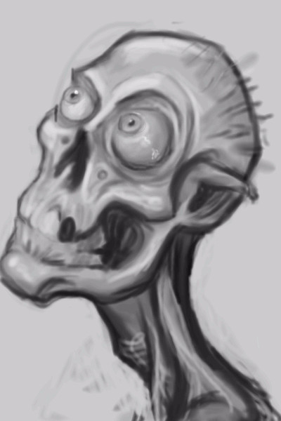
Moosh
(Feb 9, 2010)
playing around with the watercolor tool. D:does pressure sensitivity work on shi? i can't get it to work.
davincipoppalag (Feb 9, 2010)
If I press on the "M" on Shi..will it make me draw like Mooshy?
Flubbles (Feb 9, 2010)
In your'e dreams.
vlad.the.hamster (Feb 10, 2010)
Those eyeballs <3
firecracker (Feb 10, 2010)
yeah.....those eyeballs are just too cool....."lol"!! :) |
| ||||||||||||||||||||||
|
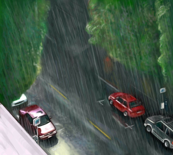
Bobstained
(Feb 6, 2010)
shults (Feb 7, 2010)
I love those cars!
firecracker (Feb 8, 2010)
These cars remind me of the little toy cars that my brother and I would play with when we were little kids....Finish later.
mursku (Feb 9, 2010)
did you use a reference photo for this or was this from your window? cause if you did use a photo, it would be easier to give constructive comments to you if we could see it... but im gonna try anyway. just keep in mind that im not that good at drawing environments myself, so take anything i say with a grain of salt, so to speak :PHere i go... What i would like to see is some more depth separating the objects. Especially the upper part of the trees from the background. Now they look pretty flat, but if you maybe darkened the street at the upper area of the image the trees would pop out a bit more. Or you could use a sharper brush to paint the leafs around the upper edges of the trees. Or you could instead add some more details at the street at the upper part of the image. Also i think the street would look a bit more like it was raining if you added some small bright dots here and there on the street, but don't over do it, just a few bright spots. |
| ||||||||||||||||||||||
|
mursku
(Feb 9, 2010)
reference: http://www.flickr.com/photos/kugelfisch/3800568262/
firecracker (Feb 10, 2010)
I agree with everyone.....this is really a great draw!! :)
staci (Feb 10, 2010)
OH OH such controversy! Gosh, people with different opinions, stirring up in the machine! Oh and get your head out of your 'bum' Peter, you know you're damn amazing at what you do, the point is, not everyone has to be LIKE what YOU do to be considered 'good'.
Flubbles (Feb 11, 2010)
People think i'm trying to be negative when i make comments, when i'm just offering my opinion to try and help people improve, i'm not saying my opinion is right it's just an opinion like everybody elses.
dotdalidot (Feb 11, 2010)
This is really nice. I love the water. |

| ||||||||||||||||||||||
| Public Boards/Beginner | |||||||||||||||||||||||
|
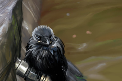
mursku
(Feb 8, 2010)
heres something different :)i just love jackdaws. every summer the street next to my apartment is filled with them in the mornings :D ref photo: http://www.flickr.com/photos/darkmere/3691483224/
TumblingUpwards (Feb 9, 2010)
I like when someone can create a drawing that is more relaxed and paintery styled, photo realism is stiff and not always considered art but thievery. I wish I could draw or paint like this, maybe in time or as I practice, we'll see. This is really beautiful, keep up with 'your' style!
vlad.the.hamster (Feb 9, 2010)
I love the more painterly styles, too, just that photorealism is easier. :pBut I'm loving all your stuff so far. They're awesome.
mursku (edited Feb 9, 2010)
i wouldn't say photo realism is easier, its just that to paint in a photo realistic style you need to use photo reference more often. When drawing from a photo reference, the guy who paints in a simplified style needs to think how the forms look in real life. On the other hand the guy who paints photo realistic stuff, doesn't need to understand how things look in real life. He just needs to be able to copy what he sees. But a skilled artist that has a bit more simplified style will be able to be much faster than the photo realistic artist.Also the thing about photo realistic artists doing stiff art, isn't exactly true. It's just that i think the artist that has a better understanding of how the forms he is painting would look like in 3D, will be able to push his characters in a more dynamic poses, than the artist who only knows how things look from a limited number of angles.
vlad.the.hamster (Feb 9, 2010)
Well, it's just that I know more people that can copy a photo exactly and can't draw/paint anything without one, but I get what you're saying. |
| ||||||||||||||||||||||
|
mursku
(Feb 8, 2010)
ref from http://www.flickr.com/photos/storm-crypt/3310768814/hmm.. perspective turned up a bit screwy :(
Flubbles (Feb 9, 2010)
I think the rest of it is beautiful, i was just saying that the hut could look a little better.
Suntan (Feb 9, 2010)
I'm just saying that I'm very happy you joined here. :)
backmagicwoman (Feb 9, 2010)
Yes..always happy to have new members...very nice picture indeed..:)
mursku (edited Feb 9, 2010)
thanks guys for the comments :DSuntan - heh, its just luck that i joined here :D i was fed up with OekakiCentral and wanted to try some other oekaki site. i found this other oekaki site where i sent my registration application, but while waiting for my confirmation email, i found this site and i didn't need to wait for any administrator to begin drawing oekakis :D and also this site looks to be more active than the other one, so, yay! Bobstained - ah you meant that. heh, the hut does look does look a bit rubbish, doesn't it, but then to my eye so does the horizon line too. I meant to just do a quick 20-30 minute landscape study, and then i ended so frustrated with getting the sea to look even halfway decent.. and as for the hut, thats my second try to draw the hut and it still looks like that... for my excuse i can say that i didn't understand the form of the hut from looking at the reference picture... it just looked to me like a haphazard bunch of sticks, so thats how it pretty much ended... and besides guys, i made this in the beginner section, im sure this will be lost quickly enough in the flood of other posts that are made in this section. When i post in the intermediate or advanced boards i will take more time to draw. everybody else, sorry for not replying, but im really slow at writing stuff and i really need to go back to drawing (or should i say painting?) this nude in the advanced board. It will be awesome! :D |

| ||||||||||||||||||||||
|
lynnandcharlie
(Feb 2, 2010)
firecracker (Feb 8, 2010)
very nice!!! could this be the way to drive to the land of the purple moon???? I like the "lettering" that you did.....I'm glad you got the "hang" of the "text" tool. Cool draw!!! :)
lynnandcharlie (Feb 8, 2010)
the bright lights at the end of the road is fom the space port
firecracker (Feb 8, 2010)
the space port!? Wow.....that sounds interesting.....I never saw one before....now you'll have to draw a pic of the 'space port'!! :)
lynnandcharlie (Feb 9, 2010)
I will work on that after I finish the guest house |

| ||||||||||||||||||||||
|
mursku
(Feb 8, 2010)
ref photo was from: http://www.flickr.com/photos/storm-crypt/3116080930/
vlad.the.hamster (Feb 8, 2010)
dramatic. :) I agree with flubbles in that it definitely would have more impact on a bigger canvas, but it's still wonderful work.
firecracker (Feb 8, 2010)
very nice.....those clouds are awesome! :)
mursku (Feb 8, 2010)
thanks guys. i was just aiming to do quick 20-30 min landscape studies, so if i had had managed to draw this in under 30 minutes it wouldn't have been allowed on the other boards
davincipoppalag (Feb 9, 2010)
great job on the stormy moody clouds |

| ||||||||||||||||||||||
| Public Boards/Intermediate | |||||||||||||||||||||||
|
Flubbles
(Feb 7, 2010)
I'm trying to get all my unfinished draws finished so i can start something i can put all my effort into, although i'm not really finished with this yet.
Seidal (Feb 8, 2010)
I.. really don't know why. but I think this is kinda cute.
Bobstained (Feb 8, 2010)
It looks a bit like sylvester stallone.
Cameo (Feb 20, 2010)
Yuck!!! I'm with fc on that one! I wouldn't eat that for all the money in the world! |

| ||||||||||||||||||||||
| Public Boards/Beginner | |||||||||||||||||||||||
|
mursku
(Feb 8, 2010)
just practicing to draw landscapes. i wanted to start with something easy :)ref photo was from: http://www.flickr.com/photos/91556425@N00/924368417/
lynnandcharlie (Feb 8, 2010)
excellent draw, I really like the water and the lighting
firecracker (Feb 8, 2010)
very pretty scene....:)
vlad.the.hamster (Feb 8, 2010)
Nice, very serene.
davincipoppalag (Feb 9, 2010)
you caught the feel very well |

| ||||||||||||||||||||||
| |||||||||||||||||||||||
| 2draw.net © 2002-2025 2draw.net team/Cellosoft - copyright details - 2.24sec (sql: 36q/1.55sec) |