| |||||||||||||||||||||||
| Public Boards/Intermediate | |||||||||||||||||||||||
|
zep
(Jun 14, 2004)
tribute to kathee kollwitz... |

| ||||||||||||||||||||||
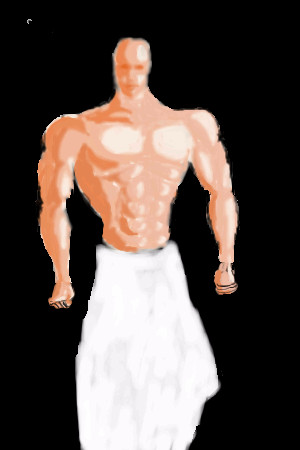
|
kejoco
(Jun 5, 2004)
yeah, so this is crap...please ignore
bumpinthenight (Jun 15, 2004)
err, not bad at all with the exceptions being the head and hands.... the musculature and skintone is great!
emmamommalag (Jun 15, 2004)
His head is way too small and his arms are too short but you've done a great job on the rest of it. Very good shading.i think i want to get this set back to unfinished and take it in another direction....
Ty854 (Jul 1, 2004)
I actually like v1 the best. |
| ||||||||||||||||||||||
| Public Boards/Beginner | |||||||||||||||||||||||
|
Gigge
(Jun 14, 2004)
Just practicing a background.
emmamommalag (Jun 14, 2004)
Nice background, Gigge. Waiting to see what you put in front of it.Ok....I wasn't going to add any kind of a foreground, but you pushed me into it, Mamma. ;)
laurael (Jun 15, 2004)
Looking at both versions, I'm glad you did add the flowers. They make this look complete now and I wanted to tell ya...nice job!
emmamommalag (Jun 15, 2004)
Yay, Gigge! Very pretty flowers you've added... I like this a lot. :) |

| ||||||||||||||||||||||
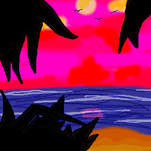
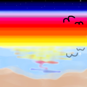
|
ChibiNay
(Jun 15, 2004)
I was just looking at beaches and this came to mind.
Gigge (Jun 15, 2004)
Great colors. Very cheerful.
davincipoppalag (Jun 15, 2004)
Yep!~ I'm lookin at a beach all week this week..its right outside! Whee great colors
emmamommalag (Jun 15, 2004)
OOoooh, I love the colors! Very nice with the silhouetted foliage.
Erewin (Jun 16, 2004)
The silhouettes work well against the saturated sky, creating a nice sunset effect. Or ... late evening. |
| ||||||||||||||||||||||
| Public Boards/Intermediate | |||||||||||||||||||||||
|
Pandora
(Jun 12, 2004)
I remember as a kid, we would climb a mountain and at the top of the mountain was the shrines and cemetery in Japan. It was lit with candles everywhere and lanterns. Very peaceful..amazing
emmamommalag (Jun 15, 2004)
I agree with the rest of them, Pandora.. a really lovely picture. :)
Pandora (Jun 15, 2004)
Thank you all..I took a lot more time with this one..so maybe that's the ticket. haha I hope.
davincipoppalag (Jun 15, 2004)
This is lovely..the colors and the details are very nice indeed! good job
longway (Jun 15, 2004)
wow great job pandora!!!!, you know i like these....wink! lol |

| ||||||||||||||||||||||
| Public Boards/Beginner | |||||||||||||||||||||||
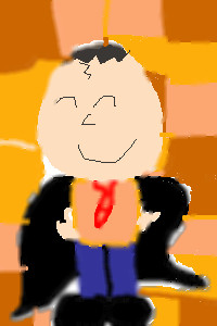
|
poocabear
(Jun 15, 2004)
This was hard to make
emmamommalag (Jun 15, 2004)
This is cute, pooca. I like his smile. :) |
| ||||||||||||||||||||||
|
Gigge
(Jun 15, 2004)
Thanks for the comments/advice on the last draw. I put in a few harder lines on this draw, but I didn't use the anti-alies to do thin highlights. I found that it blurs the line too much and makes the line 2 or three pixels wide. What worked better for me was turning off the anti-alias and blend and using a low opacity and high flow to draw thin highlights. But, thanks for the suggestion!Ok...i sharpened the bowl slightly, added a touch more definitiion to the glass outline and 'clarified' the base of the glass. Thanks for the hints.
deannak24 (Jun 15, 2004)
fab gigge .....is beautiful nice to see you drawing here as well as in the game
davincipoppalag (Jun 16, 2004)
I think what it is about this is the bg kind of camouflages the glass.. I think with a different bit of color back there the glass would stand out more... its much better as I stare at it.. but that bg hides it...
JackSprat (Jul 26, 2004)
Just browsing yer board....this one is beautiful! I love the blending and colors, especially the contrast between the grey and the wine. LOL....sorry, but I think of things in terms of where I'd like to see them....this would make an absolutely beautiful cover for a wine menu. |

| ||||||||||||||||||||||
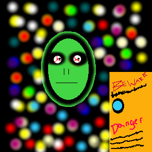
|
PrettyPaintingArtist
(Jun 15, 2004)
This is an alien floating in space. I know it doesn't look very mean, but I am working on it, I am not sure about the background. I was just playing around!
bumpinthenight (Jun 15, 2004)
learn to unlock your caps lock.... and try to use something other than the elliptical tool, the rectangle tool, the pencil tool, and the blur tool....
PrettyPaintingArtist (edited Jun 15, 2004)
1...........I know how to unlock the caps lock tool, I didn't want to use any of the other tools for this picture....besides..............I like it this way.........I just have a little more to do with it.................it isn't as awful as the other pictures, and I will draw more pictures with the other tools, I know how to use 'em now, It isn't to hard, Someone asked me to draw this pic for them so i did, there is another pic that I am working on with the pencil and blur tools, I think you will like that style better!
Beaukat (Jun 15, 2004)
It doesn't look like you put any effort into it at all - try using some different tools... i agree.
emmamommalag (Jun 15, 2004)
I like the background. It's very colorful and the balls seem to be lit from within. Nice! |
| ||||||||||||||||||||||
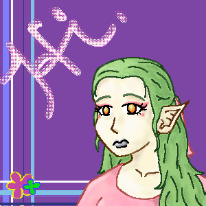
|
MoonlessDreamer
(Jun 15, 2004)
Hello. I'm new to this board. I kinda got lazy on this. I don't feel like shading this one, yet.Almost done. AOL is being evil.
Oops. I forgot her left shoulder. Oh well. Not going to finish it anyhow.
bumpinthenight (Jun 16, 2004)
ehhh... pretty good... her right eye (viewers left) is too far to the viewers right..... her lips are also not very well formed.... but the shading and background are nifty! oh... and dont make elf ears too pointy... then they would seem unrealistic.... there has to be a more blunt and defined point to the end...
lp_phaery (Jun 16, 2004)
cute little background,i like the hair. |
| ||||||||||||||||||||||
|
Beaukat
(Jun 15, 2004)
Well this is a beach I'd been working on previously, but I scrapped the old one because I didn't get the layering and sunset right...I think this one turned out much better ^.^
emmamommalag (Jun 15, 2004)
Nice bold colors, Beukat. I like it. :)
xwindflyer (Jun 15, 2004)
I like the ranbowlike colors. Like emmamomalaq said, nice and bold. |
| ||||||||||||||||||||||
| |||||||||||||||||||||||
| 2draw.net © 2002-2025 2draw.net team/Cellosoft - copyright details - 2.16sec (sql: 40q/1.81sec) |
This is the funniest expression you've done yet I think Zep. It's just great. The face.. the posture.. the background. I think the face has more of an impressed look to it.. like "that.... is one huge dinosaur"
Hehe, what a fun trip.