| |||||||||||||||||||||||
| Public Boards/Intermediate | |||||||||||||||||||||||
|
Kloxboy
(May 2, 2004)
oh mod, you know who you are, I'm gonna make you squeal like a pig and gut you like one too |
| ||||||||||||||||||||||
|
DMV
(May 2, 2004)
um.....yuck.
davincipoppalag (May 2, 2004)
Lmao. I'm glad its Still.. if it moved I would have to run.. another very imaginative creature.
emmamommalag (May 2, 2004)
Oooh, this one's gumby-esque. Don't know how you come up with all these scary creatures. Those red wings are cool.
DinoFlorist (May 2, 2004)
I think I like this one best of all yours so far. It' s a good, complete, picture!
DMV (May 2, 2004)
Thanks for the comments ...tried a 3D look ,did not come out right. |
| ||||||||||||||||||||||
| Misc. Boards/Sprites | |||||||||||||||||||||||
|
tattered_wing
(May 2, 2004)
Deadjournal Icon.
emmamommalag (May 2, 2004)
Shoot.. I thought it was going to be food. |

| ||||||||||||||||||||||
| Public Boards/Intermediate | |||||||||||||||||||||||
|
Patches
(May 2, 2004)
Hmm I esen something about a ketch wars and decided I wanted to join ^.^reference piccie http://images3.deviantart.com/i/2004/119/3/6/Aqua_Walls.jpg
davincipoppalag (May 2, 2004)
Quite a good sketchy rendition... look out Icats and Rav
scarfeh (edited May 2, 2004)
I'm lovin' it.Badadadada.
Kloxboy (May 2, 2004)
That's really good. Considering the style you used, it's pretty sweet. Right on Patches.
longway (May 2, 2004)
far out!!, love this drawing..... |

| ||||||||||||||||||||||
|
longway
(May 1, 2004)
as tides come and go..
davincipoppalag (May 1, 2004)
Great colors and light. The shallows are particularly well done. Good job.
longway (May 2, 2004)
thanks everyone, its these suggestions that have helped immensely...you are all awesome artists....
emmamommalag (May 2, 2004)
I second all of the above. This is lovely.
tivatdoar (May 10, 2004)
very very good.I think the rocks should be blured too. |

| ||||||||||||||||||||||
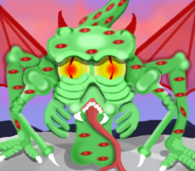
|
RavioloiTheDancingClown
(May 1, 2004)
THE SKETCHY WARS CONTINUE! ICATS will be conqured! i issue a decree of WAR! ....time to pillage *waves flag around*.............
Kasha (May 1, 2004)
ohhhh, a war. Too bad I'm busy with my finals or I would be kicking your ass! >:D
davincipoppalag (May 1, 2004)
OOh Rav fires a heavy round in the sketchwars.......
emmamommalag (May 2, 2004)
Interesting picture. It looks as though it were painted on foil.
Patches (May 2, 2004)
ooh ooh I wanna join! ::goes to draw:: |

| ||||||||||||||||||||||
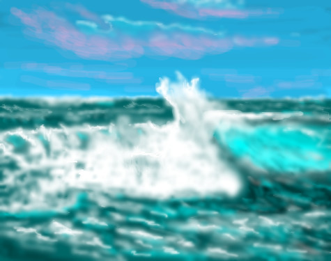
|
xwindflyer
(May 1, 2004)
I just had to revisit the sea, and let it all go! lol
xwindflyer (May 2, 2004)
lol, It does seem a little out of focus to me now too. I don't remember that it was that way when I posted it. (maybe I was just tired, and my eyes were out of focus, and it looked good to me then.) :o)
davincipoppalag (May 3, 2004)
If you're on aol xwind.. they have that preset compression thing for graphics which makes things go blurry in the interest of speed in loading. You can disable it. There is a posting here somewhere on how, I forget where.I did it..but I decided I would rather see a bit blurry than have another birthday waiting for sharp loads. I am on dialup so its already slow as molasses .
DeadlyBlondeArcher (May 6, 2004)
Maybe that's why everything needs to be sharper, Davin? lol....
emmamommalag (May 6, 2004)
Do you mean from the artist's or the viewer's standpoint? It seems to me that if it had something to do with your computer or connection, ALL the pics would look blurry. |
| ||||||||||||||||||||||
|
Ixbalam
(May 1, 2004)
Bunny boy in cutoffs.
Xodiak (edited May 1, 2004)
I wonder ifQuicky, Cheerios or La vache qui rit could ever been drawn into a yiff hentai furry drawing. >:D |XOD|
davincipoppalag (May 1, 2004)
Sounds like a project for XOD
emmamommalag (May 2, 2004)
Looks like he ate too much chocolate, himself.. he can't keep his button from popping. Cute picture.
Ixbalam (May 2, 2004)
There are other reasons why his button might pop too. =^.^=Xod: The laughing cow is kind of creepy but the Quik bunny is sure is cute. |

| ||||||||||||||||||||||
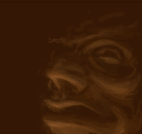
|
coriolis
(Apr 19, 2004)
It didn't turn out as well as I wanted it to. But I'm running out of space and getting rather tired of working on it too.
tappie_chan (Apr 22, 2004)
this is really beautiful. i really love the shape of the lips and the facial expression. the left eye is a bit too high, but it doesn't detract from the overall beauty.
coriolis (Apr 22, 2004)
Was kinda like that in the original photo. I probably should have found one that was easier to do ^_^ I'll try to finish this one later.
Pandora (Apr 23, 2004)
This is a great drawing to learn from ..it does look like a oil painting. Wish I could use it for an example of using tones when I draw, just so I could understand at least that part of it.It's to bad we can't pull the drawing down at the same time. Not for copying but for understanding.Exquisite!Still not quite happy with it. But I ought to quit while I'm ahead.
|

| ||||||||||||||||||||||
| Main Forums/2draw.net | |||||||||||||||||||||||
|
inuyashaforever (May 1, 2004)
how do i do a collaboration with someone?
5 comments
|
|||||||||||||||||||||||
| |||||||||||||||||||||||
| 2draw.net © 2002-2026 2draw.net team/Cellosoft - copyright details - 3.03sec (sql: 36q/2.27sec) |
You are excellent, Cloxboy, especially when it comes to drawing shadows. >:)
|XOD|