| ||||||||||||
| Public Boards/Beginner | ||||||||||||
|
elana
(Nov 23, 2003)
Well, this is my first post on the intermediate board, it needs a lot of work...but they DO say that redheads are the best, right? |
This is hidden because it is rated 18+. Edit your privacy settings to make it visible.
| |||||||||||
| Public Boards/Intermediate | ||||||||||||
|
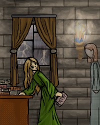
Harmanye
(Nov 22, 2003)
Book Ghost. Teehee.Oh, anyway. Comments please? (I know, I sound pitiful, but really, I'd like to have something, I mean. Uh. I'm blank right now) BTW, I had this open for 22 hrs, but that's not how long it took. Three hours at most; I like to mess around a lot, and I didn't feel like saving it unfinished anything.
mikhail (edited Nov 24, 2003)
yes it does look better, the drawing is well composed, however there is much free space above so i would suggest putting in a chandaleer with candles if u know what im talking about... and maybe you could make the ghost glow
Harmanye (Nov 24, 2003)
Glow. Hmm, I don't think glow would work, too much light from the fire to have more glowing stuff, wouldn't look right methinks.There is a lot of free space, this I know and worry about. When I start I don't usually know what I'm drawing beyond a rough idea, so my canvas size isn't always right. Bubmp, bubmp, a chandalier, I don't know if that would work, they're rather Victorian, them chandeliers... At least the ones I've seen are. Maybe I can work it out, bubmp Thank you Mr. Mikhail.
elana (Nov 24, 2003)
I like the lighting from the torch and the sconce! Are those trees outside or lightning?It's lighting, Ghosts always turn up when it's storming outside, remember?
|
| |||||||||||
|
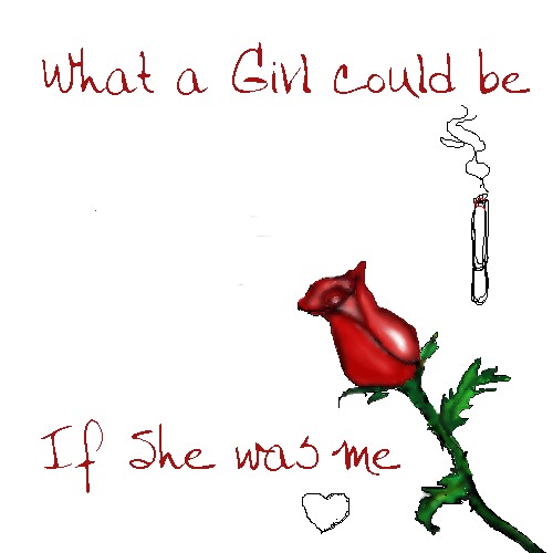
loserxnextdoor
(Nov 23, 2003)
I'm not done ^^; But uh It's going to be a picture of a quote I have. It'll be on there later. Please cirtique! I need help >_>: ._.!!!!!!
Zinc (Nov 23, 2003)
Outline of it looks rough.. if that helped any. The stem looks irregular though. It's skinny and thick in the wrong places. The stem part between the two leaves is skinny..
mikhail (Nov 23, 2003)
i like the texture on the rose
elana (Nov 24, 2003)
I like the rose, but maybe the stem shouldn't bend so much near the bottom. So much empty space!Grr! heehee, cant wait to see the finished product!Just added a few stuff. I'm really busy ._.
|
| |||||||||||
|
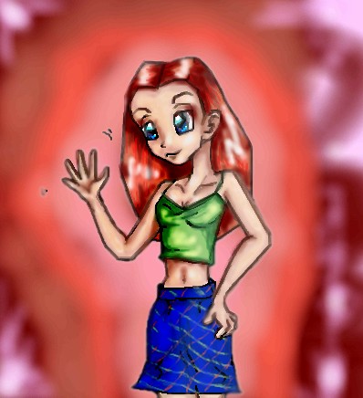
SuzieSuze
(Sep 25, 2003)
Just trying a diffrent style.. don't like it muchok well I don't think I am ever going to get to fixing this up.. so I guess this is it.
Fin_beast (Sep 26, 2003)
ehhh.........did you just flip my drawing?It's good but it would have looked better if you didnt use the smudge tool as much as you did.
Harmanye (Nov 24, 2003)
LOL Fin_beast, not every picture of someone waving is a copy off of you ^_^Anyway, less blur would be good, but it's one can't undo it now, just like one can't unring a bell. I like her hair, and her face. Your hands are awesome, so hand-like, not just flesh coloured blobs. I love her skirt, blue is good. ^_^ Navaer.
elana (Nov 24, 2003)
Her collarbone should be smaller and a shorter space should be between the depression of the bone. :D I like the pic though! |
| |||||||||||
| Public Boards/Beginner | ||||||||||||
|
jazzysinger
(Nov 16, 2003)
Ummm...This is my favorite picture I have drawn yet.
concannon (Nov 24, 2003)
Because this is too big to move to the practice boards. However, it's not crappy enough to delete.
marcello (Nov 24, 2003)
actually it can be moved to the beginner board, but I guess I missed it.
jazzysinger (Dec 25, 2003)
umm, ok, i am sorry you think this picture is a piece of crap, and it is in the beginner board.
marcello (Dec 26, 2003)
that's because I moved it there. duh. |

| |||||||||||
| Misc. Boards/Sprites | ||||||||||||
|
mikhail
(Nov 23, 2003)
user logo |
| |||||||||||
| Public Boards/Beginner | ||||||||||||
|
8 comments
– latest 4:
Knockoff (Nov 26, 2003)
Yeah, I konw -__-. meh. I really dont think its that great,. It just...... ok.
RIKG (Nov 30, 2003)
Awww Hes cute! No nose? Really nice.
darkk_angel (Dec 16, 2003)
well, at least he has eyebrows... ;) great shading, dude.... |

| |||||||||||
|
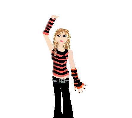
Carlucci
(Nov 23, 2003)
I have not been on this site in a while...
elana (Nov 23, 2003)
Whoa, this looks bare! Cant wait to see what the finished product looks like! Those are interesting colors together, I've never seen dark salmon and black stripes. It works though :) |
| |||||||||||
|
Hotaru-chan
(Nov 22, 2003)
I'm done!! comments are welcome!! >__O(p.s. I got this from this comic > http://sortawonderland.keenspace.com/ )
Shuichi-chan (Nov 23, 2003)
Hahahaha I like it nyah!!!ok I'm done!! it doesn't look quite right though.... >__O
elana (Nov 23, 2003)
the markings on the face remind me of oni link! she/he looks frustrated! its cutey petootie!
Hotaru-chan (edited Nov 24, 2003)
It's a he...... did I really ruin it by making it look like a she??? >.>; |

| |||||||||||
|
6 comments
– latest 4:
Lark (edited Nov 23, 2003)
whoa! don't get me wrong! i WANT christmas to come.... im gloomy cuz it's not here yet....and ppl are putting up their lights already....
elana (Nov 23, 2003)
heehee, yeah people around here are putting up their lights as well and its not even thanksgiving yet! nice picture : D
Lark (Nov 24, 2003)
^^ thanks!
ZaKi_nii-san (Nov 24, 2003)
mwhaha, cute dude. v -.- |

| |||||||||||
| ||||||||||||
| 2draw.net © 2002-2024 2draw.net team/Cellosoft - copyright details - 0.28sec (sql: 38q/0.12sec) |
|XOD|