| |||||||||||||||||||||||
| Public Boards/Beginner | |||||||||||||||||||||||
|
IceMan450
(Feb 9, 2004)
I was just messing around, drawing a random person and this is what eventually came of it. I found out that Its very hard to draw hair with a mouse. |

| ||||||||||||||||||||||
| Public Boards/Intermediate | |||||||||||||||||||||||
|
My good pal noremac will be assisting me in making the pupils look deeper and more angry (using fire) and i will be attempting some shading skills picked up from gigandas(thanks).
23 comments
– latest 4:
Noremac (edited Feb 26, 2004)
i guess this is it..
fleeting_memory (Mar 1, 2004)
interesting-nice use of bold color-but he seems a little flat-or dimensionless(if that's a word) Nice fire in the eyes but somehow this picture disturbs me a bit ^^;;;
15grifficorntears (Mar 3, 2004)
HAHAHAHA...Jesus is out on a warpath!!!!Jesus: I ain't f***ing around no more!!
LovelyLori (Mar 28, 2004)
I really like this.... |

| ||||||||||||||||||||||
| Public Boards/Beginner | |||||||||||||||||||||||
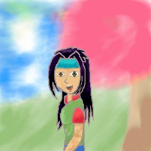
|
shinobigirl2002
(Feb 9, 2004)
yes...i was in diar need to draw something...and i really don't know why this took me so long, but o well...enjoy and C&C is much appreciated!
DieChan (Feb 9, 2004)
Aww, cute BG. Spirals, original. The character itself has a big head o.0 He/She looks sad. I like the shininess of the hair! The shading on the clothes is cool, too. The eye away looks uneven, tho. Other than that, really good!
dixielandcutie (Feb 9, 2004)
cute picture. the bg is adorable...and maybe more shading on the skin? but awesome job!
Noremac (Feb 9, 2004)
it looks like ME !!!!! |

| ||||||||||||||||||||||
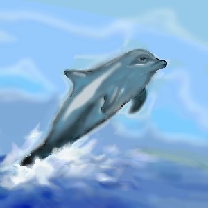
|
7 comments
– latest 4:
Look (Feb 5, 2004)
it's beautiful! i think you can add more lighting to him. :)
davincipoppalag (Feb 6, 2004)
i think you nailed the water and the splash..very nice
dixielandcutie (edited Feb 9, 2004)
oh thats neat. cool blurry bg...brings more focus to the dolphin...maybe ya did this on purpose, but if you use layers you can make it flow better b/w the bg and the pic. beautiful job tho, i love it
Look (Feb 9, 2004)
The outline of the dophine is a little blurry, but the lighting and coloring is really good! |
| ||||||||||||||||||||||
|
MattyP
(Feb 8, 2004)
Hi everyone!! It has been a while since I have drawn here so I though I would come back!!This is my newest character, Kiyoku. She is not finihsed at the momment but tomorrow i will blend and smoothen lines, draw a BG and draw her face.
dixielandcutie (Feb 8, 2004)
cool beans so far...nice skin tonesThere it is done, though the face did not turn out as good as I had Hoped.
Hope you like it!! PLEASE critisize it!!! |
| ||||||||||||||||||||||
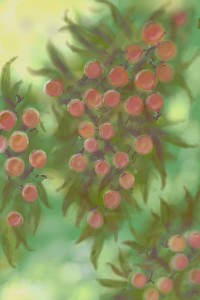
|
starmarked
(Feb 5, 2004)
Finished now...Winter sunlight filtering through the green and red berry bush on a winter evening
Look (Feb 9, 2004)
Very nice color, it looks delicious. It's all dreamy
starmarked (edited Feb 9, 2004)
Thanks DBA, davin, and HJ... i dont think these are the edible berries, hehe...dont eat them, Look, they are ornamental berries, glad u like them
dixielandcutie (Feb 9, 2004)
beautiful. i love how the bg gets blurry, but the foreground is nice and sharp
bakayaro_onna (Feb 10, 2004)
Very nice and painterly. It looks like the paint is still wet! |
| ||||||||||||||||||||||
| Public Boards/Intermediate | |||||||||||||||||||||||
|
thug
(Feb 8, 2004)
street racing for guys with big'uns
thug (Feb 9, 2004)
thanks everyone, I like all kinds of racing but these guys are nuts that race the street bikes
Look (Feb 9, 2004)
That's very realistic! especially you make the background all blurry, it bring all the focus to the character in the front. Nice!!!
gothamgirl (Feb 9, 2004)
I love the three-dimensional look! *stares in awe*
dixielandcutie (Feb 9, 2004)
oh that is a cool picture. i love how you caught them both at opposite leans in the turn. the color scheme is rockin... |

| ||||||||||||||||||||||
| Public Boards/Beginner | |||||||||||||||||||||||
|
sal
(Feb 9, 2004)
...
davincipoppalag (Feb 9, 2004)
I like this..good sense of depth...
mazi (Feb 9, 2004)
ok so you used linear perspective to add depth. some other good ones are changing values. (aka light in back dark in front or vice versa). texture gradient (aka making those lines on top closer and closer together as they get further away). adding detail when its closer, blurring further away. as well fog makes things look far away.
dixielandcutie (Feb 9, 2004)
i have nothing better to add except for that its lookin pretty cool...i like the colors you used
bakayaro_onna (Feb 10, 2004)
Looks a lot like real paint. I like the veined texture in the dark 'triangle' section especially. |

| ||||||||||||||||||||||
|
Childlike_Vampire
(Feb 8, 2004)
Tank Girl sends her regards.
dixielandcutie (Feb 9, 2004)
haha. cute. the expression on her face is awesome...i like the simplicity of it, and the black/white contrast. nice job!
Alethio (Feb 9, 2004)
Whos tank girl?? Great pic btw!!!! ~.~
laurael (Feb 12, 2004)
I really like your stuff...sorry if I don't get around to commenting a lot. Trying to practice, practice, practice...
esaure (Apr 5, 2004)
Ja! So kick ass! Luf tank girl comics since i was wee ole! |

| ||||||||||||||||||||||
| Public Boards/Intermediate | |||||||||||||||||||||||
|
DeadlyBlondeArcher
(Feb 8, 2004)
This one is really going outside the lines for me. Wanted to do something different.
fleeting_memory (Feb 10, 2004)
I know it sounds strange but I am really impressed with the eyelashes. You manages to make them so thin and fine that they look real...very nice job
BlueDreamer (Feb 16, 2004)
I'm really impressed. You are a very talented artist and should sell your art to people.
PinkuEspeon (Mar 4, 2004)
Oh... *shudders* I know some voo-doo spells... have you heard the one for unwanted visitors? Well... anyways... great picture! I simply adore this!
Xodiak (Oct 20, 2004)
Hehehe... I desire... more sensual drawings by DeadlyBlondeArcher... cannot wait until another one is drawn. >:)|XOD| |
| ||||||||||||||||||||||
| |||||||||||||||||||||||
| 2draw.net © 2002-2026 2draw.net team/Cellosoft - copyright details - 1.23sec (sql: 39q/0.44sec) |
drawn in 22 min
drawn in 27 min