| |||||||||||||||||||||||
| Public Boards/Advanced | |||||||||||||||||||||||
|
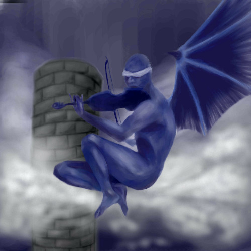
haunting
staci
(Apr 4, 2004)
not done..ran outta room..*waits patiently*
pulkidamnesiac (Apr 18, 2004)
pink. I see pink. I like pink. This drawing gets an eight on my pink scale. I also like the way its...pink. Pink pwns, and if you disagree then a certain...pink bear will eat you alive...
fleeting_memory (Apr 18, 2004)
this is real nice-me likey lots-helps that I love dragons and these look like dragons. I love the tequnique you used for the clouds-the edgyness of them lends itself very well to the picture
safescene (Apr 19, 2004)
whoa, that's bizarre o.O I like this one a whole lotta lot, Icats..the pink goes exceptionally well with the white and the black. Nice! :)
Aubrey (Apr 20, 2004)
Yeah I agree, the colors go so well together. At first it reminded me of the movie "Birds" for some reason.. like crows flying in.. I dunno. At any rate this is great. I love the sky and how open it feels and the dragons definitely add to the coolness of it all. |

| ||||||||||||||||||||||
| Public Boards/Beginner | |||||||||||||||||||||||
|
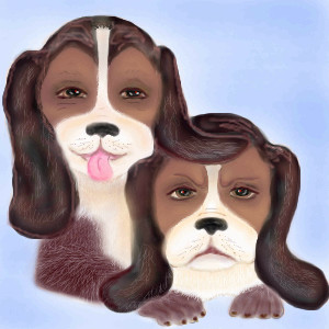
gloworm043
(Apr 15, 2004)
Inspired by other pet pic's...and by my brother's dog, Samie, who actually squints his eyes and smiles all over his face when you walk in the door. I tried to capture his expression in my picture. The grumpy one is taken from memories of our beagle Misty..who was ...grumpy!
staci (Apr 17, 2004)
that one looks like a luck dragon..and he was creepy too
Pantera (Apr 17, 2004)
They are cute but I think the eyes look to much like people eyes, maby if you make them round it look more like animals.
davincipoppalag (Apr 17, 2004)
Yea...the eyes ,especially with eyebrows, do look too human. Its a nice picture but they don't look "doggy" enough.
gloworm043 (Apr 18, 2004)
Yes, your right... they do look too human...I thought that too...but couldn't get them right...I started out on this pic as a practice using the copy tool...but it turned out to be struggle trying to make them not look like 'copies'..while trying to show, by facial expression, the differences in their personalities...thanks guys for your input..it helps..I'll keep your tips in mind for my next animal drawing.:) :) |
| ||||||||||||||||||||||
|
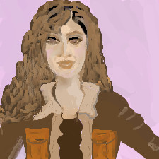
Pandora
(Apr 17, 2004)
Trying to make her look real, maybe I'm using to many tones. Help all artist please.
dixielandcutie (Apr 17, 2004)
hmm...i'm not so good at realism myself, but here's just some observations...maybe some more white in her eye....and...use a thin brush tho make individual hair strands, with a really low opacity, like 60 or 70. thats all i can think of...i think you did a pretty darn good job though...hehe, and the jacket looks really cool :)
davincipoppalag (Apr 17, 2004)
I don't think this is bad. I can' t do faces or I would offer some help..
staci (Apr 17, 2004)
its harder to make faces more real when they are smaller..to me. if you are going to work on such a small canvas try to do just the face to fill the whole space..or zoom in to make details and subtle skin tone changes..this isnt bad tho..id not make a full line around her whole eye..give her a pupil or two ; ) and her nostrils a little closer together with a little more shadow under the nose, perhaps |
| ||||||||||||||||||||||
| Public Boards/Intermediate | |||||||||||||||||||||||
|
reference from old book of angels.
7 comments
– latest 4:
Marienkind (Apr 9, 2004)
ooh. thanks. (i'll erase the messy white bits tomorrow)cleanup. oh, i'm whoring my lineart skills. if you want, please memo me.
dixielandcutie (Apr 17, 2004)
wow...so nice you guys! spooky, mysterious...awesome
bumpinthenight (Jun 15, 2004)
woahhhhhhh..... neat stufff!!! jeebus.... wish I had that kind of talent.... XD |
| ||||||||||||||||||||||
| Public Boards/Advanced | |||||||||||||||||||||||
|
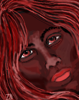
staci
(Apr 16, 2004)
yarg
laurael (Apr 17, 2004)
Great piccy. You are very pretty Icats...especially with the attitudey...
Reprah (Apr 17, 2004)
gajus... simply gajus... nice dra too
RavioloiTheDancingClown (Apr 17, 2004)
sexy *wink wink nudge nudge*
Aubrey (Apr 20, 2004)
I coulda swore I commented on this... I opened it... looked at the box... coulda swore I typed something... hmm Welllllllll what I meant to say is you're a very pretty girl with a whole lotta talent. The style is soft yet the look is so intense. |

| ||||||||||||||||||||||
| Public Boards/Intermediate | |||||||||||||||||||||||
|
mooseflower
(Apr 17, 2004)
practice doing faces.
Knockoff (Apr 18, 2004)
Woaw, really nice coloring again, really smooth. I love the lips and the natural skin color. Oh yeah. Nice nose. x)
safescene (Apr 19, 2004)
really pretty, I like the shiny-ness of her skin and her cute little nose. Your stuff is great mooseflower; I'm definitely keeping an eye on you :) (heh, not in that creepy, stalker sort of way)
frappa (Apr 29, 2004)
I love the lineart of it
emmamommalag (Apr 29, 2004)
I love the freckles.. great job on the skin, eyes and mouth too. |

| ||||||||||||||||||||||
|
mooseflower
(Apr 17, 2004)
I <3 trees.
Knockoff (Apr 17, 2004)
I love the colors. The texture is great.The whispy background is a nice touch.!
Bagels00000008 (Apr 17, 2004)
Thats Awesome! This will be a showcase!
lp_phaery (Apr 17, 2004)
yeah this is definetly good enough to go on that showcase thing. its just so beautiful.
mooseflower (Apr 19, 2004)
wow, it's really great that you have so much confidence in this, but there are actually a whole lot of errors in it *cough*wonkytorsosaggyfacemugglyarms*cough* |

| ||||||||||||||||||||||
|
longway
(Apr 16, 2004)
looked deep in thought...
dixielandcutie (Apr 17, 2004)
intense eyes...nice color choice too! good work! |
| ||||||||||||||||||||||
|
dixielandcutie
(Apr 14, 2004)
hehe, a fun memory...i havent been able to log on ina while, but i wanna make this good...all suggestions so very appreciated
dixielandcutie (Apr 17, 2004)
yup, fulla fun memories, puddles...glad yall like it...thanks
Knockoff (Apr 17, 2004)
Wow, thats cool. You did a great job with the puddle. The two girls are done well, also.Hoodies!! :)
davincipoppalag (Apr 17, 2004)
I think ya did good mizz dix! I can see the giggles..
Supergurl103 (Apr 25, 2004)
nice one, dixie :) |

| ||||||||||||||||||||||
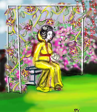
|
longway
(Apr 16, 2004)
oh well
Tuukke (Apr 16, 2004)
awww nice.. this is awesome but i'll now still criticise a bit :) sry.. that 'building' thingy above her is a bit weird.. i mean that on the front it is much more down that on the back, but still the top is just a line.. i think it should rise a bit also? hopefully u understand my not-so-good english :) good pic
emmamommalag (Apr 16, 2004)
I love the colorfulness. Not sure I see what Tuukke means about the back and front lines.
xwindflyer (Apr 17, 2004)
This is very pretty. I think what Tuukke is trying to say, is: the trellis that the figure is sitting under, on the side nearest the viewer the lines are not parallel, and the top is a straight line from the front side to the rear. The perspective is a little off. I do like the picture though, the mood of the scene is dipicted well.
dixielandcutie (Apr 17, 2004)
oh wow...i love the colors...and yea, the trellice thingy is a little off...but i dont think it really detracts from the picture as a whole. great work! |
| ||||||||||||||||||||||
| |||||||||||||||||||||||
| 2draw.net © 2002-2026 2draw.net team/Cellosoft - copyright details - 1.92sec (sql: 35q/0.96sec) |