| |||||||||||||||||||||||
| Specialty Boards/Collaborations | |||||||||||||||||||||||
|
draw your face with characteristics of your favorite animal. And my hair is shorter than that but by the time I fucked up on this It was too late.
20 comments
– latest 4: |

| ||||||||||||||||||||||
| Public Boards/Beginner | |||||||||||||||||||||||
|
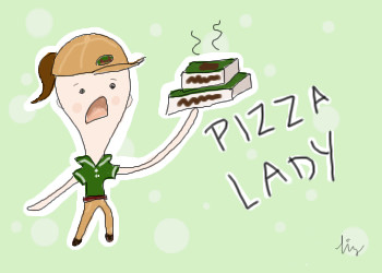
penpen
(Jun 28, 2007)
yay pizza!
deathking (Jun 28, 2007)
This is adorable and yes they are, girl can do better than that.
penpen (Jun 28, 2007)
*sniff* but I'm a pizza lady T_T
deathking (Jun 28, 2007)
yeah but think on the bright side youre gonna be something much better in a while and one of the major laws of the universe will be back in order
penpen (Jun 29, 2007)
haha, as soon as i pay off these darn college bills. think of it this way, i'm starting a pizza industry revolution! |
| ||||||||||||||||||||||
|
pancakes_rock
(Jun 22, 2007)
O.o;;
Wraith (Jun 24, 2007)
Hmmmn.. Where did my comment go? Anyways, I posted, or thought I posted this.... "OMG! Where is her nose? Cute and pretty drawing regardless. :D
Sweetcell (Jun 24, 2007)
Your necks still need to be bigger, and your lineart's sketchy, but your coloring is fab.Why are the eyes always so big?
pancakes_rock (Jun 24, 2007)
Wraith Shes not suppose too have a nose. :)Sweetcell I make the eyes big cause it makes it look cuter, and i'll work on the necks.
pray4love (Jun 28, 2007)
pan....you rock now. and you're an addict, too? so cool. i'm back now. so talk to me pleaseies? |

| ||||||||||||||||||||||
|
foxfiresaint
(Jun 23, 2007)
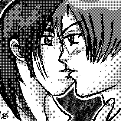
I was bored and 2/3 in the morning i wanted to draw some yaoi! so tell me what you think :D
foxfiresaint (Jun 27, 2007)
weird i thought his chin is fine O________o
Sweetcell (Jun 27, 2007)
Ah, I have to say that chin is something even Bruce Cambell would go *whoa*.It's because the mouth is right below his nose, I mean right below, if you lower his mouth more the chin won't look so.... monstrous. I know that will place the other guys lips on his nose, but making a copy of the right guy (after you fix the face) and moving it up you can place him correctly. Or conversely you can lower the left guy's mouth a little and no conflict. You have more than enough space, try it. Nice use of tones btw.
foxfiresaint (Jun 28, 2007)
Sooo..uh lower the dude on the right mouth....and then it would fit better with the face...make sense...i'll try it... here goes nothing O_o.Okay so i lowered the mouth and fixed up a couple minor things. BUT the chin really doesn't look so big anymore :D yays
|
| ||||||||||||||||||||||
| Specialty Boards/Contest! | |||||||||||||||||||||||
|
Silvair
(Mar 12, 2007)
Still need to work out some of the imbalances...So are there any stipulations as to what exactly the icon must be of*..?
cmb (Mar 25, 2007)
Impressive win!
Sweetcell (Mar 25, 2007)
Another one I forgot to comment on. Well since everyone's said everything already I'll just add wow, beauty, and congratulations on first. Well worth it. It's a wonderful piece.
jaded_angel (Mar 26, 2007)
Congrats! and i didnt even see this before o_0...i love the hair and the eyelashes the most
Lishan (Jun 26, 2007)
='O I feel inspired! x3 This is sooo pretty! |

| ||||||||||||||||||||||
|
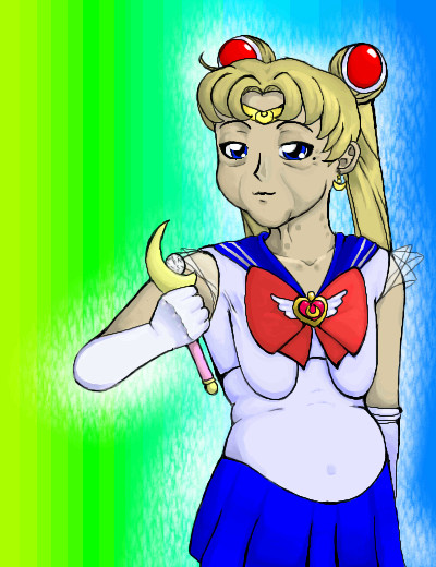
deathking
(Jun 22, 2007)
Might as well take a swing at this, and really c'mon my ideas are so frail and bland you had to expect this. heres a younger version http://s142.photobucket.com/albums/r120/pyropal/sm.jpg
R_O_L_O (Jun 23, 2007)
yay!
enjoydotcom (Jun 23, 2007)
Great work DK, love the lines and coloring.
davincipoppalag (Jun 24, 2007)
Congrats on the place!
Miss_DJ (Jun 25, 2007)
congrats! good entry! |
| ||||||||||||||||||||||
|
solve
(Jun 11, 2007)
For the contest.Heroic, Fearless, determined. I think batman is a great hero, but at the same time a bit insane. Past the costume, putting his life on the line, etc. Just how he has focused his whole life from a tragic event. Its a fixation like no other, and he goes to such extreme means to fulfill it. So I imagine that in his late years he would become quite depressed. Feelings of impotence, uselessness, hopelessness, and anger. This is something I have thought about for, sucks to draw a hero defeated. Then again maybe he would reflect back on his life and be happy about all he accomplished. I doubt that to be the case though.
deathking (Jun 24, 2007)
Congrats on first place, I dont care if I win because I don't know how the prize thing works cause if you need paypal I can't even get it.
Kloxboy (Jun 24, 2007)
deathking: What do you mean? All you need to win is an address for Oddica to send the shirt to, there is no purchase involved.
davincipoppalag (Jun 24, 2007)
Congrats on the win marcus!
Miss_DJ (Jun 25, 2007)
congratulations!! |

| ||||||||||||||||||||||
| Public Boards/Intermediate | |||||||||||||||||||||||
|
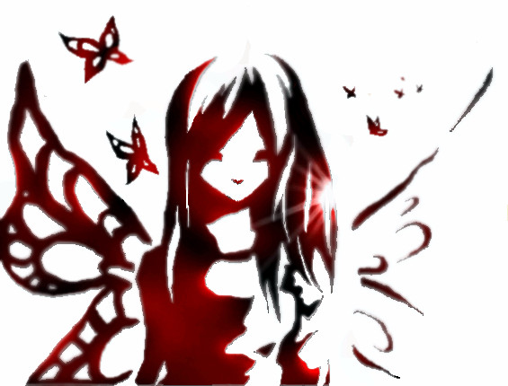
Lishan
(Jun 23, 2007)
I was going to do something else with this pic, but I forgot..... ^^; Oh well. I'll just leave it like this for now... Maybe I'll remember it later. It took me a while to figure out what to do with the background, but I kinda like the one I chose. The picture is inspired by an aquarelle-doodle I did the other day. Timer is off, I was doing other things as well while drawing this.
deathking (Jun 23, 2007)
This is really pretty and it reminds me of a tattoo.
psychofox0 (Jun 23, 2007)
Very nice. I like the shininess.
Sweetcell (Jun 24, 2007)
Well isn't this pretty. I love the use of red and black blended to make a sillouette. And great lens flare. There's a silkiness too. Did you go back with the blur? I've seen this effect and I'd love to replicate it.
fleeting_memory (Jun 25, 2007)
Oh wow! Amazingly simple beauty-nice use of the dodge tool. |
| ||||||||||||||||||||||
| Public Boards/Beginner | |||||||||||||||||||||||
|
ChibiChibi-chan
(Jun 23, 2007)
D; I haven't oekaki...ed? here in two years? D;' maybe that? XD lol :3 here we go again I suppose :3
xiau (Jun 24, 2007)
Oh, I really love the colors in this <3 And the eyes and hair shading are excellent :]You've really improved since your last picture~
deathking (Jun 24, 2007)
The is so cute and thats some awesome cell shading.
Sweetcell (Jun 24, 2007)
Wow, that was a long time ago. Only one other entry in 2005. And what an improvement in those 2 years. This is amazing, great cell shading (I envy those who can do it properly) Hope you stick around Chibi.Incidentally she looks embarrased, like she was caught listening to something she'd rather not admit to. :) |

| ||||||||||||||||||||||
|
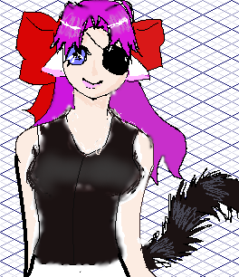
SANDYclaws
(Jun 24, 2007)
give me coommmennttss ; o
deathking (Jun 24, 2007)
She has a really pretty face but its never too good to ask for comments, its better to ask how to fix something if you know something is wrong.
Sweetcell (Jun 24, 2007)
Dk's right, if you ask for comments you won't get them. Your basically saying give me some attention. You won't get it. As for this though it's nice there's too much color bleeding, especially around the vest, chin and shoulders, and the lineart is sketchy and mismatched. You have thin jagged lines then boom, thick ones. And though the face is nice it needs more shadow (especially the nose) and you can work a bit more on the eye. And if your using the fill, don't. Layers is all you need. Keep working, your getting better every picture. |
| ||||||||||||||||||||||
| |||||||||||||||||||||||
| 2draw.net © 2002-2025 2draw.net team/Cellosoft - copyright details - 0.75sec (sql: 39q/0.48sec) |
drawn in 20 min