| |||||||||||||||||||||||
| Public Boards/Beginner | |||||||||||||||||||||||
|
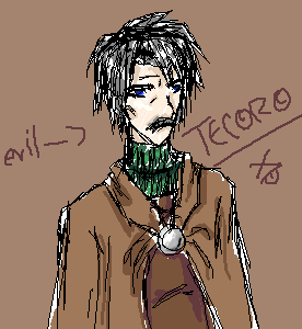
KiLi
(Mar 18, 2004)
sketch of a chara from manga my friend and i are doing...Sameeeera, if u reading...issa this a decent sketch? |
| ||||||||||||||||||||||
|
KiLi
(Jun 16, 2004)
timer is very, very off...
Sutafani (Jun 16, 2004)
it looks great, keep working
bumpinthenight (Jun 16, 2004)
I like the hair and hat... some of the anatomy is quite off (chest region, nose), but it doesnt make the picture entirely unredeemable.... I suggest you use oekaki shi... it would be easier to work with.... |

| ||||||||||||||||||||||
|
AtomicBunny
(Jun 4, 2004)
ummm first post and i hope you guys likey
xiau (Jun 4, 2004)
i like her tiny wings! welcome to 2draw!
Thear (Jun 9, 2004)
pretty good...=) Welcome!!
bumpinthenight (Jun 16, 2004)
ooh.... not bad at all... i really like the proportions of the stomach... the head is ok, but you should get rid of the black lines of the face beneath the hair... the arms are also a tad bit misshapen... try to do some backgrounds as well.. XD just some constructive criticism.... oh, and I suggest that you use oekaki shi in stead of lascaux.... tis easier to use, at least for me.... |

| ||||||||||||||||||||||
|
AtomicBunny
(Jun 15, 2004)
ummmmmmmm yeah i was bored.....and thus this thing was born....not very good, huh? oh well. i can't draw with a mouse. bleh.
MoonlessDreamer (Jun 15, 2004)
It would probably look better if you curved some of the lines. She's going to have sooommmee crick in her neck if she moves. I love the hair. *Pink*
AtomicBunny (Jun 15, 2004)
lol thanks, Dreamer
bumpinthenight (Jun 16, 2004)
ehhh... tis ok... the hair could use alot of work.... also, what md talked about was true... try to use some curves when drawing..... and never forget eyebrows!!!! aaack!!! thats what knockoff did quite a while ago... XD |

| ||||||||||||||||||||||
| Public Boards/Intermediate | |||||||||||||||||||||||
|
DMV
(Jun 15, 2004)
He sure looks worried LOL!
kejoco (Jun 15, 2004)
duration 1 min????DAMN DMV, you ARE good!!! ;)
sal (Jun 16, 2004)
very nice dmv... i like ur black and white ones...
DMV (Jun 16, 2004)
1min lol! I wish ...no Kejoco ,sometimes I have trouble submitting, so I have to submit my back up image.Thanx Sal:)
Thear (Jun 16, 2004)
hey great draw!! i have to say this too: Freaking good shadings! =P heh =P his chin looks funny ^^ |

| ||||||||||||||||||||||
| Public Boards/Beginner | |||||||||||||||||||||||
|
Hakkai
(May 26, 2004)
Just testing out a sketchy type of style.. Like Saikano. Not really working out.. Even the coloring is sketched.. sorta. And SHE looks like a HE. I'm planning to fix that though. >_>;
lp_phaery (May 26, 2004)
ohhhh....wow...i wish i could color as greatly as you.....but i cant..hmmm...
Childlike_Vampire (May 27, 2004)
This picture is awesome, I like it alot, it really strikes me, like "Ooh, I like that, gotta comment and say so,". My favorite part is the lips...mebbe the eyes. lol.
KiwiKitsune (May 28, 2004)
I also wish that I could color like that. Hakkai... you really are a good artist!
Erewin (Jun 16, 2004)
She looks really sweet, though. I like her expression, it's very gentle and caring ... the sort of person that generally loves people. Nice pink on the lips, too. |

| ||||||||||||||||||||||
| Main Forums/Drawing Discussion | |||||||||||||||||||||||
 |
anti-christ (Jun 4, 2004)
I have browsed through all of your drawing many of times and would like to see a pirate drawn by you. if you do not mind
6 comments
|
||||||||||||||||||||||
| Public Boards/Beginner | |||||||||||||||||||||||
|
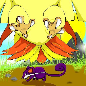
15grifficorntears
(Mar 13, 2004)
ah, pokemon in their natural enviornment.so wonderful.
marcello (Mar 14, 2004)
natural environment, eh? You mean in a gameboy?
DinoFlorist (Mar 14, 2004)
This is very well done. Although drawing the pokemon themselves isn't super hard, the way yuo composed it as well as the shadows, grass, sky, all make it look really nice
Deathaisha (May 17, 2004)
Uh-oh fast food*throws up* Ugh I can't eat fast food it makes me throw up....
bumpinthenight (Jun 16, 2004)
woah!! a pigeot!!! poor ratatta... I feel bad for the little guy... grass/regular (?) against flying types isnt good.... |
| ||||||||||||||||||||||
| Public Boards/Intermediate | |||||||||||||||||||||||
|
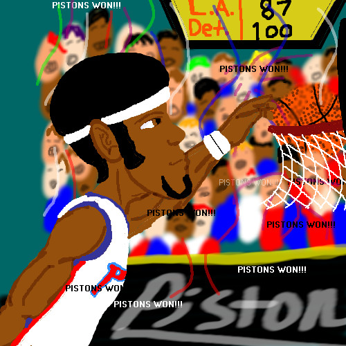
ChibiNay
(Jun 15, 2004)
AH i knwo this aint the best but hey I neede the room! idc I am to happy PISTONS WON!!!
kejoco (Jun 15, 2004)
i'm just extremely happy the lakers lost....stupid lakers....
bumpinthenight (Jun 15, 2004)
errrr..... your anatomy and lineart could use some work, and you should actually use shading... but your use of the text tool is ok.... |XP
Knockoff (Jun 15, 2004)
boooo, the pistons suck!!lol, nah. Im glad the pistons won, too!
Zack (Jun 15, 2004)
I don't really have team preferences, except in collegiate sports, (f. miami, man) so I usually just root for the underdog. I say go Pistons.As for the picture, my one main complaint is the font. That font is just... ugh. Use Eras Demi or something, and check the 'antialias' box. It makes a big difference. An easy way you could have made the background a lot easier on the eye is (assuming it's on a different layer) make its layer a little transparent and put another layer of solid (in this case, dark) color below it. It'd give the pic more depth too. I like the look on the guy's face. |
| ||||||||||||||||||||||
|
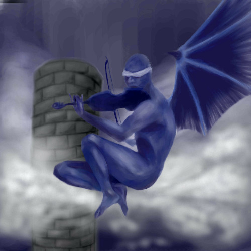
reference from old book of angels.
7 comments
– latest 4:
Marienkind (Apr 9, 2004)
ooh. thanks. (i'll erase the messy white bits tomorrow)cleanup. oh, i'm whoring my lineart skills. if you want, please memo me.
dixielandcutie (Apr 17, 2004)
wow...so nice you guys! spooky, mysterious...awesome
bumpinthenight (Jun 15, 2004)
woahhhhhhh..... neat stufff!!! jeebus.... wish I had that kind of talent.... XD |
| ||||||||||||||||||||||
| |||||||||||||||||||||||
| 2draw.net © 2002-2026 2draw.net team/Cellosoft - copyright details - 1.24sec (sql: 36q/0.65sec) |
muahahaha
--Sim