| ||||||||||||||||
| Public Boards/Beginner | ||||||||||||||||
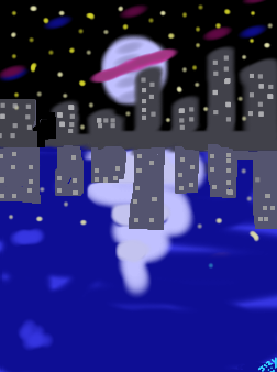
|
Midnight Blue
jazz2jizy
(Jun 10, 2007)
My hand hurts, i will finish lalter . Any critisium is needed??
artguy79 (Jun 10, 2007)
good start, maybe put the reflection of the city in the water too
Sketcher_V (Jun 10, 2007)
simple and effective composition, i agree with artguy, and maybe try to blend the light with the water a little? |
| |||||||||||||||
| Public Boards/Intermediate | ||||||||||||||||
|
Miss_DJ
(Apr 30, 2007)
pls move to beginner board. I'm tired of this in my unfinished draws. So it is what it is.
artguy79 (Jun 4, 2007)
excellent Miss DJ, very smooth
enjoydotcom (Jun 5, 2007)
How in earth are you able to make such gorgeous color flows?
Sweetcell (Jun 5, 2007)
It's like an alien fish. I'm with Joy, I think the only way we'll know is if you do a tutorial like I did.Tutorial Donna, I wanna do flowy, oily rainbow pictures. Btw, I really like V3, really has an alien landscape look to it.
Miss_DJ (Jun 9, 2007)
thanks! so glad you like this one! |

| |||||||||||||||
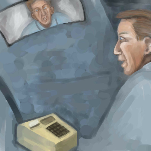
|
Belldandy
(Nov 11, 2005)
For some reason when I go back to edit this, the image in Shi-Painter comes up with an earlier version.Is there anything I can do to get it to load the current version?
artguy79 (Jun 7, 2007)
nice chalky look
davincipoppalag (Jun 7, 2007)
I dunno...memo marcello..he is the master of mystery |
| |||||||||||||||
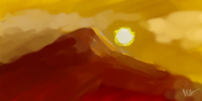
| Public Boards/Beginner | ||||||||||||||||
|
artguy79
(Jun 4, 2007)
it's red
doodledaniel (edited Jun 5, 2007)
why is this extreme? well, its nice anyway ^__^
Axil62 (Jun 5, 2007)
I like this a little.
Sweetcell (Jun 5, 2007)
Extreme heat maybe?Nice oil painted look you have going here. I love those colors combined. I think I'd like this simply framed and hung on my wall.
artguy79 (Jun 5, 2007)
lol i couldn't figure what you were talking about until i noticed i put it on extreme setting not everyone oops! thanks for the replies. |
| |||||||||||||||
| Public Boards/Intermediate | ||||||||||||||||
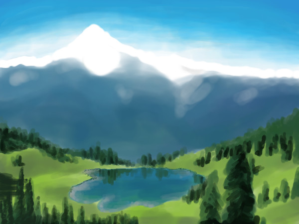
|
evilkyo
(Nov 12, 2006)
my first landscape. Hope you like it :D
hideyourface (Nov 12, 2006)
could be more detailed. I really like the reflections and the placement of the trees on that nice green grass.
evilkyo (Nov 12, 2006)
that's right, i'm working on it. Thanks for the comments ;)
hideyourface (Nov 12, 2006)
oh I didn't see it was unfinished. I think it's going to turn out great.
doodledaniel (May 26, 2007)
nice one! this looks like its going to turn out really good! |
| |||||||||||||||
| Public Boards/Beginner | ||||||||||||||||
|
Miss_DJ
(May 21, 2007)
sans saguaro's. |

| |||||||||||||||
| Public Boards/Intermediate | ||||||||||||||||
|
Gemmy619
(Nov 12, 2006)
I know the right hand is messed up. i might try and have another go at it later.
Sweetcell (edited Nov 13, 2006)
The left nipple looks a bit flat but other than that nit pik it's a nice form of the female figure.I didn't actually notice the nudity when I first saw it. Either Im becoming more mature about nudity or I look at too much porn. Not even gonna go there :D
HunterKiller_ (Nov 13, 2006)
Nice work.
JK-Arts (May 8, 2007)
SExy. very nice picture.
_INGRID_ (May 8, 2007)
this is beautiful |
This is hidden because it is rated 18+. Edit your privacy settings to make it visible.
| |||||||||||||||
| Public Boards/Beginner | ||||||||||||||||
|
Kloxboy
(Nov 5, 2006)
Just because :)
artguy79 (Nov 5, 2006)
neat little icon
Kloxboy (Nov 5, 2006)
Noremac: This design is over 3 years old but yes, it's different than the majority of my work on 2Draw. I use the original "leafhead" design for my MSN icon, which I've made into many different colors, including orange & black for Halloween. :)
davincipoppalag (Nov 5, 2006)
This would be a great logo for a clean environment organization.. nice work mr Clox
frootcake (Feb 15, 2007)
just noticed you upgraded it to gradients |

| |||||||||||||||
| Public Boards/Advanced | ||||||||||||||||
|
Shanghai
(Nov 11, 2006)
Big huge giant tree! I'll be using this on the new version of my website I'm working on now. There'll be a whole backstory and everything, plus various characters.
Childlike_Vampire (Nov 13, 2006)
Wow, this is amazing. I really adore the perfectly tiered sky, so pretty are the clouds. I also love the feel of the waterfall. Great concept!
darthfurby (Nov 14, 2006)
Great choices in the color palette, the purply blue shadows work especially well on the trunk. But perhaps more importantly, you have made a positive civil rights statement for birds everywhere. Not only do they deserve better living conditions, birds understand that building condos instead of nests yields higher profits in a competitive real estate market.
Tsukiko (Nov 19, 2006)
gorgeous... wonderful coloring, i love that tree and the clouds *_*
nyao (Jan 27, 2007)
I really love the colors ^^The use of purple/blue makes it seem magical~ |

| |||||||||||||||
| Specialty Boards/Contest! | ||||||||||||||||
|
Ruggi
(Jan 6, 2007)
Homer the Dutch Master...
artguy79 (Jan 6, 2007)
doh
Miss_DJ (Jan 6, 2007)
what a cute idea! nice.
davincipoppalag (Jan 6, 2007)
Not many knew about the Dutch branch of the Simpson family...lol cute..
cmb (Jan 6, 2007)
rougish good looks! |

| |||||||||||||||
| ||||||||||||||||
| 2draw.net © 2002-2025 2draw.net team/Cellosoft - copyright details - 0.25sec (sql: 35q/0.14sec) |