| |||||||||||||||||||||||
| Public Boards/Intermediate | |||||||||||||||||||||||
|
Knockoff
(Oct 7, 2003)
Happy Early birth day MSE! Make a wish, or two. And then we will open presents and hope the hurt buddy wolnt steal them!(ps)(This is not MSE) |

| ||||||||||||||||||||||
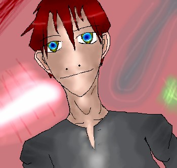
|
Well, Its was one of my first drawing. It was crap and deicded to change it. Messed up, decided to scru it up and I turned it into a collab. Well Thanks to Rikku And DBA!
15 comments
– latest 4:You two rock!
Thear (May 2, 2004)
lol! NIce but it gives me a headache! xD
Knockoff (May 2, 2004)
lol@ dino. Heh yeah, I bet it gives a few people head aches. XD
KiwiKitsune (May 3, 2004)
Hah hah hah! This is funneh! xD I read through the comments, and took another look at the picture! XD I love the bubbles! ^_^||:~*KiwiKitsune*~:||
Nightmare66641 (Jun 13, 2004)
This is really cool. AH! You can see Lincoln!!! Nice you three rock! I loves de bubbles. |

| ||||||||||||||||||||||
|
11 comments
– latest 4: hair.
Done!, The eyes are a little to high I think. A few small parts got blurry somehow. o_X
Zappo (Oct 4, 2003)
In all seriousness, I think that your problem started right when you started this pic. Your proportions are off. [color:Green](Begginer)[/color] http://www.sanford-artedventures.com/create/tech_face_shapes.html [color:Yellow] (Intermedeate) [/color] http://www.geocities.com/bearsclover/portraits/facetips.html (Intermedeate) [color:red] (Advanced)[/color] http://www.portrait-artist.org/face/structure.html (Advanced)
Knockoff (Oct 4, 2003)
Yea I know,. Thanks. |

| ||||||||||||||||||||||
|
Knockoff
(Sep 28, 2003)
About an hour and a half off.Major Big super huge Cookie to who ever can name the singer from the lyrics.
marcello (Sep 28, 2003)
well, ko's just confirme the fact he's only capable of drawing profile busts
Marienkind (Sep 28, 2003)
Artist: Stacie Orrico Song: (There's Got To Be) More To Life i don't want a cookie. i want male concubines.
taori (Sep 28, 2003)
Yay, Stacie Orrico. I wrote a parody to "Stuck" that was all about my obsession with Zel. "Ooh Zelgadis/too bad you're anime/that hard blue bod is/a turn-on I must say" and so on... Knockoff, I love the little shiny marks on your little Mr. T-esque necklace there. And your noseless expression.
RIKG (Oct 1, 2003)
OMGZ Its KO! Can I have your autograph, I cant believe in commenting on this! ^^ I really like this one also Its very purdy,. Its nice comicy feel to it to, And I lurv That song also.! |

| ||||||||||||||||||||||
|
Knockoff
(Sep 24, 2003)
Heh It was very fun too do, Ahh The is what Life is like when you have brothers.Nooooooo! Wrong board. *cries* Pretty please put this in the intermediat baord.
Knockoff (Sep 25, 2003)
Ill try roy, Anyways Dragon girl, Your so effing gay, and confuesed, I AM THE ONE IN THE MIDDLE. Derrr. drgon grl suks <--- Looks at the spelling.
concannon (Sep 25, 2003)
Don't use gay as an offensive term.
quintessence (Sep 25, 2003)
>_< Yes, please don't.
RIKG (Oct 1, 2003)
Awwwww You look cute! The shading is awsome, Its so smooth! Thats really cute., Great job Knockoff! |

| ||||||||||||||||||||||
|
Knockoff
(Sep 21, 2003)
Unfinished
amuy (Sep 21, 2003)
lol meaty. I liike the hair, and the little light highlight thingy(in the hair)..its cool! heh neat reptilian nose!
Fin_beast (Sep 21, 2003)
da face seems a bit flat at the moment...maybe you need a bit of shading around the cheek bones and the chin to make it look more "meaty"(lol).da necks pretty sweet.
mazi (Sep 21, 2003)
check it out. http://www.npj.com/thefaceofbach/1760-13-if-nose-0439.jpgits a nose.. notice the dark and the light and how it makes things appear to stick out. give it a shot.
RIKG (Oct 1, 2003)
Looks good, I love the shading, But I to think it looks "meaty". I The background is very nifty though! |
| ||||||||||||||||||||||
| Public Boards/Beginner | |||||||||||||||||||||||
|
Knockoff
(Sep 13, 2003)
Woaw I love textures.Blah, I tried, Hard when you already have textures. >____<
mazi (Sep 13, 2003)
dont beat me up just yet, but think about your lught source. if the lights coming from the left, the shadow will go right. think in 3d and where the light beams will go, and where the egg will block them out.
amuy (Sep 13, 2003)
Looks good too me! I want a dinosaur egg..I have a duck egg, but its not that pretty *sniff* wish it was....anyway the textures are coolios! awesome job knockoff! ;)
RIKG (Sep 13, 2003)
Woaw Thats Really awsome, I love it. Lovely textures/shading. |

| ||||||||||||||||||||||
|
Knockoff
(Sep 12, 2003)
New Icon. Funfun.
Hotaru-chan (edited Sep 12, 2003)
very nice colors, it looks soo shiney, in fact it looks like a glass ball ( rectangle ) from a chistmas tree!!!=3
RIKG (Sep 13, 2003)
OOooo Pretty!. Yea It does look like a ball for a X-mas tree ^^. I like it very much! |

| ||||||||||||||||||||||
| Public Boards/Intermediate | |||||||||||||||||||||||
|
Knockoff
(Sep 8, 2003)
folds, sorda. Bleh blorg blah hah.
RIKG (Sep 8, 2003)
O awsome-ness. Very cool. Nice gold. *snatches gold* There are a few white dots though.... |

| ||||||||||||||||||||||
|
Knockoff
(Sep 7, 2003)
heh heh hah. That was fun. The devil looks blury. Gah dang compresion. *cries* I might try to fix it later. |

| ||||||||||||||||||||||
| |||||||||||||||||||||||
| 2draw.net © 2002-2024 2draw.net team/Cellosoft - copyright details - 0.58sec (sql: 32q/0.17sec) |
The figure is better than any of your other figures ive seen from ya! ";
I like it!
Although it would have looked better with a good background.
Ahh, and I agree with Fin Beast. It would look even better than it is if it had a background. n__n;