| |||||||||||||||||||||||
| Public Boards/Beginner | |||||||||||||||||||||||
|
my avi
sav
(May 11, 2005)
this is my avater on gaiaonline.com.i hope what i drew is ok with you moderaters.im just a newbie
nekodesu (edited May 11, 2005)
Engraving descriptions into the drawing is unnecessary becuase there already is a description box and in this case, it takes a lot of space.
~unwritten_law_girl~ (May 11, 2005)
ya but if u write descriptions into the drawing it SORTA looks like a comic..(in a way)
marcello (May 11, 2005)
wow this sucks. o_O
Sutafani (May 12, 2005)
for some reason, i'm starting to hate noobs... thier attitudes are so bad! |

| ||||||||||||||||||||||
| Public Boards/Intermediate | |||||||||||||||||||||||
|
Juni_gatsu
(May 11, 2005)
meh...I'll finish (at least) the lineart by tonight. hopefully. I've got to go...somewhere...not sure where....just going out. yup. *sigh* why does lineart have to be so difficult? >_<unenthusiastic villiagers: yay....
juni_gatsu:.... >.<
nekodesu (May 19, 2005)
Wow! Beautiful work with the hair and shading. =D
Xodiak (May 19, 2005)
Xod gets excited because she is very sexy! I love the skin texture and shading... hehehe... I like the shape of her face, she is charming and beautiful. Terrific drawing! <:D|XOD|
nozomii (May 19, 2005)
REally great hair. I love the bg also. |
| ||||||||||||||||||||||
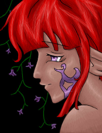
|
~unwritten_law_girl~
(May 11, 2005)
People are annoying.. 13+ for blood
Punky (May 11, 2005)
heh. thats cool. :D
nekodesu (May 11, 2005)
I second that... the right (the picture's right) arm is a bit weird...it doesn't look right, compred to the left one. And me like blood >:D
~unwritten_law_girl~ (May 11, 2005)
i know the arms look weird but it's just the angle i put him in.. and thanx^_^
tragicnurseryrhyme (May 13, 2005)
This could not possibly be any more emo. |

| ||||||||||||||||||||||
| Specialty Boards/Collaborations | |||||||||||||||||||||||
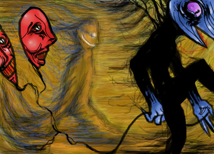
|
just an image that popped in mind. i dont know. erase/do anything. go wild.
13 comments
– latest 4:
Amethysts (May 15, 2005)
pretty...
IdentityOne (May 22, 2005)
And this would be the reason you two are two of my favourite artists here. I especially like the blood in water effect in the background.
sarah.com (Dec 14, 2005)
heyite
DoOp (Apr 27, 2006)
i like this one XD it's really i dunno, creative ;) |

| ||||||||||||||||||||||
|
6 comments
– latest 4:
Amazon (edited May 12, 2005)
It looks just about done to me - the yellow guy in the background looks like he's really happy to be there - you've added a nice touch of motion to the picture. - well done.
HunterKiller_ (May 20, 2005)
This is weird, but awesome. The mud guy walking in the background is well done.
sincity (May 20, 2005)
Good job guys. :}
Xodiak (May 20, 2005)
The two different styles look so great together! Hehe! Splendid. <:)|XOD| |
| ||||||||||||||||||||||
| Public Boards/Beginner | |||||||||||||||||||||||
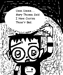
|
Kitti.Witti666
(May 8, 2005)
Squee! |
| ||||||||||||||||||||||
| Public Boards/Intermediate | |||||||||||||||||||||||
|
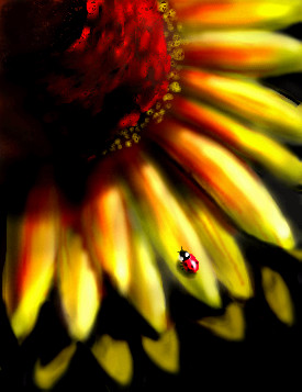
Kraisa
(May 10, 2005)
I wanted to put some kind of subject in with the flower...I tried over and over and finally settled on this little lady bug, she really makes it look nice.
Gemmy619 (May 10, 2005)
i agree about the lady bug it looks great, very pretty draw :)
Punky (May 10, 2005)
i love this. its great, so warm looking.
emmamommalag (May 10, 2005)
I like it very much. The colors, shading and lighting are beautiful and that ladybug was the perfect touch.
nekodesu (May 10, 2005)
The colors are so pretty =D and I love that ladybug...nice little touch to the drawing. |
| ||||||||||||||||||||||
| Public Boards/Beginner | |||||||||||||||||||||||
|
I"m obviously not done. I want to make this my best picture yet. I have a rough idea of what I want, i'm just not sure If i can do it. This is basically the background so far. If you have any suggestions to add to this go right ahead.
12 comments
– latest 4:The reason for the title is actually my inspiration for this drawing. Three Days Grace- Home. Its basically talking about a home that's not a home. This house is not a home is what it says. I hope this turns out well! ^^ THANK YOU REDPANDA!! YOUR MY SAVIOR!
TaCO (May 8, 2005)
O.O That so cool looking!!!!!!!!!
emmamommalag (May 10, 2005)
Oooh, I like the atsmosphere in this one.
Punky (May 10, 2005)
i love this so much! :D reminds me of Nny's house.
inatyrb (May 11, 2005)
^^ i'm happy to finally have this done! It makes me so happy. Thank you redpanda, you really grasped the concept I was trying to show! |

| ||||||||||||||||||||||
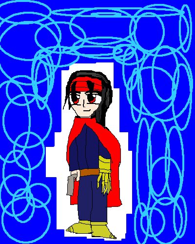
|
RikuGirl12
(May 10, 2005)
Just a chibi Vincent Valentine from FF7.
Punky (May 10, 2005)
i agree with hideyourface, and also, i dont think this is intermediate quality. its a good start, but it doesnt look up to intermediate standards. nope.
Xodiak (May 10, 2005)
When I saw the title I thought that was chibi method3. His name is Vincent, haha! >:D|XOD|
friend (May 10, 2005)
I really like the lightsaber effects.
Shanghai (May 10, 2005)
I don't think the background with the circles is really necessary. They look like you didn't have anything else to put there and just put random circles so it wouldn't be blank, and it would probably be better without them. |
| ||||||||||||||||||||||
| Public Boards/Advanced | |||||||||||||||||||||||
|
TRIP
(May 8, 2005)
Oooooow. The compression is absolutley horrible. Here's a link to a non-crappy compressed version; http://blueskywolf.com/2005/ThalatOe.jpg Yeah, I play this game too :/
TRIP (May 8, 2005)
as much as I like Lascaux, it doesnt have the same paint quality as Shi-painter. It's a picky process thing, thats all ;| but thanks for the explanations. I thought I was going looney when I was the only one that seemed to notice.And I agree with the background. I should have but was about to pass out and wanted to sleep :/ I'll keep that in mind next time, I see it now >.>
Maiko (May 8, 2005)
OMFG, RO wizard D: <3 <3 <3 <3LOVE LOVE their outfits but yeah, very pretty *luff* *luff* I wish I could draw them pretty e_e
p3ndragon (May 14, 2005)
TRIP, you're awesome dude.Except I've had problems with saving JPEG in Photoshop CS. Even at max quality, they turn out looking horrible. Meh. Either way, great draw. Maybe the BG could've been a darker shade of greyish stuff? I dunno. Looks great anyway.
sincity (May 14, 2005)
I thought I commented on this. OOPS Sorry. I like this, The only thing I don't quite agree with is the hands. know they are close to the screen and all, and so out of focus, but still they seem like they blend to much and they should be more distinguished. If I used the right word. Over all I like the piece though. :} I dig your work trip. :} |

| ||||||||||||||||||||||
| |||||||||||||||||||||||
| 2draw.net © 2002-2026 2draw.net team/Cellosoft - copyright details - 1.33sec (sql: 43q/0.86sec) |