| |||||||||||||||||||||
| Public Boards/Beginner | |||||||||||||||||||||
|
PinkuEspeon
(Feb 17, 2004)
Alright Marcello, Mazi, and Armando... please... please... PLEASE just remember that I am only learning... Mazi was basically saying that I was a n00b... and, Mazi is totally right... so... I looked at the links that she had on some of the little postings that she (he?) left... then, from there, I looked at them, and followed the directions and all that jazz... so... yah... well... I'm not finished with this. But, I will be soon... |

| ||||||||||||||||||||
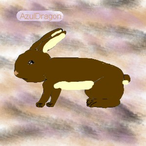
|
AzulDragon
(Feb 18, 2004)
This is my rabbit. His name is Brownie. This is my first drawing here.
PinkuEspeon (Feb 18, 2004)
O_O... well... that's even scarier than Syndey and his little car of clowns... O___O....... |
| ||||||||||||||||||||
| Misc. Boards/Sprites | |||||||||||||||||||||
|
PinkuEspeon
(Feb 8, 2004)
Okay. This is cute.
Knockoff (Feb 11, 2004)
I think this is your best, the lineart is smooth, but I think it needs a little more shading.
PinkuEspeon (Feb 18, 2004)
Yah. It does... but... this is just my icon... e_o... : ) |

| ||||||||||||||||||||
| Public Boards/Beginner | |||||||||||||||||||||
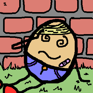
|
Alethio
(Feb 17, 2004)
Hehe its Humpty after he fell...thts y he has bandages and stuff on ^.^isnt he cute
PinkuEspeon (Feb 17, 2004)
Well... if someone ain't on the creative side! ^_^
DinoFlorist (Feb 17, 2004)
I love it. It's so simple, but a very nice composition with just the right amount of detail. It's perfect. |
| ||||||||||||||||||||
|
GundamWing
(Feb 17, 2004)
Megatron pointing ....
PinkuEspeon (edited Feb 17, 2004)
Wow. This is interesting. But... why is everyone drawing robots?
dixielandcutie (Feb 17, 2004)
thats pretty cool. i like the way you did blur and then sharp...and the little reflection star thingy. nice work.
Alethio (Feb 17, 2004)
Its the return of the transformers -.- i knew it was coming
sky_warp (Feb 17, 2004)
i love it! |

| ||||||||||||||||||||
|
sal
(Jan 15, 2004)
first time usin the airbrush..
marcello (Jan 15, 2004)
But to contrast what mazi said, this style has its own merit, and isn't necessarily bad. it's 10x better than the rest of the stuff you've posted.
sal (Jan 16, 2004)
ty for the advice...
ambermac (Jan 22, 2004)
i agree with marcello. there are other styles other than airbrushed/hilight-shiney musclebound comic book styles. you have a unique style.
PinkuEspeon (Feb 17, 2004)
I also agree with Marcello. Hey, ambermac, you should capitalize people's names. |
| ||||||||||||||||||||
| Public Boards/Intermediate | |||||||||||||||||||||
|
GundamWing
(Feb 17, 2004)
Dbz reference
Childlike_Vampire (Feb 17, 2004)
I like the background, and his mouth. *thumbs up*
marcello (Feb 17, 2004)
well considering the original/real dbz looks crap, you really have to draw something that isn't dbz to make it look good...
Look (Feb 17, 2004)
Very nice expression. It''ll be nice if the overall blurrness matches. Some part of the image is sharper than the other.
PinkuEspeon (Feb 17, 2004)
Oh, this awesome! ^_^ I love this!! |

| ||||||||||||||||||||
| Public Boards/Beginner | |||||||||||||||||||||
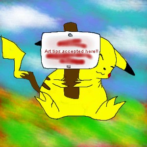
|
PinkuEspeon
(Feb 15, 2004)
Okay... yeah, that's a Pikachu... and, I bet your wondering why I wrote "Tsuki" (Japanese for moon) on the little picket sign that Pikachu is holding up... I wrote that there as a sub for drawing tips accepted here... why? Because, I'm like... not finished with the picture of the Pikachu holding the sign up! ^_^ I've still gotta write that (in English) on the picket sign that Pikachu is holding up. You may post some drawing tips here early, if you want to, that is! ^_^ But, first, look at my drawings that I have previously drew. Thanks! :D
marcello (Feb 16, 2004)
it could just be a fat pikachu
sal (Feb 16, 2004)
true, true
PinkuEspeon (Feb 16, 2004)
No, no, no... I wanted y'all to look at all of my other drawings. Not this one! |
| ||||||||||||||||||||
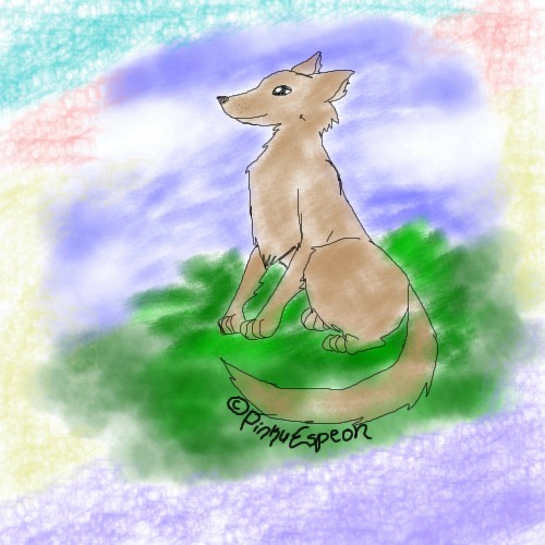
|
PinkuEspeon
(Feb 15, 2004)
Hmm... I drew this because I was bored... but, anyway, I beg and plead for someone to comment on this! Well... anyway, this was a really, really, really easy picture to draw. I hope that you people out there like it! ^_^ !! Oh, and by the way! Right now, just right now as we speak, it just started snowing/icing/hailing outside. O_O... and... imagine that at the beach...
marcello (Feb 15, 2004)
well the lineart is ok, but the coloring does no justice to the piece. The grass is alright, but everything else, especially the textured brush crap with seemingly random colors around the edge seems poorly thought out. You may try just a solid white or offwhite, or continue the grass and sky to the rest of the piece. On the dog, the main problem is all those white bits. I would suggest start by coloring on a layer between the background and the lineart, and use a solid brush to completely fill in the character (not the fill tool!), then use a darker or lighter brush and add shadows/highlights to give it depth. Last of all, as I've mentioned before, the copyright notice is really tacky. Personally I'd leave it out altogether until you're actually good enough that someone might want to rip you off. Anything you draw is automatically copyrighted whether you put that stupid little notice or not. If someone wanted to use it without your permission they could easily erase that copyright message anyway. If you actually want to include, I suggest making it a lot less obvious (the copyright notice has a bigger presense than the drawing itself!). You could use a thin brush and write it very small, or simply use the text tool and put it in the corner of the picture out of the way and not distracting.
PinkuEspeon (Feb 15, 2004)
Thanks, Marcello... I see... I see the errors that I have made... I will try not to make them again... |
| ||||||||||||||||||||
| Public Boards/Intermediate | |||||||||||||||||||||
|
rydicanubis
(Jul 7, 2003)
yay! i liked my louis pic so i decided to do this one...could be better, but it's one of those the-longer-you-work-on-it-the-better-it-gets pictures and i con't want to work on it any longer, so there...! 8 Pyay! :3
nyao (edited Aug 13, 2003)
ooo... wow... cool style... me like... lookz like that dude too. ^^
PinkuEspeon (Feb 15, 2004)
Weird... but, it looks neat.
Fluffysheep (Feb 15, 2004)
Weee, Seth Green ! You've got a nice style, great ! :)
Tuukke (Feb 15, 2004)
nice style.. the forehead is still a bit messed up but the colours are great! it looks like him, really |

| ||||||||||||||||||||
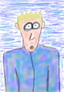
| |||||||||||||||||||||
| 2draw.net © 2002-2024 2draw.net team/Cellosoft - copyright details - 0.97sec (sql: 33q/0.33sec) |
drawn in 4 min
About the picture, it's very nice, very good for a beginner. The colors are good, and it looks kind of sad, although emotions are hard to portray with just an eye.
The best help I received on how to draw eyes was on one of the tutorials Mazi has posted many times...Here. The rest of her posted tutorials can be found here. *shrug* Hope that helps.