| |||||||||||||||||||||||
| Public Boards/Advanced | |||||||||||||||||||||||
|
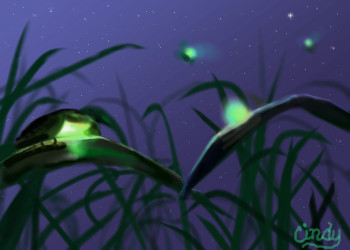
hulk
HiroDaZero
(Sep 27, 2008)
I got a request from my friend to draw hulk with an afro with some samoan tattoos. I put this on advanced board for size. I hope that's okay.
bette_davis_eyes (Sep 28, 2008)
awesome draw hiro
HiroDaZero (Sep 28, 2008)
i know, the tat looks completely fake because i decided to sort of rush with it. i might be able to fix it if i just find enough inspiration to do so, but i'm not even getting paid with this, so all the extra effort doesn't benefit much for me. oh and thanks for the comments.
twit (Sep 28, 2008)
lol if you send it to deviant art and put it up for sale, then maybe you'd get paid xD
HiroDaZero (Sep 28, 2008)
lol maybe, if people like the hulk in afro with some tattoos. |

| ||||||||||||||||||||||
|
PS
(Apr 1, 2008)
We couldn't see what we were doing.
Miss_DJ (Sep 27, 2008)
beautiful, Paul!
Roytje (Sep 28, 2008)
Yeah, I love this.
bette_davis_eyes (Sep 28, 2008)
beautifully done!
Pandora (Oct 1, 2008)
The colors, the textures and lighting you captured beautifully. Wonderful job. |

| ||||||||||||||||||||||
| Public Boards/Intermediate | |||||||||||||||||||||||
|
DeadlyBlondeArcher
(Aug 21, 2008)
Sometimes it's the teeny tiniest, most fleeting things in life that make me happy. :)
davincipoppalag (Feb 2, 2009)
She did this edit way back in September Gloria :0(
adxaidl3692 (Jun 10, 2009)
I like the fourth version, with the stars in the sky.
Miss_DJ (Feb 9, 2010)
miss you
pure72 (Jul 25, 2010)
good call on peacing, the book thing was a dick movecurious about your art |
| ||||||||||||||||||||||
| Public Boards/Advanced | |||||||||||||||||||||||
|
zep
(Sep 27, 2008)
:P
Pandora (Oct 1, 2008)
Hi Zep, this is wild looking. I love how his face looks like it's pressed against the glass of the screen. You do amazing work.
huirimeir (Oct 1, 2008)
yuju!! buena!! ya pronto por aca.
Miss_DJ (Oct 19, 2008)
another great piece, zep!
Suntan (Sep 16, 2015)
i wonder if we"ll ever see your drawings again. :\ |

| ||||||||||||||||||||||
| Public Boards/Intermediate | |||||||||||||||||||||||
|
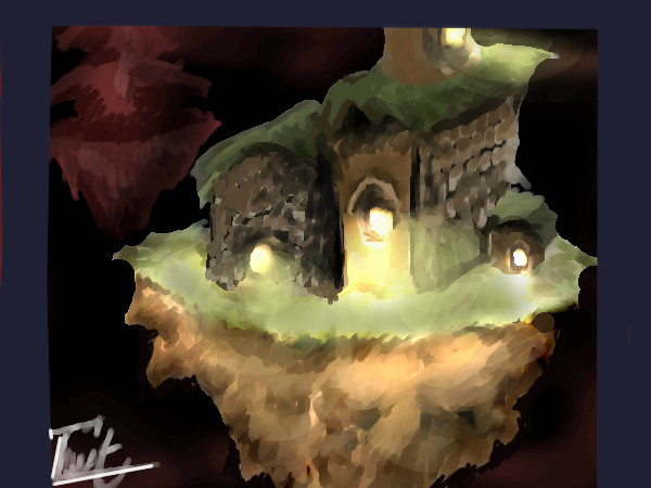
twit
(Sep 27, 2008)
-sigh- this was originally supposed to be for the contest, but i forgot that i was on the intermediate board, but besides, this doesnt even look like a van Gough-ish painting =0, heh i tried
lori (Sep 27, 2008)
it's a good lookin pic nonetheless
davincipoppalag (Sep 27, 2008)
This is beautiful!
HiroDaZero (Sep 27, 2008)
wow this is nice..
Miss_DJ (Sep 28, 2008)
yep, the lighting is really nice here. |
| ||||||||||||||||||||||
| Public Boards/Beginner | |||||||||||||||||||||||
|
Miss_DJ
(Sep 27, 2008)
abstract
HiroDaZero (Sep 27, 2008)
woah do i see a road? nice drawing.
lori (Sep 27, 2008)
really good one DJ, so 3d looking
davincipoppalag (Sep 27, 2008)
I really like this one Donna. Such cool planes and shapes
Miss_DJ (Sep 28, 2008)
thanks!! playin with a new way of creating. |

| ||||||||||||||||||||||
| Specialty Boards/Contest! | |||||||||||||||||||||||
|
3 comments
– latest 3:
davincipoppalag (Sep 23, 2008)
Great job with this entry Paul. It really has the feel of him
Miss_DJ (Sep 24, 2008)
great!
HiroDaZero (Sep 27, 2008)
woah this is nice! |
| ||||||||||||||||||||||
| Public Boards/Beginner | |||||||||||||||||||||||
|
Suntan
(Sep 27, 2008)
vlad.the.hamster (Sep 28, 2008)
Woo! You drew something!! :DIt's nice, draw more! :D
Suntan (Sep 28, 2008)
Thanks, vlad! I am going to try again...hopefully a bit better than this one. We'll see how it goes. ;D
QTgillie (edited Oct 8, 2008)
Great one Sunny! I love the eyes and the simple look of the way you put it all together.
DMV (Oct 17, 2008)
I really like clowns. |

| ||||||||||||||||||||||
| Specialty Boards/Contest! | |||||||||||||||||||||||
|
Dr.Moony
(Sep 23, 2008)
Some quick and fun stuff.ref is some random photo I took: http://bv-design.com/stuff/van_ref.jpg Colors look completely different because I tried to go for his palette. Bright spots are mostly yellow, and darker mostly blue(somewhat green, somewhat red). Now that I look at it, it's way too saturated and to start with orange wasn't the best decision. One key point are the short strokes which flow(don't cross!). Also the strokes are done with a high opacity(and blending activated) to give them the impact they need.
Suntan (Sep 29, 2008)
I thought you did a beautiful job. Congrats.
Miss_DJ (Sep 30, 2008)
well deserved, great entry. Congrats!
Aakyra (Sep 30, 2008)
Congratulations, this is beautiful!
bette_davis_eyes (Oct 1, 2008)
Congrats on the win! it's a beautiful drawing |

| ||||||||||||||||||||||
| Main Forums/Drawing Discussion | |||||||||||||||||||||||
 |
Gigandas (Sep 25, 2008)
My sequential art teacher introduced this website to us and I wanted to share the wealth with all of you who may be interested. The greatest feature about this site, is that it demonstrates the movement of the muscles in the face in order to get from one expression to the next (great tool for anyone in animation). Anyway, here is the link: Hope you guys find it as useful as I found it to be :).
6 comments
|
||||||||||||||||||||||
| |||||||||||||||||||||||
| 2draw.net © 2002-2026 2draw.net team/Cellosoft - copyright details - 3.37sec (sql: 37q/2.85sec) |