| |||||||||||||||||||||
| Public Boards/Beginner | |||||||||||||||||||||
|
but all of those vows you made?
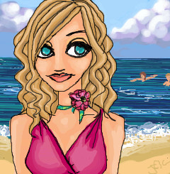
juliamandapanda
(Jul 1, 2004)
were never to be!
lp_phaery (Jul 2, 2004)
Yeah this is really good. I especially love her hair and the clouds look so puffy.
ObeseityKills (Jul 2, 2004)
I like the coloring! It purdy.
davincipoppalag (Jul 2, 2004)
Very nice colors and shading.
Knockoff (Jul 3, 2004)
Oh wow. Your art rocks! I love your style, and the the colors are great. Nice beach background. |
| ||||||||||||||||||||
| Public Boards/Intermediate | |||||||||||||||||||||
|
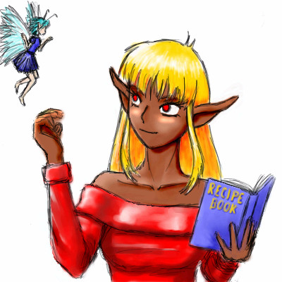
MaboroshiDaikon
(Jul 2, 2004)
It's a little sketchy, but it's the first time I've used this version of an Oekaki software... Anybody up for some lunch?
MD_Anonymous (Jul 2, 2004)
Hehehe. I pity the poor fairy...kinda, sorta, okay not really. ^^ You might want to add a background...but other than that its really good. Very nice job. ^^
lp_phaery (Jul 2, 2004)
I like it. the fairy looks kinda dainty and is so adorable. |
| ||||||||||||||||||||
| Public Boards/Advanced | |||||||||||||||||||||
|
starmarked
(Jun 22, 2004)
Used a reference picture, but I changed some of the details. I am finaly glad to be finished with this one, it did take me a while but not as long as the timer says. Sometimes you don't realize how much detail there is in a picture.
coward-san (Nov 1, 2007)
it's amazing the contrast between red/orange and black color
Debrosi (Jul 16, 2008)
beautiful... love the colors!!!
betty96 (Mar 29, 2010)
I like the colors .....and the sky too.........good job!!!
davincipoppalag (May 2, 2020)
Still looks great |

| ||||||||||||||||||||
| Public Boards/Beginner | |||||||||||||||||||||
|
nikki613
(Jul 2, 2004)
im still not good at this
MD_Anonymous (Jul 2, 2004)
Its nice to try out all the tools and effects you can get. You might want to make the colors darker. |
| ||||||||||||||||||||
| Main Forums/Drawing Discussion | |||||||||||||||||||||
 |
MD_Anonymous (edited Jul 2, 2004)
This might have already been addressed but I was wondering when the documentation would be completed. (So its not under construction.) I know the mods have a ton of work just keeping this site in order, but I'm hoping that the documentation would help me (and probably others) a lot. Thank you!
6 comments
|
||||||||||||||||||||
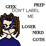
| Public Boards/Beginner | |||||||||||||||||||||
|
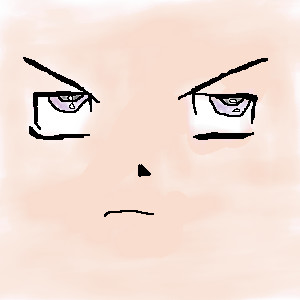
_Shadow_
(Jul 2, 2004)
Ehh ... Eyes :P
ILoveKenshin (Jul 2, 2004)
Well, I think that they shouldn't be so... square. I like the expression, though! xDHana-chan ---------------------------------------- Kenshin and I are having a contest! Whoever draws the best anime character wins a free anime poster of their choice! Here's our website: http://freewebs.com/kaorusanimestuff/ Good luck!
MD_Anonymous (Jul 2, 2004)
Yes, I agree with ILK, you might want to make them have more rounded edges ^^. And it would be nice if you could add a head (outline of it, you already have the eyes, nose, and mouth) and hair so it doesn't look just like some random eyes. Nice job. ^^ I especially like the shines on the eyes. ^^ |
| ||||||||||||||||||||
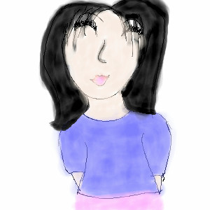
|
nikki613
(Jul 1, 2004)
im very tired so im going to bed
emmamommalag (Jul 1, 2004)
Very pretty mouth and nice colors on this, nikki. Sleep well.
MD_Anonymous (Jul 2, 2004)
Maybe add a background and shading? Nice job. ^^ |
| ||||||||||||||||||||
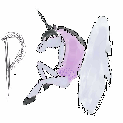
|
yellow_mello_99
(Jul 1, 2004)
dsafaWell umm.. the shoulder is a little funny but i think it will do n-n; I hope its ok!
ILoveKenshin (Jul 1, 2004)
It's pretty! ^^ Although... the unicorn is my school mascot... bleh. BUT, this pretty. ^^ I like your use of colors, they go together very nicely. n.n-Hana-chan
MD_Anonymous (Jul 2, 2004)
I especially like the eye. You might want to do more shading to give it more depth and maybe more detail on the feathers of the wing.... but other than that very nice job! ^^
Bumble_Beez (edited Jul 2, 2004)
It's really nice, it looks like water colors ^_^ (that's a good thing O_O)But why is there a 'P'? Edit: Nevermind, I just noticed it said Peg O_O Sorry, little idiot here |
| ||||||||||||||||||||
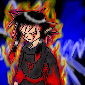
|
Leaf-Nin
(Jun 25, 2004)
.... yeah
squee (Jun 26, 2004)
badass!WHOOPAS!
MD_Anonymous (Jun 26, 2004)
Yay! No more head-hanging-in-air! You finished it! ^^ I especially like the red flames/glow on him and his clothes. Nice job. ^^done , kazaa inspired bg
MD_Anonymous (Jul 2, 2004)
I like the contrast of the blue and red. Nice job. |
| ||||||||||||||||||||
|
warriorxangel
(Jun 30, 2004)
My friend suggested me to draw this and I have no idea why so don't ask
MD_Anonymous (Jun 30, 2004)
Well, the picture has a point. Maybe your friend was pointing out the point (yeah, I know that sounds lame). You might want to do more detail in the background...... nice job. ^^ |
| ||||||||||||||||||||
| |||||||||||||||||||||
| 2draw.net © 2002-2026 2draw.net team/Cellosoft - copyright details - 0.33sec (sql: 38q/0.10sec) |