| ||||||||||||||
| Public Boards/Intermediate | ||||||||||||||
|
CRKT Classic K.I.S.S.
Parelis
(Dec 11, 2003)
My CRKT folding knife glows funky blue in the monitor light.
marcello (Dec 13, 2003)
it has a background.
Parelis (Dec 13, 2003)
I actaully was going to draw it sitting on my tablet, but I decided to just add the shadow and move on to other things. It would look nicer with something in the BG and with that scribble gone, but I was really just interested in trying to replicate the effect of multiple light sources on metal. I'm happy with what I did in that respect, and learned a bit more about using the app.
MC.Cracka (Dec 14, 2003)
completely KICK ASS, but the bolt on the top of the blade is transparent.
mikhail (Dec 21, 2003)
hah. i have that same knife, except its not two-tone, very nice... |

| |||||||||||||
|
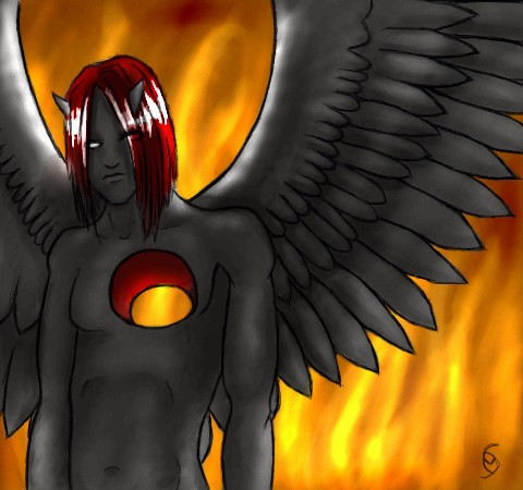
mazi
(Dec 12, 2003)
started out as an angel guy.. buy hey.vbxcvbxvhdhfgBFHF
Parelis (Dec 13, 2003)
Whatever it started out as, the final product is a winner. I wonder though, should those white highlights have some yellow or orange in them from the firelight?
Fin_beast (Dec 13, 2003)
That is really cool. :D. It looks really shit from the thumbnail tho. *Shoots him again at close range with 12 boar*
MC.Cracka (Dec 14, 2003)
nice depth in the hole, and great fire in the background |
| |||||||||||||
| Specialty Boards/Collaborations | ||||||||||||||
|
Finally finished this drawing! After the longest time with out the applet to finish it, I finally got to my other computer to finish it! YahAHAHAH! ^^ *dances*
19 comments
– latest 4:
marcello (Feb 2, 2004)
they look fake
Noremac (Mar 9, 2004)
sweet this picture makes me feel wierd when i look at it. mainly because its pretty damnn AWESOME
esaure (May 2, 2004)
Oh so freakin niiice. I really like the bg and him. The pose is what really gets me, its so lovely! La the staff and the jap writing on it. *noodles* Never mind the coloring, damn thats niiice.
AngelSentHedai (Jun 9, 2004)
Looks like a modern day dotHack...weee.... |

| |||||||||||||
|
*doesn't want too*
3 comments
– latest 4:
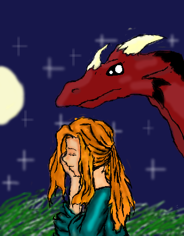
Gothic_Otaku (Sep 16, 2003)
Oh...so that's what that thing was.....sorry I mistook it for hair. It was a sleeve and arm :P. But I think she looks better praying :P :P :P :P *more :P's*Teh compression killed the dragon! 0_0
Changed the eyes. -_-
MC.Cracka (Dec 14, 2003)
great shading on the shirt |
| |||||||||||||
|
still sharp of vision, an old veteran spots something out of the corner of his eye...
4 comments
– latest 4:
MC.Cracka (Dec 13, 2003)
great lineart, cant wait for color and shadingpresently still quite under construction...
tappie_chan, i also started basic skin tones but they're hidden here... feel free to continue on and add or change to what i've done so far... ^ ^ colour away!
finalfairy383 (Jul 1, 2005)
Thinks its pretty good but you need to finish with color
kissimmeegurl (Feb 23, 2007)
wow plz finish it!!! |

| |||||||||||||
| Public Boards/Intermediate | ||||||||||||||
|
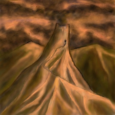
supermonkey
(Dec 12, 2003)
Kicked off computer.
TwystedFate (Sep 26, 2004)
Its beautiful .. it feels so real.
Squishee (Jan 23, 2009)
Damn, crazy, it's wow, beautiful
Spotteddapple (Jan 23, 2009)
thats amazing!
davincipoppalag (Jul 23, 2017)
They need to crawl on the front page again |

| |||||||||||||
|
Parelis
(Dec 13, 2003)
A little shiny frog. Still needs more BG, need to re-do forleg.
Edward (Dec 16, 2003)
Froggy!!!! So shinny!!! *hugs it*
nyao (Dec 22, 2003)
OMG! it's sooooo coot!! I luv the textures and the colors, and the blue shininess is awesome!! ^^ so good!!
Coolsoft (Dec 22, 2003)
quite interesting style.
concannon (Dec 22, 2003)
Wow, lovely. Bravo. And the shine on the back leg closest to us is fantastic.>> << >> *steals froggie* |

| |||||||||||||
| Public Boards/Beginner | ||||||||||||||
|
gusiLuNg
(May 2, 2002)
testing
Mad_Cow_Disease (May 24, 2006)
wow, i really like this, i would like to see it at a higher resolution than 200x200 though.
riccir (Jun 9, 2009)
showcase??? really?..okay
rayne (Jun 19, 2009)
that's pretty cool
davincipoppalag (Nov 20, 2017)
hmmmm |

| |||||||||||||
| Specialty Boards/Collaborations | ||||||||||||||
|
Here the ring was forged, and here the ring was destroyed.
8 comments
– latest 4:Here a tale began, and here a tale ended. finished I guess... though there is still a little bit of ghost shading around the edges and depth highlights...
JesusFreak89 (Dec 11, 2003)
sorry I couldn't do anything
MC.Cracka (Dec 12, 2003)
good rock feel and shading, might want to fix up the lines though
Coolsoft (Dec 13, 2003)
I do want to, but I set it to finished already. And I really don't want to fix every single flaw in it, at that rate, it would take forever. |
| |||||||||||||
| Public Boards/Beginner | ||||||||||||||
|
dc1
(Dec 12, 2003)
first time user!^^
Parelis (Dec 12, 2003)
Beautiful colors, very serene. A little sparse in detail, but I like it anyway.
MC.Cracka (Dec 12, 2003)
everything looks blurry, like if you were focused on an object and you took that abject away, good effect
dc1 (Dec 13, 2003)
I know this pic is kinda of rough, I will try to put in more details next time, thank you everyone!^^
Lalaland (Dec 15, 2003)
I agree w/ coolsoft. Maybe you could add a dolphin or two??? Anyway, its my opinion, you pick '_' :-) |

| |||||||||||||
| ||||||||||||||
| 2draw.net © 2002-2026 2draw.net team/Cellosoft - copyright details - 1.46sec (sql: 45q/0.39sec) |