| |||||||||||||||||||||||
| Public Boards/Intermediate | |||||||||||||||||||||||
|
Wolfheart
(May 27, 2004)
NO WAIT ITS UNFINISHED crap -_-;; |

| ||||||||||||||||||||||
|
Wolfheart
(Mar 19, 2004)
Ahhdhahdhaldahsdh ahahahhaha...
squee (Jun 23, 2004)
hmm nice picture. Your technique is very unique. the shading is so.. standy outy er.. yeah.. wow.. your good.
TaCO (Dec 2, 2004)
O.o Harry Potter, he looks american??? Great pic, I have never seen him draw like this before.
Cordelia_Pink (Dec 25, 2004)
Erm... HARRY POTTER??? You people think you know Harry Potter???! Do you see a SCAR on the forehead? Erm... no. Looks like this is just a person wearing glasses but a neatly drawn picture. =)
mukumuku (Dec 26, 2004)
i like the color and the sketchy ness. |

| ||||||||||||||||||||||
| Public Boards/Beginner | |||||||||||||||||||||||
|
dalexilestio
(Aug 25, 2004)
I do't really know what i was doing here, made up a random person, put in a kinda mecha bg with the ellipse...still experimenting with this type of painter, its awesome
haruko_ryuu (Oct 13, 2004)
i love the background! thats awesome o.o
Knockoff (Oct 13, 2004)
Yeah, the background looks like a never ending slinky. :)
mukumuku (Dec 26, 2004)
cool, the expression really sets a mood to this picture |

| ||||||||||||||||||||||
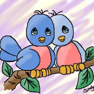
|
somebody
(Aug 5, 2004)
This is my first attempt at line drawing. And also the first time I have used multiple layers. I used a picture from my daughters Precious Moments bedtime story book. Special thanks to Zack for his awsome tutorials. They were a huge help
Knockoff (edited Aug 5, 2004)
haha, thats great. Nice lineart. The coloring is alirght, too!
TiggerTiger (Aug 5, 2004)
That's so cute! I love their eye's and the lil feathers on the tops of their heads.
9090 (Dec 26, 2004)
hi sindy i love the little birds
davincipoppalag (Dec 26, 2004)
Very cute drawing Sindy. Great colors and good lines. |
| ||||||||||||||||||||||
| Public Boards/Intermediate | |||||||||||||||||||||||
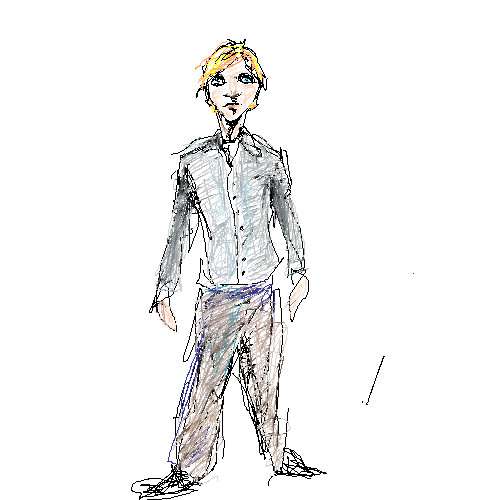
|
DaveTell
(Dec 22, 2004)
he seems a little to handsom and fashionable here
me007 (Dec 22, 2004)
I wish my shoes looked like his. I would be the fashion king. :(
StrawberryYamichan (Dec 22, 2004)
the little thumbnail makes it look like a coloured pencil drawing :) interesting style ye got there
Jack_Fox (Dec 23, 2004)
Hey Dave, the sixties are on the phone, they want they're art back. (that's a compliment comming from me: I lub everything artsy from the 60's.) Peace, Jack
Knockoff (Dec 23, 2004)
Super coooL!? |
| ||||||||||||||||||||||
| Main Forums/Drawing Discussion | |||||||||||||||||||||||
 |
Pence (edited Dec 13, 2004)
I've been thinking abuot joining like other art sites like Deviantart and i need a name.. can anyone give me a good idea to create a good name? Any one have name ideas?? T_T... i just can't decide. please help.
51 comments
|
||||||||||||||||||||||
| Specialty Boards/Elite Bastards | |||||||||||||||||||||||
|
Sererena
(Dec 23, 2003)
I felt like drawing a gothy-type Aeris... at first I was gonna do an undead version of her (ie. resurrected after Seph kills her). But I like this melencholy, sad Aeris. She doesn't look scary or anything.
DaggerQuill (edited Jul 13, 2004)
thats really cool. nice to think of aeris in a not-so-pink way. i love how everything but her face looks washed out or something (even if i am alone in that)
Satanicka (Sep 11, 2004)
Lookin lovely darlin.... I think this is my new favorite image...yep.
plzdontjudgeme (Oct 21, 2004)
wow! this looks amazing! great job!
mukumuku (Dec 23, 2004)
this is so great, i've never really liked her, but as a goth, aeris looks so much cooler |

| ||||||||||||||||||||||
|
method3
(Oct 10, 2003)
this was supposed to be some kind of metal stamp kinda thing, but that looked pretty crappy.plus since i ran out of space on the other boards on the first submission it yet again ends up on the only board i have been posting to, that is the only reason it's here.
method3 (Jan 22, 2004)
Just posting to let people know that I guess I'm still going to work on this piece as new ideas come to me. The thing that's missing from this is just overall lack of depth i guess.
marcello (Jan 22, 2004)
you need more contrast in the main outlines, I think... btw, are you boycotting aim/icq now?
method3 (Jan 22, 2004)
Nope, I just never bother to start trillian anymore, I don't think that's the same as boycotting it.
mukumuku (Dec 23, 2004)
this looks just like a real paining! i think it looks great |

| ||||||||||||||||||||||
| Public Boards/Beginner | |||||||||||||||||||||||
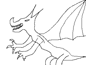
|
Agoylis
(Sep 30, 2004)
he needs dental work
canibal_misfits (Sep 30, 2004)
let me color it in pls ill hook it up im new also lol i just posted my first pic!
Knockoff (Sep 30, 2004)
He sure does!
Kenshin (Dec 23, 2004)
Welcome to 2draw! (althought his comment it a little late) I hope you enjoy and draw more dragons.. after their dental work. ;D |
| ||||||||||||||||||||||
|
tidus
(Dec 20, 2004)
nobody has put foren language on here so I did
Knockoff (Dec 20, 2004)
And you would wonder why? Pffft.
Kilala (Dec 20, 2004)
You missed 3 spots... XD
StrawberryYamichan (Dec 20, 2004)
XD actually....*counts*.....4
mukumuku (Dec 22, 2004)
this is cool either way. i like it, it would make a cool icon |

| ||||||||||||||||||||||
| |||||||||||||||||||||||
| 2draw.net © 2002-2025 2draw.net team/Cellosoft - copyright details - 2.19sec (sql: 36q/1.66sec) |
I live in a boot too.