| |||||||||||||||||||||||
| Public Boards/Intermediate | |||||||||||||||||||||||
|
Kloxboy
(Aug 19, 2007)
soup |
| ||||||||||||||||||||||
| Specialty Boards/Contest! | |||||||||||||||||||||||
 |
Kloxboy (edited Sep 2, 2007)
ANNOUNCEMENT: 2Draw needs a new Contest Board Moderator. Kloxboy is leaving the Contest Board and we need a new contest board moderator to replace him. If you would like to be the replacement, please memo Kloxboy with your request, along with an explanation as to why you would like to be a contest moderator. Your request will be reviewed by Sweetcell, Marcello and Kloxboy. if you're the right fit for the job, we will set you up with...
9 comments
|
||||||||||||||||||||||
| Public Boards/Intermediate | |||||||||||||||||||||||
|
staci
(Aug 19, 2007)
aaa
camadeon (Aug 20, 2007)
OOO... how super cool. Lovely green colors!
patienceisoverrated (Aug 20, 2007)
oooohhh so pretty :)
Heartsdomain (Aug 20, 2007)
I adore her face, and you just want to lean down and kiss her lips.
Axil62 (Aug 25, 2007)
I just want to lean down and rub my pecker on her nostril and giggle. |

| ||||||||||||||||||||||
|
Zer0
(Aug 19, 2007)
squares and rectangles - ref used
sincity (Aug 19, 2007)
This is just insane good. :}
davincipoppalag (Aug 19, 2007)
WHo is Ron Paul? This was a terrific idea , great work
Kloxboy (Aug 20, 2007)
Dave: Ron Paul's website - He's one of 4 I'd vote for but he's not my first choice. The fact that he's a republican and I'd vote for him should tell you something. :D
davincipoppalag (Aug 20, 2007)
Thanks..he looks promising.. Lives in Texas.. was Air Force..voted against the Patriot Act.. hmmm |

| ||||||||||||||||||||||
| Public Boards/Beginner | |||||||||||||||||||||||
|
staci
(Aug 18, 2007)
sss |

| ||||||||||||||||||||||
| Public Boards/Intermediate | |||||||||||||||||||||||
|
Roytje
(Aug 16, 2007)
:)
fleeting_memory (Aug 19, 2007)
as always I love your texture.
Roytje (Aug 19, 2007)
Thanks alot, people :)
Sweetcell (Aug 21, 2007)
Oh so pretty. I immediately think Viking when I see this. Such lovely colors Roy.
shell (Apr 7, 2010)
nice song |

| ||||||||||||||||||||||
| Public Boards/Advanced | |||||||||||||||||||||||
|
steveandjoe
(Aug 18, 2007)
kinda looks like me, but i think i look like i'm about to barf, so i have to make some adjustments.
Miss_DJ (Aug 19, 2007)
sweet eyes. great skin tone colors! you 'both' draw nicely.
TheCrimsonKing (edited Aug 24, 2007)
It's funny to me because your weight here is so low, it's not understood just how talented you are.Let's get them up to date. Steve's Murals This looks just like you steve!
solo_mob (Sep 9, 2007)
fine color mixing is an incredible talent, in my experience. You've done an impressive job here, (and perhaps more impressively in those murals. IRL mediums are so fickle.)This is a strong start.
shining_star_sam (Oct 16, 2007)
You look dishy :P I like how you used the green background to bring out your eyes. Well done. |

| ||||||||||||||||||||||
| Main Forums/The Post Board | |||||||||||||||||||||||
 |
Gemmy619 (Aug 18, 2007)
Hi all, ive just designed 2 of my own ambigrams for a tattoo i want but i cant decide which i like the best and was hoping you guys would help me decide which would look better. The ambigram reads "Family" (the normal way and when flipped upside-down) and its going to go on the inside of my wrist. Also if anyone has any ideas of how to make it look better plz let me know (not the obvious tidy it up a bit, ill leave that to the tattoo artist lol) ...
5 comments
|
||||||||||||||||||||||
| Main Forums/2draw.net | |||||||||||||||||||||||
 |
marcello (edited Aug 18, 2007)
I am looking to start a 2draw ART blog, that is an editorialized news feed about digital art, art on the web, and art in general. The goal is to provide a source of inspiration, information, and entertainment for aspiring artists and admirers of art alike. The content will be primarily media (images, video) showcasing various artists and art related media, but also original editorial content. Once things get rolling we will probably look into monthly/weekly features such as spotlights, inte...
16 comments
|
||||||||||||||||||||||
| Public Boards/Intermediate | |||||||||||||||||||||||
|
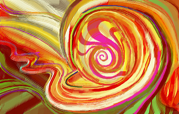
Kloxboy
(Aug 18, 2007)
fog fog
Miss_DJ (Aug 18, 2007)
it looks like you're having FUN Klox! good result!
Nocturnal_Romance (Aug 18, 2007)
Squint your eyes and look at this.
Sweetcell (Aug 18, 2007)
It's metallic and 3D in the thumb, yet organic in life size. I like where you've been going.
Kloxboy (Aug 18, 2007)
Thanks guys. I think smoothing out some of the edges would improve this image, I'll try that on a future piece. |
| ||||||||||||||||||||||
| |||||||||||||||||||||||
| 2draw.net © 2002-2026 2draw.net team/Cellosoft - copyright details - 2.09sec (sql: 34q/1.74sec) |
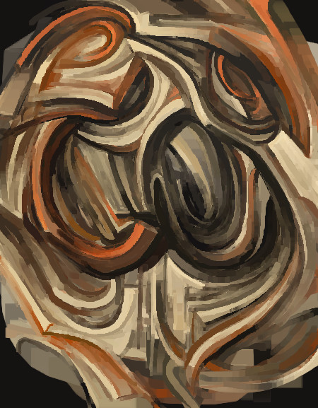
The colors the shapes the bright lights.... the letter E. sorry, Simpson's moment
That would be a funkadelic thing to see.
Nice to see you experementing with different color schemes.