| |||||||||||||||||||||||
| Information/News | |||||||||||||||||||||||
 |
marcello (Dec 22, 2006)
Just figured I would post something here since it's been quite a while since the last update. But, there are no updates, so carry on! Let's make this more interesting. Name the one thing you wish 2draw had. That is, one thing you think would make it a better place. Happy holidays! 2draw.net team
127 comments
|
||||||||||||||||||||||
| Public Boards/Intermediate | |||||||||||||||||||||||
|
Voldemorting
Kloxboy
(Jan 18, 2007)
To King Joe
Sweetcell (Jan 18, 2007)
Yes I remember that one, I mean more of these asymmetrical people together.
Naima (Jan 18, 2007)
Freaky! Great nose crinkle...
frootcake (Jan 19, 2007)
man, you do great things cloxy
Great_white (Jan 19, 2007)
Such elegance! |

| ||||||||||||||||||||||
| Public Boards/Beginner | |||||||||||||||||||||||
|
Naima
(Jan 18, 2007)
Just messing around. This one turned out to be rather obnoxious to look at, sorry *laugh*
Kloxboy (Jan 18, 2007)
Excellent patterns. I'd love to do a collab with you someday, my insanity meets your patterns, might be cool.
Naima (edited Jan 18, 2007)
Thanks, Klox! And wow, that would be interesting - your work is so textured and 3-D, who knows what we'd end up with? Would likely be quite a challenge for me (you can tell I'm a flat surface slave), but I agree that the result could be really cool. Hmmm... *rubs hands together* |
| ||||||||||||||||||||||
| Specialty Boards/Elite Bastards | |||||||||||||||||||||||
|
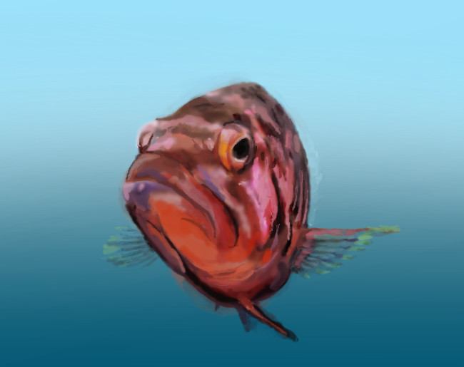
Axil62
(Jan 16, 2007)
:o
Axil62 (Jan 16, 2007)
Well I'm just glad someone got it :)
davincipoppalag (Jan 16, 2007)
Alice looks like the last guy that waited on me at the motor vehicle department.. same expression...this one probably has a better personality , though.. great fishy face
lori (Jan 16, 2007)
he's pretty
Kloxboy (Jan 17, 2007)
That's cool Dan. Very colorful. Nice work broski. |
| ||||||||||||||||||||||
| Specialty Boards/Contest! | |||||||||||||||||||||||
|
Axil62
(Jul 5, 2006)
:)
Axil62 (Jul 12, 2006)
I deleted it.
sincity (Jul 12, 2006)
wow. this drawing is awesome. just like Ty said. :}
Purgatori1 (Jul 16, 2006)
How do you delete something?
a_blue_orange (Jan 16, 2007)
!!! |
| ||||||||||||||||||||||
|
Orkdoop
(Jan 8, 2007)
A redo. I think this is the old one. http://cellosoft.com/2draw/view/27441/
Axil62 (Jan 12, 2007)
Good job Jessy. I love you. :)
Kloxboy (Jan 14, 2007)
Congratulations Orkdoop! "Jean Harlow" is awarded first place for Contest Week 42: Do over!. You can see a tremendous growth in Orkdoop's digital drawing skills in this piece. Aside from blowing her old piece out of the water, Orkdoop demonstrates a stronger sense of proportions, an eye for detail and an all around more advanced drawing ability. I also found the gradient patterns in the clothing to be an innovative approach to making fabric textures. You've come a long way siski.
davincipoppalag (Jan 15, 2007)
Congratulations on the win Jessica!
Miss_DJ (Jan 15, 2007)
very nice and congratulations! really a super representation of artistic growth! :o) |

| ||||||||||||||||||||||
| Specialty Boards/Collaborations | |||||||||||||||||||||||
|
DRAW YOURSELF!
47 comments
– latest 4:Anyone can join! :D
camadeon (Jan 15, 2007)
(1oo years later) ^^ eh... I'd like to join.
101_Torchic_101 (Jan 15, 2007)
(^D^) Oo! Oo! Me =D Please?
MRP (edited Dec 13, 2011)
.for sure.
|

| ||||||||||||||||||||||
| Specialty Boards/Contest! | |||||||||||||||||||||||
 |
Kloxboy (edited Jan 15, 2007)
Contest Week 42: Do over! *Showcase Selections Announcement Below* Your goal this week is to select one of your older drawings on 2Draw and do it over...but better. The piece you select must be from the first half of your membership here, no newer pieces. Basically, the most improved piece wins, not necessarily the most skillful one. This is a great opportunity to show everyone how much you've improved and learned since you've been on 2Draw. When picking your "do over" piece, do not s...
23 comments
|
||||||||||||||||||||||
|
6 comments
– latest 4:
fleeting_memory (Jan 8, 2007)
hey I remember this! :) Interesting difference! I love this contest.
PolythenePam (Jan 11, 2007)
the detail on the money and the snowglobe is amazing
cmb (Jan 12, 2007)
I love the origami"!
Alter.Native (Jan 15, 2007)
This one was my favorite entry in this contest! (well, apart from mine of course..;)..) It's not only far more skillful than the original, but it goes to show that when you acquire more skills, you can take risks and chances to modify and apply your o w n artistic vision much more effectively. |

| ||||||||||||||||||||||
| Public Boards/Beginner | |||||||||||||||||||||||
|
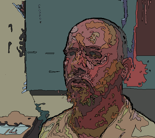
Kloxboy
(Jan 13, 2007)
```
Naima (Jan 13, 2007)
Nice structure, Klox ;) :-D. You know, I wonder if the "lighting" comments turn up so frequently because that's the thing that jumps out most strongly at people - maybe because it is something that lots of people have trouble getting to look right? Just a thought - I'm only a tyro dabbler on this site and in art in general, so that might be way off base :P~. Anyway, I love your stuff!
sweet_insanity (Jan 13, 2007)
i always like your use of color, and how you can see the "strokes" of the picture, it seems to flow and carries great texture.that and the interesting twisted features XD
davincipoppalag (Jan 13, 2007)
My turn.. I have to say some of us don't have much knowledge of art, and its terminology..so we say we like this or that about a particular picture just because that's all we know how to say. I like this too, I like the exaggerated features, and yes.. I like the light too.. You rock , Klox...ok I'm done too
marcello (Jan 14, 2007)
On the other hand klox, one could comment that lighting is the only thing that makes any picture good. if there were no light, the image would be blank. a lot of our understanding of shape, form, and texture is based on how light reflects off things. of course, if one were to make an image represent form, shape and texture without light (ie, just abstracting the physical feeling somehow), that would be a whole other animal (arguably modern/abstract art attempts to do this, though maybe not with the same intent).I think people like the fact that you tend to use more than one light source or have very little ambient light, giving your pictures a more dramatic feeling. Something that I think more people should try doing (self included). |

| ||||||||||||||||||||||
| |||||||||||||||||||||||
| 2draw.net © 2002-2025 2draw.net team/Cellosoft - copyright details - 2.92sec (sql: 37q/2.49sec) |