| |||||||||||||||||||||||
| Public Boards/Intermediate | |||||||||||||||||||||||
|
GundamWing
(Oct 7, 2005)
Something differnt |

| ||||||||||||||||||||||
|
TheCrimsonKing
(Oct 19, 2005)
With the economy so bad the UPS had to lay'em off.He modeled his sadness for me to paint.
somebody (Oct 21, 2005)
Holy cow. This is incredible. It almost looks like a watercolor or something. Excellent job
DarkCloak (Oct 21, 2005)
What can I say that hasn't already been said, other than, this kicks serious butt! :P
ambermac (Oct 23, 2005)
excellent!
Renuar (Oct 27, 2005)
Your good with the colour pallet, and yes, the drool is bigger than its apparent form. very nice. |

| ||||||||||||||||||||||
| Public Boards/Advanced | |||||||||||||||||||||||
|
davincipoppalag
(Oct 10, 2005)
From a picture I took on my last trip there.
davincipoppalag (Oct 16, 2005)
thanks Gigge!
darkshadow (Oct 18, 2005)
now i want to live here reallt likin that fince
HunterKiller_ (Oct 21, 2005)
It feels really fresh and clean. =]
Miss_DJ (Dec 10, 2005)
wow...so nice poppa. I adore lighthouses (we got married at one, ya know...Yaquina Head in Oregon) the fence is super! excellent job! I really like it. |

| ||||||||||||||||||||||
| Public Boards/Intermediate | |||||||||||||||||||||||
|
Rudeezy
(Oct 13, 2005)
i'm hungry.
hideyourface (Oct 13, 2005)
yeahh, blurring is bad in most cases.
HunterKiller_ (Oct 14, 2005)
Good to see new subject matter, and it sure is a good one. Food is great, especially potato chips.
JK-Arts (Oct 14, 2005)
Doritoes are better
featherstone (Oct 14, 2005)
I love food drawings :)Staci does them best. ya know what kinda chip is sooo yummy? onion & garlic chips mmmm |

| ||||||||||||||||||||||
|
anarie
(Aug 23, 2005)
The coloring's okay for Lasceaux, I guess, it's been sitting in my Studio for too long, and I'm lazy; so it's done. ><;;Enjoy. xD
HunterKiller_ (Aug 23, 2005)
Really nice folds you got there. Good work.
anarie (Aug 23, 2005)
Thanks, even if I think the folds leave much to be desired. XD
KaykuyoAkabane (Aug 30, 2005)
The clothes look SOO cool! The shirt gave you problems but I think it looks amazing! ^_^
DivineStar (Sep 30, 2005)
Wow....I love the shirt! even if it gives you probs.....especially if it gives you probs....fufufu...mwahahaha! >XD |

| ||||||||||||||||||||||
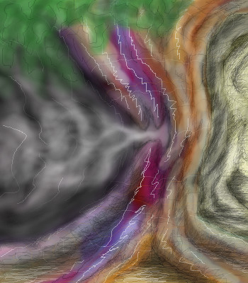
|
TaCO
(Sep 27, 2005)
Lets just call this done.
HunterKiller_ (Oct 2, 2005)
More space! The tree looks great but you've gotta get rid of those white lines, they throw the whole thing off. Maybe the leafs could be a little sharper. |
| ||||||||||||||||||||||
| Main Forums/Drawing Discussion | |||||||||||||||||||||||
 |
thug (Oct 12, 2005)
14 comments
|
||||||||||||||||||||||
| Public Boards/Intermediate | |||||||||||||||||||||||
|
Luka
(Oct 8, 2005)
..a wizard maybe; i don't know yet :)
DarkCloak (Oct 12, 2005)
It's looking good! I love how well you've blended the colors so far!
Luka (Oct 13, 2005)
Thanks guys! �there are some odd things in the pic(the hand is one of them :P ), but I wasn�t feeling very well and I just wanted this finished.
JK-Arts (Oct 13, 2005)
this looks alot like something youd see mid game like a game movie or something them spider webs look so real great over all shading.
HunterKiller_ (Oct 14, 2005)
Love the character. The subtle lines are a nice touch. |

| ||||||||||||||||||||||
|
Axil62
(Oct 12, 2005)
$12.63
DarkCloak (Oct 12, 2005)
This guy needs to see a doctor about his smoking problem. :PVery nicely done!
jayceepearl (Oct 12, 2005)
Wow. New quit date, Dec 1st. Just FYI
HunterKiller_ (Oct 14, 2005)
$12.63? Damn, i would buy it.
Axil62 (Oct 14, 2005)
Cool, thanks. |

| ||||||||||||||||||||||
|
hideyourface
(Oct 9, 2005)
you can almost see his wee wee.
22darkangel22 (Oct 11, 2005)
im disappointed as well that i cant see his wee wee...but wow.....just frickken smexy..
DarkCloak (Oct 11, 2005)
Nice! Perhaps it's just the colors you've used, but he looks rather menacing.
ambermac (Oct 12, 2005)
I'll take a half caff and a cranberry cornmeal scone, thanks. and can you warm it up a bit too? Thanks, darling.
HunterKiller_ (Oct 14, 2005)
lol @ feather and angel. *coughwhore*Just kidding. =P |

| ||||||||||||||||||||||
| |||||||||||||||||||||||
| 2draw.net © 2002-2025 2draw.net team/Cellosoft - copyright details - 2.92sec (sql: 36q/2.13sec) |
same here.
i spent most of the time on ver 3 trying to get the head to look right but the eyes are 4 pixs wide and im not use to drawing small detailed images, sleeping is good, the guy burning was a must :)
spiderman missed the ledge and died, yeah after i fin. pics i notice all the mistakes for some reason... i would fix but i hit limit, and i got bored with it thanks for the coments.
I've noticed the character's eyes are red. That and by the way he's running towards the enemy makes me think he's a cyborg of sorts. Am I right? :P