| |||||||||||||||||||||
| Public Boards/Advanced | |||||||||||||||||||||
|
Roytje
(May 24, 2012)
Passed all my exams. Time to draw here again :) |
| ||||||||||||||||||||
| Public Boards/Intermediate | |||||||||||||||||||||
|
Bobstained
(Apr 18, 2011)
Setting it to finished, then I have to finish it.
Suntan (Apr 24, 2011)
oh, good..yes, good to see.
shults (Mar 19, 2012)
version 2 is the best.
Dr.Moony (Mar 19, 2012)
I like how the pot explodes in version 9
The_Chosen (Apr 21, 2012)
I love this tea pot the texture is great. |

| ||||||||||||||||||||
|
shell
(Mar 17, 2012)
Imperfect (Apr 4, 2012)
Those skin tones. And her expression is so alive.
Pantera (Apr 5, 2012)
All of the above, really amazing work :)
elly (Apr 6, 2018)
I really love this portrait Shell did of me! It popped up on my Facebook from the original posting I shared 6 yrs ago and still, to this day, NO ONE has captured my likeness like Shell has here!! She is brilliant!!!
davincipoppalag (Apr 6, 2018)
she did great =0 |

| ||||||||||||||||||||
|
Black_Bird
(Mar 16, 2012)
Black_Bird (Mar 16, 2012)
A friend Dav. Thanks lori. I wish I had the persistance to keep working on it. The hand gave me a lot of grief.
Dr.Moony (Mar 16, 2012)
Squint your eyes when comparing it with the ref. That makes mistakes more obvious...and easier to fix.
cyclops (Mar 16, 2012)
decent.
Black_Bird (Mar 16, 2012)
Thanks I'll try that next time. |

| ||||||||||||||||||||
| Main Forums/The Post Board | |||||||||||||||||||||
 |
shell (Mar 12, 2012)
I only just recently stumbled upon a thread called "Faces to names" and got the idea to start drawing some of them. Unfortunately not everyone's picture was there and some links became broken with time. I encourage everyone to share their photo (so that I can draw it =u=) and if they have the time and feel like it, draw someone of their own. Cyclops, Black Bird and myself already broke the ice, hope it's contagious, let's put some portraits to the faces of 2draw >:3
20 comments
|
||||||||||||||||||||
| Public Boards/Intermediate | |||||||||||||||||||||
|
Axil62
(Jan 4, 2012)
Dr.Moony (Feb 17, 2012)
thanks for sharing them with us :) def looks different from what I expected.also found the chairs: http://2draw.net/view/59366/ http://2draw.net/view/59377/ http://2draw.net/view/66805/
Axil62 (Feb 17, 2012)
Here is one of the paintings of Orkdoop's that I love and want,but it's for sale in a tattoo shop right now.http://s699.photobucket.com/albums/vv352/Axil62/?action=view¤t=cid_604.jpg
davincipoppalag (Feb 18, 2012)
She's very talented.. I always liked this one http://2draw.net/view/84851/ and this onehttp://2draw.net/view/71468/
lori (Feb 18, 2012)
is that oil paint as well? I like it too. |

| ||||||||||||||||||||
|
elmenora
(Feb 12, 2012)
Herp derp, glow stuff. There's more to fix on this but I'm tired of looking at it :PAny advice or critique would be greatly appreciated. Thanks!
davincipoppalag (Feb 13, 2012)
I like your lighting
Dr.Moony (Feb 13, 2012)
I like that you seem to be thinking about how things are constructed in space and how they should be lit.It's not completely possible to discern between lit skin and glowing goo(though I would guess the ears are just lit). It seems like that dragon(?) just ate a mouthful of lava from of a pit that's underneath. The backlight doesn't completely make sense...some parts are more lit from the left and others more from the right. But I guess that's a minor problem if you chose a convincing color palette and construct things well through textures. I should also mention that the throat is pretty awkward. I know you wanted you bend the throat(neck) so that he looks up, but it end up looking like the head sits on the back of his neck. Illustration: http://i.imgur.com/6CCsf.jpg Also the eye could use some more definition...that's where a ton of people look, especially when it glows golden. I'm not sure if you were going for this so I mention it, the dragon looks like it's made of wax. Not that there's anything wrong with that but I assume you maybe wanted it to look more like reptile skin with scales. To spice up the composition I generally think it's good to make background, middle ground and foreground interact with each other/connect them. Keep it up, I dig your general approach. The bokeh effect around the little droplets is neat too. /critique |

| ||||||||||||||||||||
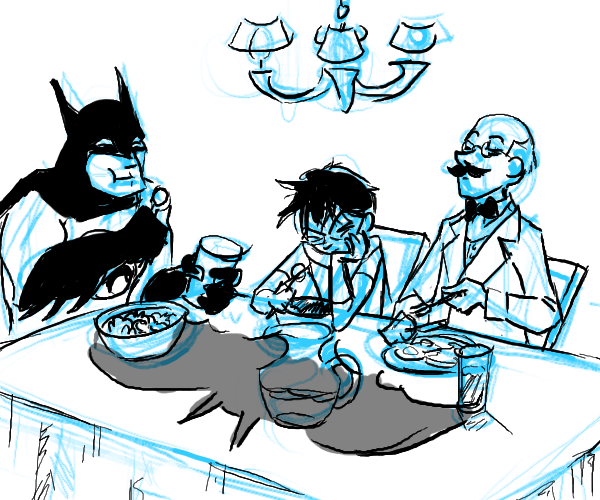
|
elmenora
(Jan 30, 2012)
lori (Jan 31, 2012)
great skills
enjoydotcom (Jan 31, 2012)
Although I'd love to see it colored, this way looks cool as well.
Dr.Moony (Feb 1, 2012)
Bat and breakfast amirite?
firecracker (Feb 3, 2012)
I am a fan of Batman....this is very cute! :) |
| ||||||||||||||||||||
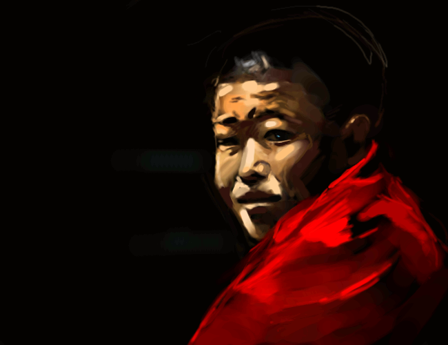
|
Roytje
(Nov 11, 2011)
lori (edited Nov 13, 2011)
this is cool with the blue light in the eyes... I really like that red on the forehead too... another great one - the colors you choose remind me of old Renaissance paintings which I really really like... like this one: http://www.art.com/asp/View_HighZoomResPop.asp?apn=12969680&imgloc=21-2129-Z00DEW4O.jpg&imgwidth=671&imgheight=894
itchymonkey (Nov 14, 2011)
yep
Mr_L_V (Nov 16, 2011)
Oh wow it does gives a beautiful resemblance on both drawings :DYour art skills are always stunning my friend XD
Imperfect (Nov 18, 2011)
I like her strong facial expression, how you used bold, defined colors to put the lit part of her face into focus. Amazing portrait, really |
| ||||||||||||||||||||
| Main Forums/Drawing Discussion | |||||||||||||||||||||
 |
shults (Nov 7, 2011)
So, I was painting a goldfish (using a ref) for its glass's reflections, and then I thought "axil's the only one I can think of right now that would do it justice".. and then I got to wonder, if there's "talent" for art, or is it just practice. Personally I don't feel I was born with a talent for art, but I see improvements as I practice. I realized the nativism vs. behaviorism question is old, but I want to look at it from a slightly different way. Talent can be viewed as the base level, wh...
7 comments
|
||||||||||||||||||||
| |||||||||||||||||||||
| 2draw.net © 2002-2024 2draw.net team/Cellosoft - copyright details - 1.16sec (sql: 39q/0.68sec) |
Loose and powerful strokes here.