| |||||||||||||
| Public Boards/Intermediate | |||||||||||||
|
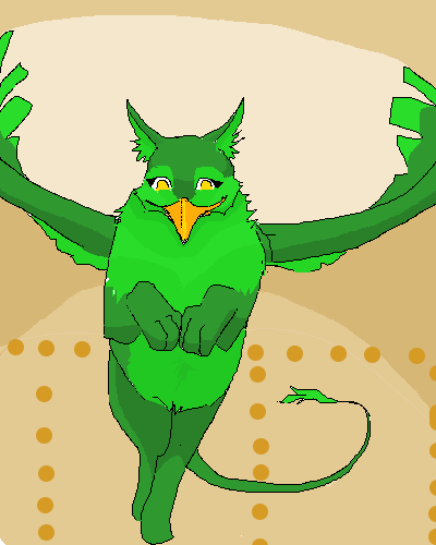
Destervetha
(Jun 18, 2004)
Desterenel, my Eyrie from Neopets. This'll go on my Pet's Page sooner or later. |
| ||||||||||||
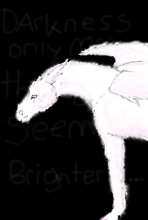
|
Destervetha
(Jun 16, 2004)
Where has his leg gone? ...Nobody knows... and YaY for horribly cleeshayed 'deep' phrases plastered on instead of backgrounds!...if you can read it.
DinoFlorist (Jun 16, 2004)
heh, thats funny about the background. It's true. You probably should have titled this "eye of the beholder" just to complete the effect. But I like your sense of humor.
SilhouettesOfDimension (Jun 17, 2004)
yup dinoflorist...everything should be called eye of the beholder. infact, i have 7 drawings named eye of the beholder. [oh and by the way, good drawing] |
| ||||||||||||
|
Destervetha
(May 11, 2004)
It's been like a year, but now I want to finish this luverly piece. Sooo...Wow! Sometimes I surprise even myself. Look at those scales!
Background suggestions? And I'm thinking of adding tack, any ideas as to what sort of halter I could draw on a dragon?
WOW the computer gave me a scare just now. I thought it would crash, and I would lose my drawing...
Gotta go
|

| ||||||||||||
|
Destervetha
(Jun 14, 2004)
Venting thru art! Y'know what's weird? When I'm happy, I draw horrible things, and when I'm sad, I draw happy things. Weird. Anyway, I was drawing this and decided for it to be Skan. Got around adding colors nicely. Skandranon and all related works and characters (C) Mercedes Lackey.Aaaayund blacked in, final outline. Imped in lion hindfeet in lieu of aquiline.
Skan if he hadn't dodged that Haighlei arrow :) Woops, forgot to dodge... The black lines would look better but I totally fubar'ed the layers tool >.<
Zack (Jun 15, 2004)
In terms of figure, this is pretty good. But the lineart leaves much to be desired. Try setting the 'antialias' checkbox in Lascaux on, that will help some. Try using different thicknesses of line as well. The shading here is not really shading at all; all it does is make the lines look blurry, so I actually prefer version 2 over 3. If you're going to shade something, pick out a direction for the light to be coming from, and use the shading to indicate it.
Destervetha (Sep 27, 2004)
Yes, I know all that, but it becomes moot when I CANNOT EVEN ERASE THE LINES >.< *anger at Lascaux* |

| ||||||||||||
|
Destervetha
(May 11, 2004)
Hey, remember those old iPod ads? Those nifty ones? We~ll...Just thought I'd just jump on that lovely, multicolored bandwagon... *sniff* iWant iPod... BTW that's my character, Destervetha, a gryphon--after my summer molt ;)
15grifficorntears (May 11, 2004)
thats cool. you deserve a trophy
Ixbalam (May 12, 2004)
Cute griffin. It kind of reminds me of this picture:http://vcl.ctrl-c.liu.se/vcl/Artists/Spiritfeatherpony/idigaponie.jpg There was a run on iPod pictures on VCL and Yerf for a while until everyone got tired of them. Some of the most creative ones came from artists who didn't even know about the bandwagon. My favorite was one posted on Guppy's board, bluefurry.com, of three dolphins with iPods titled 'iPod'. Get it? =^.^=
fleeting_memory (May 13, 2004)
LMAO! This is awsome-they should make an add outa this-like-iPod, its not just for humans anymoreNew me!
|

| ||||||||||||
| Public Boards/Beginner | |||||||||||||
|
Destervetha
(Mar 12, 2004)
I'm just keeping this because it's my very first 2Draw work ever, and I like the chunkiness.
DinoFlorist (Mar 12, 2004)
thats actually a very good picture despite its simplicity. It's very expressive and it uses the canvas well.
davincipoppalag (Mar 12, 2004)
this is a first picture??? You better do some more then...this is great for a first pic! (Its better than some who do it all the time...)
__your_face__ (May 4, 2004)
The sad part is, she drew this in about 5 minutes while Kyle (in back) was doing her hair and putting make-up on her while I sat there laughing... very good, Sonders.
TheMage (Sep 6, 2004)
That actually looks like you, seriously. I hate you, you have talent. |

| ||||||||||||
| Public Boards/Intermediate | |||||||||||||
|
Destervetha
(Apr 19, 2004)
Scales...Aaah...*dizzy* Oh, my aching wrist... Thanx __your_face__ for helpful tips!
ChibiMidori13 (Apr 19, 2004)
Nice! Looks kinda like Spyro the dragon from that Playstation game though XDShould I add yellow stripes on the wings? Coming in from the outside edge and stopping about halfway? I can't decide.
5i/\/\pl3 84c|<gr0|_| /\/d 5ugg357io/\/5? 4/\/d d035 4/\/y80dy 5p34|< /\/\y d3y34l3ct? (Simple background suggestions? And does anybody speak my dialect?)
mooseflower (May 4, 2004)
I like purple, I like dragons, I love this! For background suggustions, maybe a castle tower, a cliff, a mountain, a bunch of knights strung up by their toes...? (I could read the dialect thing, but I can't write it or speak it) |

| ||||||||||||
| Public Boards/Beginner | |||||||||||||
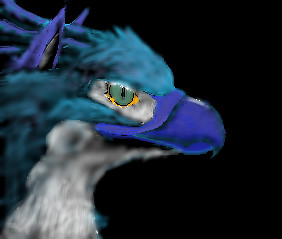
|
Destervetha
(Apr 29, 2004)
Yay~! I love gryphons! Gryphongryphongryphon~! Anyways, this will be my user Icon when/if I figure out how to put things there. Edit: It's blurry bcs it was going to be a user icon. It didn't work out too well ;_; but I'm to lazy to change it right now.
__your_face__ (Apr 30, 2004)
I loooove it but it needs a backround. If you won't listen to me in real life, maybe you will over the internet! I especially like the parts that were my idea :)
Callypso (Apr 30, 2004)
i luv it!! the detail is awesome ^_^, i agree with the background though, it would make the pic look more complete....good job!! The new me! Yes, the old one was drawn better, soon to come, a really realistic (for me) one!
TheMage (Aug 24, 2004)
Merg! I lurve it, except it needs a better defined endge, less blurry. Lurve the colors, though... |
| ||||||||||||
| |||||||||||||
| 2draw.net © 2002-2025 2draw.net team/Cellosoft - copyright details - 1.27sec (sql: 34q/0.75sec) |
drawn in 30 min