| |||||||||||||||||||||||
| Public Boards/Beginner | |||||||||||||||||||||||
|
Deja Vu Pic
Cordelia_Pink
(Oct 30, 2004)
For some odd reason it wouldn't let me upload the image when I revised it. Here's the first version:Flower For You.
Cordelia_Pink (edited Oct 31, 2004)
No, guys, it didn't take me 40 secs. (The stupid thing got messed up!!!!!!!!) In fact, it took me like an hour and a half. lol I revised this image but it didn't let me upload. So I opened a new applet and then it let me opened the temporary image which was the revised image of my last picture (if you take a look at my gallery in the 3rd quarter. It's called "Flower 4 U" <--this also took me more than an hour so altogether this picture was done more than 2 hours lol. This is the revised image. I hope the mods won't complain. I'm not cheating! It was the only way that works. (I clicked upload twice but then right after it was loading, it showed up something else and then I clicked yes and it didn't do anything after that. I don't get it!!!) So yeah people. Don't be fooled by the duration. lol like I could do this in 40 secs. Magic trick, yes. lol
Anna (Oct 31, 2004)
aww it's purdy, Cordelia. I like your use of color. It's always bright and captures attention.
Asridaein (Nov 3, 2004)
I love the bubbles. BUBBLES BUBBLES BUBBLES! MY bubbles!
Cordelia_Pink (Nov 4, 2004)
lol @ Asridaein. Hmm... I think that came from Finding Nemo. The yellow fish lol. Oh and thanks. =) I love bubbles too. =) |

| ||||||||||||||||||||||
| Public Boards/Intermediate | |||||||||||||||||||||||
|
Urei-sama
(Oct 26, 2004)
So thats where babies come from...
Cordelia_Pink (Oct 31, 2004)
Whoa this is a bit surreal. Nice work.
oikitsumaru (Nov 2, 2004)
huh. what an interesting and very deviating from the norm type of piece. I love it!
TaCO (Nov 18, 2004)
I like when trees eat people.
Koneko-sama (Dec 22, 2004)
I just realized there's a face in the tree! |

| ||||||||||||||||||||||
| Information/Site Updates | |||||||||||||||||||||||
 |
marcello (edited Aug 31, 2003)
Finally, a new version of lascaux sketch, mainly bug fixes. The experimental antialiasing code isn't in this version since it's currently worse than the existing code. New in v0.672: + Fixed bug in tablet pressure opacity never reaching full 100% opacity with solid brushes. + Experimenting with new anti-aliasing code. + Fixed bug where the verifying window doesn't close. + Fixed bug where the verifying window can appear on top of submit success message. + Possible fix for Mac OS X sucki...
21 comments
|
||||||||||||||||||||||
| Public Boards/Intermediate | |||||||||||||||||||||||
|
Cordelia_Pink
(Oct 21, 2004)
Ugh... he looks blech... it does not look like him but whatever...
LEELEE (Nov 9, 2004)
got your memo cordelia. I was so glad to see i was right. I just couldn't see ben in this pic. ( no offence to those who did) but like I said before nice job regardles. PS. i'll be waiting for you after school.....bring it on....lol once again Nice work!He looks dead, eh? Blah... I don't know why I used blue green for the top layer...
spiritdweller (Dec 4, 2004)
nice nice work
pulmonq2 (Dec 16, 2004)
I'm not sure why you put brigh orange on his face... it looks like this long sideburn creeping down his face. I can honestly say I prefer how he looked in version 3. But the new things in the picture really improve and make it start to look complete...that extra wisp of cloud... the plants... and I see your obsession with circles continues, is that like, some sort of motif you're trying to maintain or what? Oh, and the reflection in the water is nice, while the rest of it is still very incomplete-looking. |

| ||||||||||||||||||||||
|
AnimeShawn
(Mar 24, 2004)
just something
marcello (Mar 25, 2004)
sorry, but I Just have to, after reading two-na's commentholy crap. lions!
lp_phaery (Mar 25, 2004)
I usually comment on cutesy pictures but this one really caught my attention. Also usually I say how cute it is but I dont think thats an appropriate word for this so I got to think of a new one.... Its awe-inspiring! (I looked the word up '_')
dijum (Oct 22, 2004)
whoa! that is cool!
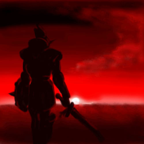
Cordelia_Pink (Oct 22, 2004)
oooh this is a really pretty red. I like it. Very rich. And red. The sky is red. (question is: why is the sky red? well, not all skies are blue. True? Yes. Looks like it took place in Mars. lol) And the figure looks cool. Very mysterious. This is great. |
| ||||||||||||||||||||||
|
Goatlord
(Oct 18, 2004)
Just decided to make my own 2draw logo. Keep checking back, I'm not quite finished!
Fin_beast (Oct 18, 2004)
lol. Totally goth blood fists.Really nice, although that 'D' looks a bit like a 'b' to me. :sDone.
Xodiak (Oct 20, 2004)
Haha, that looks very great. Awesome letter design and great effects. You should create a font of your own! >;D|XOD|
Cordelia_Pink (Oct 20, 2004)
This is great! This reminds me of those glowing fonts in flamingtext.com. |

| ||||||||||||||||||||||
|
Cordelia_Pink
(Sep 27, 2004)
It's growing out of the ground!! And it's a hand...? Yeah, I'll try and fix it up a little bit more. Ughhh!!! Why??!? Why?!?!? This had to happen. The more recent version didn't go through!! >.< Well, good thing I did Printscreen and pasted the picture in Paint. Here's what it looks like: Grown Hand Version 3. OK, seriously, something went wrong. It didn't let me upload... again. *sigh* here's the other version:Grown Hand Version 4
sincity (Oct 17, 2004)
This looks great! I actually like it better than the other one.
Xodiak (Nov 19, 2004)
Awesome, a hand made of a tree... Like an earth or nature spirit. Very nice, you have a great imagination! <:D|XOD|
laurael (Jan 8, 2005)
What an awesome pic! Great lines and nails on that hand. :)hmmmm too morbid
|

| ||||||||||||||||||||||
| Main Forums/2draw.net | |||||||||||||||||||||||
 |
Porcelain (Jun 4, 2004)
Eh.. I haven't been on 2draw for a while now, but I've been browsing through all of the boards, and.. It seems that the intermediate board is turning into a beginners board. Not only that, but the Advanced is moving on towards Intermediate. O_o We have seperate categories for a reason. I'm sure the mods (or some of them at least) know what I'm talking about. It doesn't hurt to move a few drawings around and tell people that they need more practice. Maybe we should make a test-drawing board? F...
35 comments
|
||||||||||||||||||||||
| Public Boards/Intermediate | |||||||||||||||||||||||
|
DireOnion
(Oct 5, 2004)
I don't like dragons but I made one anyway.
iloverain (Oct 5, 2004)
o___O Dragons are mythical creatures, then can look how the creator pleases. There is no 1-800 number for the set standard of drawing dragons. I think it's very orignal =D GW
davincipoppalag (Oct 5, 2004)
I like it too. Who says a dragon has to look like a stylized dinosaur.
DireOnion (Oct 5, 2004)
Cordelia: I think it's eyes are supposed to be the two white dots.This was inspired by the dragons from Panzer Dragoon.
Gigge (edited Oct 6, 2004)
I like the dragon. Reminds me of a stylized sea dragon. |

| ||||||||||||||||||||||
|
Shelonian
(Oct 4, 2004)
Rest in peace, bro
davincipoppalag (Oct 5, 2004)
Very pretty drawing. I don't know who it is in remembrance of , but I'm sorry you lost him.
Cordelia_Pink (Oct 5, 2004)
This is great. How very red. 'Tis bittersweet.
spiritdweller (Oct 5, 2004)
a beautiful rose.. nice job
Aubrey (Oct 5, 2004)
Yeah this is really pretty. Sorry bout your loss too. |

| ||||||||||||||||||||||
| |||||||||||||||||||||||
| 2draw.net © 2002-2025 2draw.net team/Cellosoft - copyright details - 1.04sec (sql: 36q/0.63sec) |