| |||||||||
| Public Boards/Beginner | |||||||||
|
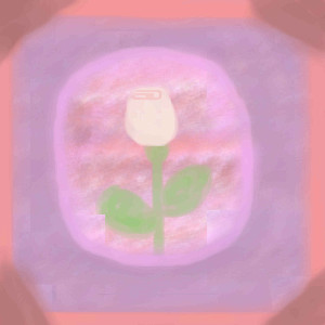
White Rose
Traaleeah
(Jun 5, 2004)
This drawing isn't very good. I drew on similar to it, sunbmitted it, but when I tried to see if anyone had posted any comments, it wasn't there. so I checked in my gallery and it wasn't there either. It was very odd....Well anyway, if you have any tips on how to make it look more realistic or just better in any way, I would really appreciate it!!!
E-cho_veggies (Jun 5, 2004)
Make the rose stand out more. Like make it deeper colors. I dunno thats just my opinion
Traaleeah (Jun 5, 2004)
Well E-cho, I would try that, but the problem is, I don't think there are deeper colors-at least not on the Oekaki Shi-painter. All of the colors are sort of light and pastely. But I don't know that for a fact. As you all can tell I'm new at this, so correct me if I'm wrong please! :)
BlueDreamer (Jun 6, 2004)
But you see Traah, If you use the color shader thing at the top of the painter, maybe you can find a darker color.
Traaleeah (Jun 6, 2004)
Oh, I see. Well thank you Bluedreamer! I will try that. |
| ||||||||
|
linwe
(Jun 5, 2004)
Well since I am a new artist I would like any suggestions on how I can get better. Thanks!
Thear (Jun 5, 2004)
ahh...is this sunset or sunrise? =P hmm.. mby u shoud make that sky color more...hmm...what's that word...(sorry my bad english)..make it so that there woudn't be those white spots...
E-cho_veggies (Jun 5, 2004)
I like it. It looks like colored pencil. Very cool
Traaleeah (Jun 5, 2004)
Its very pretty. I agree with Thear though. It might look better if the sky had less white. But it still looks good!!!
BlueDreamer (edited Jun 6, 2004)
I think what Thear's trying to say is, make the sky a little bit more bold. Or, maybe smooth it out so the color looks consistant. example: You know when you're bored and start drawing with your little sister's crayons, and you notice that there are white spots where the crayon left off, it's kind of like that. But other than that, It's very pretty. |

| ||||||||
|
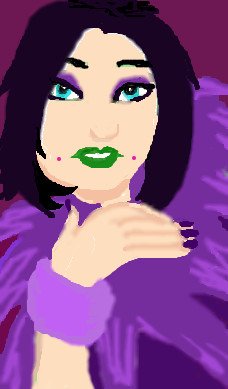
BlueDreamer
(Jun 5, 2004)
Well, Any suggestions would be appreciated!
E-cho_veggies (Jun 5, 2004)
So far so good!
emmamommalag (Jun 5, 2004)
Love the purple boa.
Shmoopy (Jun 5, 2004)
Maybe make the hand less blurred... I dunno. Looks pretty cool to me.
BlueDreamer (edited Jun 6, 2004)
Yah I agree with you about the hand being less blurred. Thankyou! |
| ||||||||
| Public Boards/Intermediate | |||||||||
|
DarkHorses
(Jun 5, 2004)
It started out as Gwenyth Paltrow, but right from the start......i couldnt do it, So, its just a face
davincipoppalag (Jun 5, 2004)
It's nice..but once again, I would like it sharpened up on the edges.. the sweater is blurry as is the left side of the face. It's a nice draw though
Thear (Jun 5, 2004)
Shadings is much berrer now! ^^
emmamommalag (Jun 5, 2004)
A very pretty face it is. Wish I could do hair that well.
longway (Jun 5, 2004)
very nice, love the expression... |

| ||||||||
|
longway
(Jun 4, 2004)
just tryin the applet.
Pandora (Jun 5, 2004)
Something about red hair appeals to me..hehe glad you tested the applet first. Her eyes are really pretty.
BlueDreamer (Jun 5, 2004)
Her Eyes are very enchanting and have a good contrast to the color of her hair.
davincipoppalag (Jun 5, 2004)
You choose the most beautiful eye colors.. I don't like this applet either, but mostly because I can't remember where everything is.. (I do like that watercolor tool though)
emmamommalag (Jun 5, 2004)
Ditto to what everyone said about the eyes. Talk about flaming red hair! Wow! :) |

| ||||||||
| Public Boards/Beginner | |||||||||
|
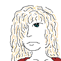
linwe
(Jun 3, 2004)
It is just a drawing of a person
BlueDreamer (Jun 4, 2004)
Hey! I'm a school budy and I think that you did good! for first time, it's really neat. What I would do is to make her hair have more depth, but overall, good JOB!!!
Traaleeah (Jun 4, 2004)
This drawing is really cool! She looks...I dunno...sad! No offense though! ;) |
| ||||||||
|
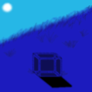
Linwe_lover_1990
(Jun 3, 2004)
Its a little Blue box. Kinda boring to most people probably.
davincipoppalag (Jun 4, 2004)
I think it's mysterious.. I would like the bg a bit sharper especially the grass on the knoll.. but I like this
ILoveKenshin (Jun 4, 2004)
I like this picture, it's cool how you made blue the main color. I also like how it's kind of foggy... '~:Kaoru:~'
BlueDreamer (Jun 4, 2004)
Me again. So, I think this really nice. I love the hill, the hazy look really pulls it off.
Traaleeah (Jun 4, 2004)
This looks really cool. Good job! |
| ||||||||
| Public Boards/Intermediate | |||||||||
|
flapjack
(Feb 5, 2004)
unsure if this merits advanced
BlueDreamer (edited Feb 17, 2004)
She has a very sweet face. Very detailed, but her dress shouldn't be so bold looking on her skin. You have 2 different textures put on to one painting.
Gigandas (Feb 17, 2004)
It looks nice overall, but seems to have the bubbly look on the face.Maybe you could tone it down more...?I like how you aren't afraid to mix unusual colors into the drawing.
tivatdoar (edited May 12, 2004)
I love this draw!loved the skin on the chest. loved the hair blowing in wind, the eyes and lips.
LovelyLori (May 14, 2004)
omg.. that's SO pretty! it merits advanced in my book... |

| ||||||||
| |||||||||
| 2draw.net © 2002-2025 2draw.net team/Cellosoft - copyright details - 0.25sec (sql: 28q/0.05sec) |