| |||||||||||||||||||||
| Public Boards/Intermediate | |||||||||||||||||||||
|
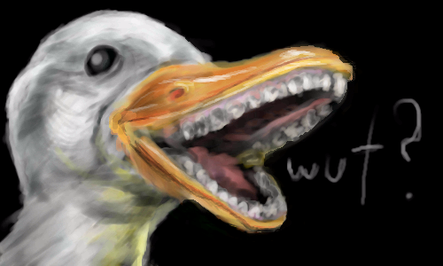
Goose :3
NishizonoTetora
(Jun 5, 2009)
Black_Bird (Jun 5, 2009)
rofl love it!
firecracker (Jun 5, 2009)
That's the funniest lookin' goose that I ever saw...."lol"!! Very cute draw.....:D
NishizonoTetora (Jul 16, 2009)
thnx :3
SaiWataki (Jul 27, 2009)
When Im playing duck duck goose with that, Its never gonna be the goose. |
| ||||||||||||||||||||
| Public Boards/Beginner | |||||||||||||||||||||
|
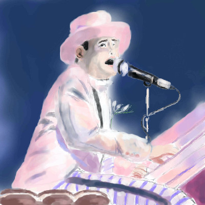
Black_Bird
(Jun 5, 2009)
Don't wish it awayDon't look at it like it's forever Between you and me I could honestly say That things can only get better And while I'm away Dust out the demons inside And it won't be long before you and me run To the place in our hearts where we hide And I guess that's why they call it the blues Time on my hands could be time spent with you Laughing like children, living like lovers Rolling like thunder under the covers And I guess that's why they call it the blues Just stare into space Picture my face in your hands Live for each second without hesitation And never forget I'm your man Wait on me girl Cry in the night if it helps But more than ever I simply love you More than I love life itself
firecracker (Jun 5, 2009)
Very nice draw, and very nice song also......:)
kupocoffee (Jun 5, 2009)
this picture has great emotion!
Miss_DJ (Jun 5, 2009)
Great song and I love the pic, but he's so 'known' for his big glasses, I was surprised not to see them.
Black_Bird (Jun 5, 2009)
Thanks everyone. :) I really appreciate it. Glad you like it.Miss DJ: Yeah me too, the ref photo I used didn't actually have him wearing them. Oh well! |
| ||||||||||||||||||||
|
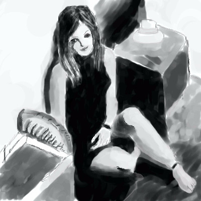
Black_Bird
(Jun 4, 2009)
QTgillie (Jun 4, 2009)
great angle and compositions, I like how undefined much of it is.
firecracker (Jun 4, 2009)
Very nice......I like it. :)
noonelikeyou (Jun 4, 2009)
Wonderful drawing, very impressive. I like it~
Black_Bird (Jun 5, 2009)
Thank you everyone. :) |
| ||||||||||||||||||||
|
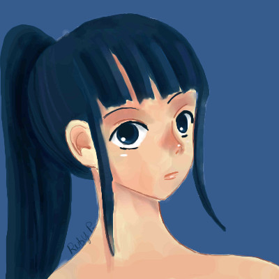
kupocoffee
(Jun 3, 2009)
I really want to improve.
Black_Bird (edited Jun 3, 2009)
Keep drawing. :) Look up Oekaki tutorials etc too if you feel the need....Eventually your drawings will evolve from one another and you'll come up with all sorts of different ideas and techniques. For instance, I started doing Oekaki back around 2005 on TACo and it was mostly anime. Now it has changed to other disciplines also. |
| ||||||||||||||||||||
|
boogilibaby
(Jun 3, 2009)
I just got this pic from my mind...
backmagicwoman (edited Jun 7, 2009)
Yeah..and what makes it so bad is that this person knew this work wasn't advanced when they posted it here....most of the artists here put so much effort into their work that it really makes me angry when someone does something like this..calls it advanced..and then can't understand why people get pissed that they put it here and then come up with some lame assed excuse of why they did it....most of the work I see on beginners board is way better than this...and if it was there it would still push down great works...I know I'm being really pissy today but it makes me mad...I just wish people would have enough consideration for the hard working artists here not to post their crap and push off artists that are way more deserving... So in closing..I would like to say... Put your crap where it belongs ..or better yet put some damned effort ito your work before you post it...and if there are any ramifications to this rant of mine..then so be it.... And I just want to say to all the people here that I really am sorry I have not been commenting on all the great art I've been seeing lately..but I really don't feel well at all lately...so I am sorry...but everyone is doing good work right now..with the exception of this picture...So this will be a catch all comment for all you woderful artists..love you guys and keep up the wonderful work...
vlad.the.hamster (Jun 7, 2009)
Seriously, at least 90% of the beginner board is better than this.
firecracker (Jun 7, 2009)
I'm wondering if anybody knows how to move a draw from advance boards to "Intermediate. I'm working on a draw, and I needed a wide board for this draw, so that's why it's here in advance. Right now it's in the "unfinished hidden" department......and I read where it says that entries can be moved if they're in the unfinished hidden stage. This draw that I'm working on is pretty, and I like it.....but it's not "advance" quality. I'd like to move it to "intermediate" before I post it. Does anyone know how to do that?
marcello (Jun 7, 2009)
firecracker: you cannot move it if it is too big for the given board. you'll just have to make it advanced quality. stop trying to cheat the system. =P |

| ||||||||||||||||||||
| Public Boards/Intermediate | |||||||||||||||||||||
|
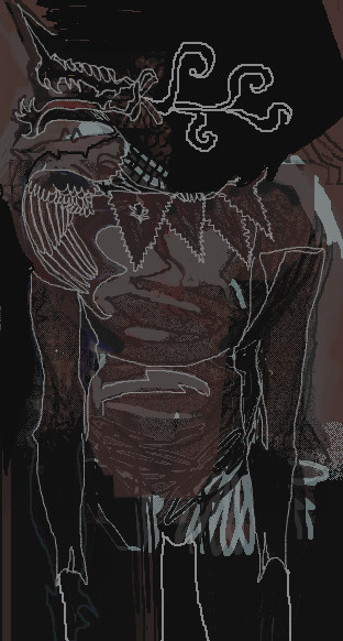
saprophilous
(Jun 3, 2009)
messin around he looks moer woven nowz
brenndurdrykkur (Jun 10, 2009)
this is great
bette_davis_eyes (Jun 10, 2009)
looks pretty cool for messin around :p
vlad.the.hamster (Jun 10, 2009)
my first thought was something egyptian until I saw the title. Pretty cool looking, I have to agree. |
| ||||||||||||||||||||
|
artistforrent
(May 29, 2009)
sketch and flats, another painting experiment. I really want to get away from my dependence on line art.EDIT: Cleaned up the flats, colors. Crits and comments always welcome. :) EDIT 2: did most of the shading, almost finished. I'm at a loss for a BG. >> Suggestions are welcome! :D EDIT 3: I'm done with this pic. Was a lot of fun, learned a lot! Crits and comments honored. <3
Miss_DJ (Jun 2, 2009)
there's a ton of stuff I like about this drawing...the placement of the people, the highlights/shadows... they remind me of the type of cartoons I watched a long time ago. The one thing that bothers me is his nose.
firecracker (Jun 3, 2009)
I think the finished picture looks awesome! I like the way you did this, and I love the colors, and the way you blended and highlighted everything. You didn't use any textures....and the pic looks awesome. Great draw. :)
artistforrent (Jun 3, 2009)
Miss_DJ: I totally agree! I hate his nose.....firecracker: awww, thank you honey! *hug*
backmagicwoman (edited Jun 3, 2009)
Beautirful in every aspect...I particularly love the way you do lips...something about your work seems very familiar to me...:) |

| ||||||||||||||||||||
| Public Boards/Advanced | |||||||||||||||||||||
|
jekyll
(May 26, 2009)
Well, it's done! Bones and all!
Moosh (Jun 13, 2009)
Hot damn! That's completely awesome.
Aubrey (Jun 13, 2009)
That really is an old beauty! Older cars are the best. So much class and refinement and hardly any of them looked the same. Now they all come prepackaged with about as much imagination as you'll find in a cookie cutter. Great job, and great taste!
QTgillie (Jul 16, 2009)
Well, I guess it turned out ok after all, wasn't sure it would in your earlier versions........NOT. As expected, just stunning. The reflections on the car are to die for, esp. the cobble stone. Not sure I like the make-up either. But otherwais........................wow wow owowowowowowoweeeeeeeeeeeeeee!!!
DinoFlorist (Nov 15, 2009)
it looks realer than real |

| ||||||||||||||||||||
| Public Boards/Intermediate | |||||||||||||||||||||
|
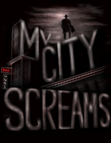
firecracker
(Jun 1, 2009)
I never saw this movie.....but I liked the "ref" pic....so I tried drawing it. Well....I really messed up the lettering.....I couldn't get it right, so I got "fed up" with this "pic", and I decided to "texturize" all the lettering...."lol"!!! I could've done a better job with the lettering if I had a tablet.....I had to draw these letters with my mouse.....and chibi paint doesn't have a "text" tool for lettering. :( I'm posting this as "finished".......I'm too tired to do any more to it.
artistforrent (Jun 2, 2009)
firecracker, this looks awesome! I think this is the best use of texture I've seen you come up with. I think it would be even more effective if you removed the texture from around The Spirit; it would add a lot of drama and contrast to this already moody scene. Have a great night!
firecracker (edited Jun 2, 2009)
Hi "Artistforrrent"......Thanks for your nice comment and suggestion......I'm glad you you think I did ok with the textures in this "pic"....I thought I might've "over done" it. That sounds like a good suggestion....about removing the textures around "The Spirit"......I'll try experimenting with it, and see how it looks....if I mess things up, and it doesn't look good.....I'll keep it the way it is...."lol". But I'm gonna give it a try... Thanks for commenting....I appreciate it. :) Well.....I removed most of the texture around "The Spirit"....and left a teeny bit of glow around his head. I do like it better this way.....it does add to the dark moodiness of the "pic". Thank you very much for your suggestion.....I do appreciate it, and I'm happy with the change. :)
xsi639 (Jun 9, 2009)
i joust can t take my eyes of it*.*
firecracker (Jun 9, 2009)
"LOL"!!! Thanks for commenting "xsi"!! :) |
| ||||||||||||||||||||
| Public Boards/Advanced | |||||||||||||||||||||
|
QTgillie
(May 31, 2009)
Photo from DA
bette_davis_eyes (Jun 5, 2009)
I love this one of yours QT.. it turned out so beautifully!
Miss_DJ (Jun 5, 2009)
This is lovely Qt! The ref pic itself seems odd to me on the fox's right front side. Your pic is beautiful! Well done!
riccir (Jun 8, 2009)
wow this is so beautiful done!! i am sorry i didnt comment earlier i come here from time to time..speechless.and thank you for the advice i think i fixed the problem
GreyGhost (Jun 24, 2009)
The critter is gorgeous, of course, but I am mesmerized by that snow! |

| ||||||||||||||||||||
| |||||||||||||||||||||
| 2draw.net © 2002-2025 2draw.net team/Cellosoft - copyright details - 0.60sec (sql: 38q/0.26sec) |