| |||||||||||||||||||||||
| Public Boards/Beginner | |||||||||||||||||||||||
|
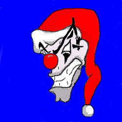
merry christmas
elliott
(Dec 6, 2004)
santa
canibal_misfits (Dec 9, 2004)
jealous lmao! falls over in pain beacuse the laughter is takin over!
Asridaein (Dec 9, 2004)
I always secretly thought that Santa had an evil brother, maybe it was actually a multiple personality of his. Nice job so far.
me007 (Dec 9, 2004)
mmm looks like the people that work at our mall :P nice picture, I wasnt sure about it at first, but it turned out really well
elliott (Dec 9, 2004)
thanks,i wouldn't wanna go shoppin at ur mall |
| ||||||||||||||||||||||
|
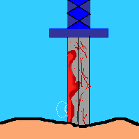
BADICAPO
(Nov 30, 2004)
This is the first time I used blood in my art.
friend (Nov 30, 2004)
sweet pretty aweesome! i like the handle design.
Asridaein (Nov 30, 2004)
I think that if you made the blood darker and make it look kind of shiny, it would look more realistic. The sword is a great start. If you had some highlites of lighter gray or if you just change the opacity of the gray you have to make the highlites it would look real. |
| ||||||||||||||||||||||
|
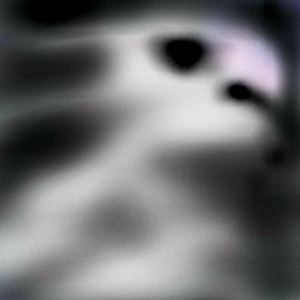
e_l
(Dec 7, 2004)
jnaaa...
Asridaein (Dec 8, 2004)
I don't know exactly what you meant this to be, but its very interesting. I can kind of see a parrot's head in this. You did a wonderful job on doing the different gradients in this. this is superb. |
| ||||||||||||||||||||||
|
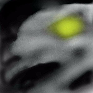
e_l
(Dec 7, 2004)
silver chiken
Asridaein (Dec 8, 2004)
Looks kind of like its a chicken spook, ya' know a chicken's ghost. It probably haunts the farmer that wrung its neck all those years ago. this is very well done with the gradients and the way you used tenebrisom. (I think that's how you spell it). |
| ||||||||||||||||||||||
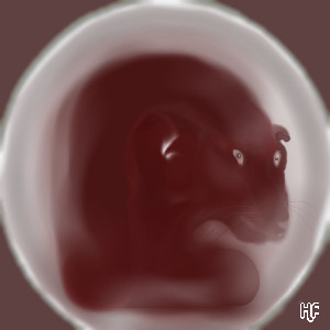
|
Pantera
(Dec 7, 2004)
Here kitty kitty :)
Asridaein (Dec 8, 2004)
its not the head, its the eyes. they need to be more on the sides of the head. Other than that, this is very well done. I love how you shaded the graya nd white and made the shine on the rounded rim of the plate. Wonderful job pantera.
sincity (edited Dec 8, 2004)
The concept is cool. I think for the idea, this came out great, If you wanted this to bo more real looking, then yes, I believe Davi's & Asridian's comments are big helps, but I like the idea,and it don't need to be dead on. Stylized work. :}Funny you did this, I was looking up Pantera just last night on google, right before I went to bed.
davincipoppalag (Dec 8, 2004)
Asridaein is correct! It is the eyes..they just need to be moved down and a bit further apart.. (neck is still too full though) good catch Asrid
Pantera (edited Dec 8, 2004)
Thank you guys very much, very good ideas, this is a kind of distorted painting done on purpose, I see the point about the eyes and neck, if I still have space I will try to change them a little, thank you all :)Edit - Well no more space, I will leave it like this for now, I may ask one of the mods for more another time. |
| ||||||||||||||||||||||
|
Cordelia_Pink
(Dec 7, 2004)
Another Sailormoon pic... I miss Sailormoon. =) This is her with wings... sorta.
sincity (Dec 7, 2004)
Sheesh, how good did this come out. I know some people have read that I am a little sick of seeing animae work, but I still have to give shouts out to good work. Great jobbers.:}
Asridaein (Dec 8, 2004)
This is wonderful. Now I am jealous of you. Gosh darn, I guess I'll have to get to practicing more on the boards so I can get better at different techniques.
pulmonq2 (Dec 8, 2004)
looks ok. not bad.
Solvera (Dec 10, 2004)
lol looks ok? not bad? what are you talking about this is freakin awesome. great job! |

| ||||||||||||||||||||||
|
VB
(Dec 7, 2004)
bbbrrr! it's freaking cold! haha :P
quintessence (Dec 8, 2004)
Whoaah, that is some aquiline nose. Nifty; I like it.
Asridaein (Dec 8, 2004)
I agree, it is really cold. Especially here in missouri during the early morning. This morning it was 33, brr. I'm glad it warmed up since then.
sincity (Dec 8, 2004)
OI! Some mints are needed here! Cute pic mon. :} |

| ||||||||||||||||||||||
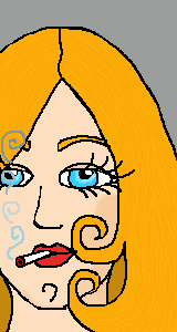
|
Asridaein
(Dec 7, 2004)
What a nasty habit. I mean it may look kind of cool, but in the long run it'll ruin your health.I didn't notice the red around the eye until a second ago, so I had to fix that.
davincipoppalag (Dec 7, 2004)
yea,,damned things are more addictive than heroin.. lights up... um wouldn't she like this butt better if she didnt have the filter end burning and the tobacco end in her mouth?
Asridaein (Dec 8, 2004)
yeah I noticed that last night after I edited the red part out of her face, I was kind of mad that I didn't realize that sooner. Anways, I am planning on fixing that. Thanks for pointing it out and your comment. :)
davincipoppalag (Dec 8, 2004)
She looks happier now.. |
| ||||||||||||||||||||||
|
staci
(Dec 7, 2004)
yeah
mukumuku (Dec 7, 2004)
thats a really cool effect! i love the coloring and the depth. your so mad skilled..my doodles always turn out to be demented stick figures x3
CzenziSnow (Dec 7, 2004)
This totally owns, I love it.
Asridaein (Dec 7, 2004)
This looks good for a doodle. The postion on the page gives the observer an interesting perception, i like this a lot.
sincity (Dec 8, 2004)
Oh Yeah, I like this alot. Love greatexpressive sketch work. |

| ||||||||||||||||||||||
|
Dagan
(Dec 1, 2004)
practice... playing around with the applet.
Dagan (Dec 3, 2004)
what's the differnce between gooey and slimey?I guess it looks better now...
StrawberryYamichan (Dec 7, 2004)
yay its better now
Asridaein (Dec 7, 2004)
Gooey is something that sticks to you, slimey is stuff that gets on you and feels like rotten bananas and most of it slides off. To me this like polymer clay. I like it so far. |
| ||||||||||||||||||||||
| |||||||||||||||||||||||
| 2draw.net © 2002-2026 2draw.net team/Cellosoft - copyright details - 1.24sec (sql: 35q/0.35sec) |