| |||||||||||||||||||||||
|
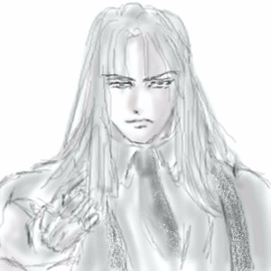
Shisei no Koe-ish Tattoos
Mafuyu
(Oct 30, 2005)
Enh, 'twas fun.
IamaCunt (Oct 31, 2005)
Yeah, that is some nice body ink :) mon
BlackRoseNL (Oct 31, 2005)
wow, great! It really looks like a tattoo. I love the hair, also ^^
Nyuusen (Nov 20, 2005)
Personally, I still liked FF2 better. ^_~ You did a good job on the tattoo. |

| ||||||||||||||||||||||
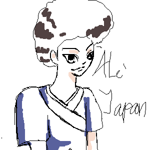
|
manadom_hearts
(Oct 30, 2005)
ff7 AC yazoo^-^
Maiko (Oct 30, 2005)
Yaaay Yazuu~! <3Very nice picture :D |
| ||||||||||||||||||||||
|
Mafuyu
(Oct 30, 2005)
xD;;Sketching...
~E.U.R.O.B.E.A.T.~ (Oct 30, 2005)
I shouldn't be in anime. >:D |
| ||||||||||||||||||||||
|
Felistorm
(Oct 30, 2005)
Was just playing around. I liked the tree in the foreground. It made me think of a tree that was hit with strong light. Kind of added the crows because it needed something and had a lot of fun drawing them. There is more color in them then there appears to be. I guess just something different. I need to practice foilage. I didnt' like the leaves or the way the pine trees came out so much on this but I liked the bark and the mountainside in the background.
JK-Arts (Oct 30, 2005)
The tree definely has alot of contrast to it can really feel the golden brown warmth from the sun in the west nice crows too. |

| ||||||||||||||||||||||
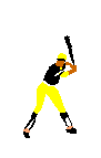
|
male256
(Apr 16, 2005)
Based on a photo of one of the 1971 Pittsburg Pirates. I will have to smooth this out and add detail. |
| ||||||||||||||||||||||
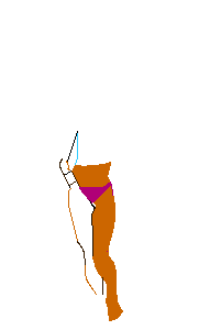
|
male256
(Apr 15, 2005)
I am just starting this drawing.
Shortiebop (Oct 30, 2006)
this took 1 hour??? i doubt it... |
| ||||||||||||||||||||||
|
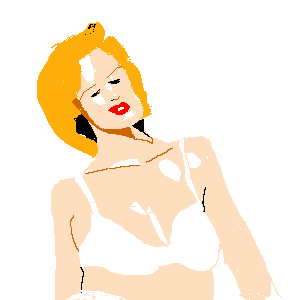
male256
(Apr 12, 2005)
Based on a photograph of Kylie Minogue. I did not finish before I had to leave the computer. I do not know if it is possible to save images on the beginner board.
geekyshoes (Apr 13, 2005)
like it!! looks like kylie!!
male256 (Apr 13, 2005)
Thank you, geekyshoes. |
| ||||||||||||||||||||||
|
GundamWing
(Oct 30, 2005)
http://www.boeingchina.com/other/images/down/space_shuttle_1024.jpgthe smoke pissed me off, so I gave up on it.
GundamWing (edited Oct 30, 2005)
Yeah I had it look'n good but thought i could make it better (the smoke on the left) so i erased and tried again 4 times, and then said the hell with it im hungry.Thanks i'll try that, and for the comments.
xiau (Oct 30, 2005)
This is way too good for beginner :)Loving everything about it, and the smoke looks fine!
Gigge (Oct 31, 2005)
Very nice Gundam. That blue bounces off the page. |

| ||||||||||||||||||||||
|
Ruggi
(Oct 23, 2005)
Now that didn't work out too well... |
| ||||||||||||||||||||||
|
TaCO
(Oct 28, 2005)
any one that is good at making comics needs to make one for Comic Week. We need aComic Board I should of went with better text bubbles. It's not really that great of a comic, but It's a start.
davincipoppalag (Oct 30, 2005)
I think it's pretty good. Reminds me of my office, where the heating system pumps cold in the winter and hot in the summer..
JK-Arts (Oct 30, 2005)
its not bad.
Rudeezy (Oct 30, 2005)
were going through with comic week? i guess i could make one too. nice job on this. |

| ||||||||||||||||||||||
| |||||||||||||||||||||||
| 2draw.net © 2002-2025 2draw.net team/Cellosoft - copyright details - 4.21sec (sql: 33q/4.17sec) |