| |||||||||||||||||||||||
|
thesolarwinds
(Sep 11, 2005)
erm.. her hands are going to kill me |
| ||||||||||||||||||||||
|
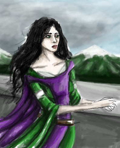
Renuar
(Aug 22, 2005)
...
Renuar (Sep 12, 2005)
wow, thank you all for the comments. Here's the trick, use the 'Pen' tool, set to minimum, and make good use of the 'soft' tool :]
p3ndragon (Sep 12, 2005)
I love you.I love this style even more.
absolutindigo (Sep 12, 2005)
Beautiful , it looks like a "Cirque du Soleil" poster
comd (edited Mar 19, 2006)
I second HunterKiller's remarks. This is gorgeous. |

| ||||||||||||||||||||||
|
broken-lock14
(Sep 4, 2005)
:3
Anna (Sep 10, 2005)
HAY! Great hair, man
davincipoppalag (edited Sep 11, 2005)
Yep..terrific looking hair on this..( is it me..or does it look a little like Steven Cojaharu (sp) on Entertainment Tonight)
broken-lock14 (Sep 11, 2005)
Uwah, it's so nice to know that the hair doesn't completely suck. I wasn't aware that this looked like anyone in particular. =P Anyways, I thank you all, very much so. *skips off to continue drawing* =^n______n^=
bobatemysandwhich (Jun 2, 2006)
Looks like a drag queen!lol. |
| ||||||||||||||||||||||
|
teenzeh
(Sep 11, 2005)
I didnt use shading because refs always look better without it x3 no crtis thanks
KittyKatMeowz (Sep 11, 2005)
omigosh! this is such a adorable picture!!!!!! i love it sooooooo much! i like how you added the heart ;) soo cute! |

| ||||||||||||||||||||||
|
Phil
(Sep 9, 2005)
think im done now
TheDarkPaladin (Sep 11, 2005)
Great detail!
davincipoppalag (Sep 11, 2005)
Ahh..there's the balcony..
KittyKatMeowz (Sep 11, 2005)
i love it! i also love her hair and dress! soo good!!
Phil (Sep 13, 2005)
glad you like it :) |

| ||||||||||||||||||||||
|
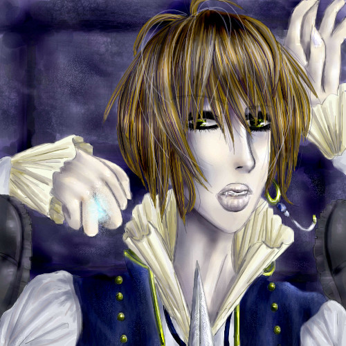
DivineStar
(Sep 11, 2005)
>__<;;; I lack of practice....T____T As always, failed at no-line painting....>__<;;;Sparda from Devil May Cry with his hair down. Enjoy.
DivineStar (edited Sep 11, 2005)
LasRever - Oooo...really? Thankies. I was worried I overdid the rain effect. Mwahahaha....>XDanarie - 'awesompossum'.....>XD LOL! I love that word! Thankies, nyao~!!! He ish purdy awright.....>;3 Anna - Awww...thank you so much ^___^ Well, at least I managed to get rid of some of the lines if not all...^___^;;; Ugh...need more practice....X____x
nekodesu (Sep 11, 2005)
holy fuckness....that's really awesome. I love the soft look to it.Failing in no-line painting...pfft..LIES!!!
thesolarwinds (Sep 11, 2005)
its really good....
broken-lock14 (Sep 11, 2005)
Ha, I saw this and thought "The art style is so very familiar", and then I looked at your name and realized that I had seen you at deviantART on several occasions. Kya, it's such a small world. =^n______n^= Mineself adores the rain, very much so, and the hair has beautiful detail (you do not fail in no-line painting, you pwn majorly *muffins j00*) |

| ||||||||||||||||||||||
|
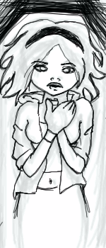
Pence
(Sep 11, 2005)
[Whee. I'm still working with my new tablet, but I have an awesome idea for this picture.]
Pakasutemanshikuka (Sep 11, 2005)
this looks awsome ;>! i wanna see it when it's done 8D
friend (Sep 11, 2005)
Ok, that would suck.Nice sketch.
DivineStar (Sep 11, 2005)
I love the pose ^___^ |
| ||||||||||||||||||||||
|
solve
(Sep 7, 2005)
upon his throne of skulls.changed it to father severity.
friend (Sep 11, 2005)
This is wicked, seems wong, but really it's quit right.
nekodesu (Sep 11, 2005)
At first, I wasn't sure what I was looking at but this looks really nice.
LisaAnne (Sep 12, 2005)
Aww I was really into the anatomy of the first picture, but the head of this is wonderful...I love the lines, and the motion it conveys. Nice work. |

| ||||||||||||||||||||||
|
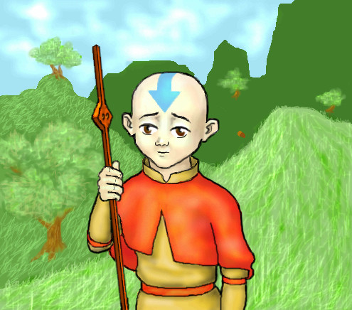
strangeoid
(Jul 25, 2005)
Aang.<3 Many references used. Calling it finished, ran out of space - computer was being evil, and had to send the last revision in early.
raise.hell.xiii (Aug 9, 2005)
you should write....* im with stupid* on the head...he.....
freefall (Aug 9, 2005)
hehe, this is well done. my brother watches that cartoon. avatar, right?Yup, Avatar: The Last Airbender. Best Nickelodeon show I've ever seen.
|
| ||||||||||||||||||||||
|
d_chan
(Sep 10, 2005)
Doodle.No clue who this guy is. Just made up someone random. I like the way he looks. His hair longer on the side and short in the back-center.
Er, he's saying "Yo!" I believe. I got it from another picture I saw. I just like how it looked. He need's a seme. >.> tee hee
~unwritten_law_girl~ (Sep 10, 2005)
omgosh, He's cute ^_^
Kenshin (Sep 11, 2005)
The yo isn't written correctly.. XD; The line doesn't go through the whole thing. Just on the right. XDFixed the 'Yo'!
Thank you Kenshin(hope I got the name right). |

| ||||||||||||||||||||||
| |||||||||||||||||||||||
| 2draw.net © 2002-2026 2draw.net team/Cellosoft - copyright details - 5.95sec (sql: 40q/5.89sec) |
drawn in 28 min
so... trying to recapture those.. here you are...
drawn in 1 min