| |||||||||||||||||||||||
|
Well? Now what?
Moosh
(Jul 10, 2006)
She looks awfully bored to have just beheaded a troll... :/
Pippi (Dec 31, 2010)
love it. needs more blood though.
werd1234 (Jan 11, 2011)
where's the red?!
5p00k3n5t31n (Aug 11, 2011)
This is incredible! Great use of one color!
davincipoppalag (May 19, 2018)
front page |
This is hidden because it is rated 18+. Edit your privacy settings to make it visible.
| ||||||||||||||||||||||
|
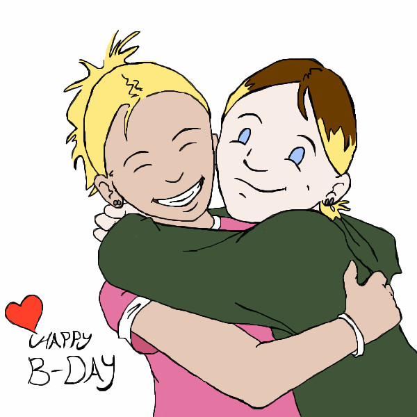
Expendable-Studios
(May 24, 2006)
a picture for my sister for her 16th birthday today.i love you alexa!!!!!!
Sweetcell (May 24, 2006)
A wonderful present ES. Happy Birthday Alexa.slowely slowely
anyone feel like improving this? please tell me
Sweetcell (Jul 10, 2006)
All I'd suggest is giving her pupils and highlights, and the white of the eyeball, some shading here and there (arms, face, clothes), and a simple background using the texture tool. One of the best things in Oekaki.Hope she had a great birthday and gave you a hug for this wonderful present. :) |
| ||||||||||||||||||||||
|
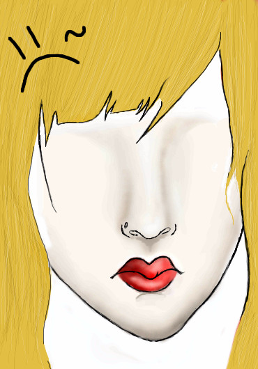
vigilante
(Jul 10, 2006)
mikhail (Jul 10, 2006)
hope you dont mind a little constructive criticism... *ahem* ok. well, you should try to improve your understanding of the mucsular and bone structure and proportions of the face to better position the facial features, because this face looks rather alien. mostly due to the eyes. The inner eye looks unnatural and should never have black outlines in it even when drawing in an anime style. Showing an understanding of these things in your work is more impressive than being able to draw a clean line.
wboyer (Jul 10, 2006)
Well, actually, mikhail... I believe that the proportions demonstrated here are part of vigilante's style. Even though the construction of the face does appear alien to our sensibilities, that may be just what vigilante intended. I actually can see nothing wrong with the start of this picture, other than the fringe on the forehead (don't make the same mistake I did in the past, and don't draw hair like banannas :D that's what a friend of mine told me hair in that style looks like XD). Really, one should only comment on disproportion and inequality in the features of a drawing. This drawing seems pretty proportional (and therefore asthetically pleasing) to me, so it's only a matter of personal taste that's in question.Whee, ah yuz beeg wurds! lol.
wboyer (Jul 10, 2006)
Ohh! This looks even cooler :D I can't wait to see the finished product :D Just a question though... Are there going to be eyes?Ahaha, I had a banannamango smoothie this morning, and it was good. and that was random. LOL.
vigilante (Jul 11, 2006)
Yup, there's going to be eyes 8----] |
| ||||||||||||||||||||||
|
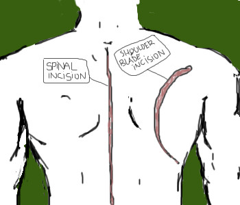
mikhail
(Jul 10, 2006)
My back. |
| ||||||||||||||||||||||
|
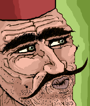
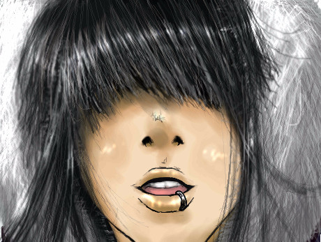
mikhail
(Jul 9, 2006)
Timur always known in village of harkan for being casanova!
SYTHE (Jul 9, 2006)
Yes, he be so pretty... ugh. Interesting style.
wboyer (Jul 9, 2006)
This is wayyy creepy. And I love it.The details of the lineart and just the way this character is drawn really makes this picture cool :D I just... Love it XD lmfao The lips just crack me up :D Awesome job! But... This isn't finished? Whatever :D It looks hella cool :D My first oekaki in 3 years! lol...
|
| ||||||||||||||||||||||
|
Dromophobic_o.o
(Jul 9, 2006)
Yay me. I didn't use a ref.:B and i think the hair actually came out decent. XD woo. Its only at 6am when i come up with good art. Harhar. shes wearing one of those jackets where the lining around the hood has that faux fur on it. lol if you know what i mean. i dont own one so its hard for me to explain. |
| ||||||||||||||||||||||
|
Kloxboy
(Jul 10, 2006)
I dedicate this piece to Solve, one of my favortie artists on 2Draw. Which is why this demon is so pink. :) Our demons never truly go away but it's time they took a vacation. This will be the last demon I draw for a while (or so I hope).
davincipoppalag (Jul 10, 2006)
Draw some animals, Clox...I would love to see what you can do with them.. bye demons..
frootcake (Jul 10, 2006)
do one for luck? your pig picture was cool and that horse one :)
HunterKiller_ (Jul 10, 2006)
This guy's like "vacation? wtf?".Awesome pink demon. |

| ||||||||||||||||||||||
|
diablo_fan
(Jul 9, 2006)
Yep
diablo_fan (Jul 10, 2006)
ahaha
olemann (Jul 15, 2006)
its too dark
diablo_fan (Jul 18, 2006)
yeah i noticed that
pancakes_rock (Jul 19, 2006)
i like this one very purdy |

| ||||||||||||||||||||||
|
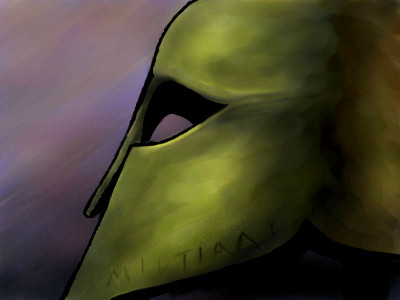
misterjimsan
(Jul 9, 2006)
Eh. It's not very good. At least it's not as interesting as the subject matter. It's the helmet of Miltiades, the Athenian (sort of) general of the Battle of Marathon. On the side he etched "Miltiades dedicated this helmet to Zeus." It's in some Greek museum. I'd like to see it someday.
diablo_fan (Jul 9, 2006)
awww shiat this looks like isenharts nice helmet!
mikhail (Jul 10, 2006)
Never forget thermopolis!!! >:0 *raises fist*
diablo_fan (Jul 10, 2006)
http://cellosoft.com/2draw/view/69878/ my gladiator helmet
Sweetcell (Jul 10, 2006)
You do these well. Next up, a person IN a helmet. :) |
| ||||||||||||||||||||||
|
wboyer
(Jul 9, 2006)
?Ehh, whatever. I don't like thumbs anyways.
Teddybear (Jul 10, 2006)
What more do I say.I love it. Nice going.
wboyer (Jul 10, 2006)
Haha, thank you :)
Sweetcell (Jul 10, 2006)
Hated Service Pack 2 as well and didn't have it for a long time but I'm used to it now. Thank God my tablet was accepted by my PC, mouse work is so hard. I like the use of just black, white and grey. It reminds me of the 60's pop posters you'd see. Or art used promoting rock bands. |
| ||||||||||||||||||||||
| |||||||||||||||||||||||
| 2draw.net © 2002-2026 2draw.net team/Cellosoft - copyright details - 3.55sec (sql: 40q/3.49sec) |