| |||||||||||||||||||||||
|
under water
eevildeeva
(Mar 2, 2007)
Just messin' around. No internet access for a while. I missed Lascaux.
Alter.Native (Mar 3, 2007)
Nice messin'..
Miss_DJ (Mar 3, 2007)
I like the reflections!
cmb (Mar 3, 2007)
ripply1!
Sweetcell (edited Mar 3, 2007)
Hey, glad to see you back, wondered where you went off to. Very fantasy like. Reminds me of Majora's Mask. |

| ||||||||||||||||||||||
|
deathking
(Feb 28, 2007)
I named that old character Amy. Here she is.
enjoydotcom (Mar 2, 2007)
Oweee, this is nice, I knew it would look good once finished.... Looking up petals for you... one moment please, judges are still in deliberation... no need to jump in front of a train. It was spelled correctly.
deathking (Mar 2, 2007)
Sorry, I just have a lot of hatred for when I mispell an easy word and I someone says something befor I notice.
Miss_DJ (Mar 3, 2007)
hatred is a really strong emotion for such a concept, don't you think? anyway..I like this draw. You did verry gud! lol :o)
deathking (Mar 3, 2007)
Thank you all for the comments. |

| ||||||||||||||||||||||
|
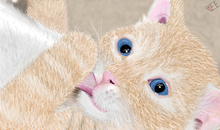
TripleE313
(Mar 2, 2007)
Cute 'lil kitty!Touched up a few things that looked weird. =)
davincipoppalag (Mar 2, 2007)
Aw cute! Love the little tongue and eyes
Miss_DJ (Mar 3, 2007)
sweet draw. the mouth, ears and fur are especially great!
TripleE313 (Mar 3, 2007)
Thanks all =) |
| ||||||||||||||||||||||
|
DrawingDork
(Mar 1, 2007)
It's my version of the Firefox logo... but I didn't like the way it came out, so I redrew it. Here's the redrawn version: http://vic-viper-001.deviantart.com/art/Firefox-175378219
Cameo (Mar 2, 2007)
Cool Beans!!!
sincity (Mar 2, 2007)
cool concept. :}
Miss_DJ (Mar 3, 2007)
nice! the colors and movement are great!
psychofox0 (Mar 7, 2007)
the high lights are awesome. I like the how the stars are like glowing.. awesome job, man.X3 |

| ||||||||||||||||||||||
|
Dr.Snoopy
(Mar 2, 2007)
fini...
Alter.Native (Mar 3, 2007)
It's a molten lava creature..I like the flow!
Miss_DJ (Mar 3, 2007)
oo, yeah! this is nice, Dr.! reminds me of a pic you can take and 'liquify' in Adobe photoshop. I just love the movement you've created.
cmb (Mar 3, 2007)
like scrunched silk...
Roytje (Mar 6, 2007)
Fantastic work! :) |

| ||||||||||||||||||||||
|
Felistorm
(Mar 2, 2007)
Hmmmmmmmm I feel like I'm doing a tad better with figures though I plan on trying to make them more defined later. I can do it on paper dang it! :D Was in a "spring" mood :D
davincipoppalag (Mar 2, 2007)
CAM<<<boobage.... I think this looks very well done Jana... best one yet...great material in the drape...
Pantera (Mar 2, 2007)
Very nice, love the detail on the throw :)
Cameo (Mar 6, 2007)
I think I love the roses the best. Of course I'm a rose freak. Rest is good too! |
This is hidden because it is rated 18+. Edit your privacy settings to make it visible.
| ||||||||||||||||||||||
|
solve
(Feb 28, 2007)
Torso is too long. Hips/stomache area seems off too. Not lining up I think.Went through a lot of ideas before stopping on this one. Any advice/ideas are welcome. Always.
Sweetcell (Mar 1, 2007)
It's still goodness. Lovely muscular goodness.
patienceisoverrated (Mar 1, 2007)
i like the flooow and movement to this. I think maybe the hips should be a tad wider? but it's fab as is.: /
HunterKiller_ (Mar 2, 2007)
I thought maybe you would have gone a bit wacky with this guy. I'm seeing those ribbons in the colours of the rainbow. =P |

| ||||||||||||||||||||||
|
Alter.Native
(Mar 1, 2007)
Listening to the soundtrack for:: one of my fav movies
Sweetcell (Mar 2, 2007)
Great angle on the gun, nice rich colors and fantastic splattering, reminds me of Solves work.
Miss_DJ (Mar 2, 2007)
oo really cool Alter.native! the whole composition is really great!
Alter.Native (edited Apr 26, 2007)
Thanks guys. |

| ||||||||||||||||||||||
|
lori
(Mar 1, 2007)
I have a sitcom theme song in my head, do you know how annoying that is?belongs in beginner
Sweetcell (Mar 1, 2007)
Oh yes, oh yes. HATE when tht happens. So sorry No. Try listening to your favorte tunes and it should fade away. Nice use of monochrome. Perfect little highlights.
davincipoppalag (Mar 1, 2007)
I don't want to think about it..If I do..one will start playing in my head too..gaaaaaaa...This is a different style..I don't know what they call this...solids? I dont know..It's good though |
| ||||||||||||||||||||||
|
brenndurdrykkur
(Feb 14, 2007)
it's a song
fleeting_memory (Mar 1, 2007)
dude you did this on BBS? A million kudos to you man.
davincipoppalag (Mar 1, 2007)
This is beautiful work..really
brenndurdrykkur (Mar 3, 2007)
thank you all!deadlyblondearcher---yes! i am obsessed with opalescence/iridescence. there is a lot of water around here that looks like that too sweetcell---the fingers were intended to be strange lengths and widths, but i agree that it's off in the corner. i got a bit lazy
Cameo (Mar 3, 2007)
exquisite! Just wonderful! How on earth do you do it? Oh, to have your talent!!! |

| ||||||||||||||||||||||
| |||||||||||||||||||||||
| 2draw.net © 2002-2026 2draw.net team/Cellosoft - copyright details - 8.53sec (sql: 36q/8.45sec) |