| |||||||||||||||||||||||
|
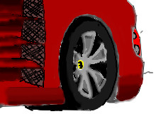
doodledaniel
(Jun 3, 2007)
constructive critisism and tips are welcome |
| ||||||||||||||||||||||
|
solve
(Jun 3, 2007)
lol oh wow
Sweetcell (Jun 3, 2007)
She's flashing, she's flashing......Looks like a picture in the process of developing. If anyone's ever developed film you know what I mean, with that red bulb on to protect the film as you put the sheet through different chemicals.
Noremac (Jun 4, 2007)
that's a boobie :D
Cameo (Jun 7, 2007)
Lovely work, solve! Very provacative!
LisaAnne (Jun 16, 2007)
some of the shading especially around the neck and mouth are just wonderful! The glasses are a little awkward, but the figure is very nice. |
This is hidden because it is rated 18+. Edit your privacy settings to make it visible.
| ||||||||||||||||||||||
|
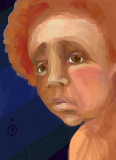
PolythenePam
(Jun 2, 2007)
"In a real dark night of the soul it is always three o'clock in the morning, day after day."
davincipoppalag (Jun 3, 2007)
..really emotional and well done giselle...I'm lovin' your newest stuff a lot!
DeadlyBlondeArcher (Jun 3, 2007)
F. Scott Fitzgerald (1896 - 1940), "The Crack-Up" (1945)- that's my all-time favorite quote in the world - it's in my profile, here This is very powerful and moving.
patienceisoverrated (Jun 3, 2007)
this is grungy and powerful and i love it lots and lots. the light and shadows on the face are great.
Sweetcell (Jun 3, 2007)
Really strong, emotional. Pulls you in. Nice one Miss Giselle. |

| ||||||||||||||||||||||
|
mooki
(Jun 2, 2007)
i think richard simmons is probrably sad.and wears glasses. badly drawn glasses. you know, probrably
davincipoppalag (Jun 2, 2007)
I liked the glasses, too...very painted looking and interesting face
lori (Jun 3, 2007)
hehe :)
TaCO (Jun 3, 2007)
I love this for some reason I can't find words for.Awesome pic sha!!!!!!!
mooki (Jun 3, 2007)
thanks you all |
| ||||||||||||||||||||||
|
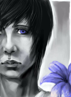
Silvair
(Jun 2, 2007)
and seem to fear Things that sound so fair?
Anna (Jun 2, 2007)
cool face! love the whole thing going on with the eye and flower.
davincipoppalag (Jun 2, 2007)
I like the blue eye in the black and white theme...and the delicate blue lily
pancakes_rock (Jun 4, 2007)
Emo!!!! xD i love the hair. |
| ||||||||||||||||||||||
|
6 comments
– latest 4:
Anna (Jun 2, 2007)
nice bod
mooki (Jun 2, 2007)
danky you
davincipoppalag (Jun 2, 2007)
nice nekkies style.. I hope this girl knows how to get ahead....... |

| ||||||||||||||||||||||
|
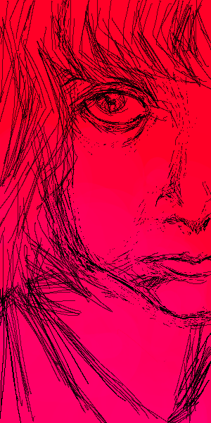
solve
(Jun 2, 2007)
Went through a couple of ideas. Then I thought "oh hay, practice a portraits since you are going to be drawing Lori later". So I did this as a quick practice. The overall angle of the face is off. I am still training myself to draw what I am looking at rather, adding or making features up.Ref is: http://img.photobucket.com/albums/v407/marcusa/9e9c8362-e167-11db-a010-7bae0c6e557.jpg I dont plan on making any revisions to this. BUT Any critiques, or mistakes you notice and want to comment on, are very welcome. Helps my brain thingy learn.
davincipoppalag (Jun 2, 2007)
Yea just go for it marcus..you have so much talent in those hands.. I'm sure whatever you produce will be greatfucking jaws
HunterKiller_ (Jun 2, 2007)
Yeah, the angle is pretty off, there still is a strong resemblance, which is good.
LisaAnne (Jun 16, 2007)
Angle. I like the big eye. Cute chick. |
| ||||||||||||||||||||||
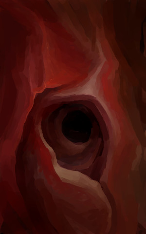
|
Kloxboy
(Jun 1, 2007)
a raindrop unites with the ocean
Punky (Jun 2, 2007)
To me it looks like some super crazy cave. I really like the colours and the shapes. :)
mooki (Jun 2, 2007)
like a rose.its beautiful
Childlike_Vampire (Jun 2, 2007)
This really caught my eye. I can't wait to go home and look at it on my own monitor, this one is far too dark to see any details.
Sweetcell (Jun 2, 2007)
It's interperative, can be so many things. I just like staring at it. |
| ||||||||||||||||||||||
|
akiaki-chan
(Jun 1, 2007)
XD; been watching this since wednesday and is hooked x__x watched the second opening and i imediately wanna draw Tsuna's kakkoii look ... :3
Truearashi (Jun 1, 2007)
Mm, very good, very good ! I really like the shading.
DoOp (Jun 2, 2007)
pretty : ) |

| ||||||||||||||||||||||
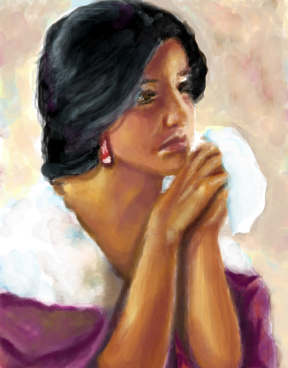
|
dark_angel
(May 31, 2007)
tryin somethin different
lori (Jun 1, 2007)
came out really beautiful, your art's really taking off ya know
Anna (Jun 1, 2007)
hey this is lovely. i love her skin tones. :-)
Sweetcell (Jun 1, 2007)
Turned out wonderful. I don't know why but it reminds me of Mexican paintings.
akiaki-chan (Jun 1, 2007)
it's really nice... the overall picture is beautiful... |
| ||||||||||||||||||||||
| |||||||||||||||||||||||
| 2draw.net © 2002-2026 2draw.net team/Cellosoft - copyright details - 5.72sec (sql: 33q/5.66sec) |
drawn in 7 min