| |||||||||||||||||||||||
|
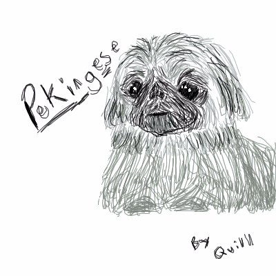
Pekingese
quillthephone
(May 19, 2005)
A picture of a pekinese: these dogs just grab my intrest; probaly because they are just so ugly! I like the face better then the body here.
xswirvex (May 19, 2005)
We have 2 Pekingnese, yes they are very ugly o.o this looks like our pekingnese, Moglie. :P |
| ||||||||||||||||||||||
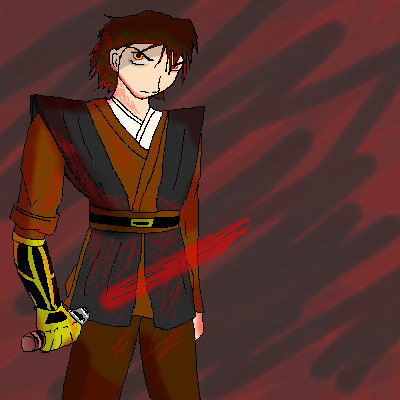
|
usagisailor
(May 19, 2005)
I'm such a nerd... ^_^;; But Anakin was just too bad@$$ in the new movie to not do fanart.Finished copy of "Seduction of the Dark Side". Anakin's just so delicious....ly evil. ^_^;;
15grifficorntears (May 19, 2005)
Big dark Darth Vader (after the fact) is much sexier....but this is good, I like his cyborg arm. |
| ||||||||||||||||||||||
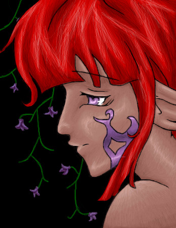
|
Juni_gatsu
(May 11, 2005)
meh...I'll finish (at least) the lineart by tonight. hopefully. I've got to go...somewhere...not sure where....just going out. yup. *sigh* why does lineart have to be so difficult? >_<unenthusiastic villiagers: yay....
juni_gatsu:.... >.<
nekodesu (May 19, 2005)
Wow! Beautiful work with the hair and shading. =D
Xodiak (May 19, 2005)
Xod gets excited because she is very sexy! I love the skin texture and shading... hehehe... I like the shape of her face, she is charming and beautiful. Terrific drawing! <:D|XOD|
nozomii (May 19, 2005)
REally great hair. I love the bg also. |
| ||||||||||||||||||||||
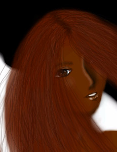
|
nekodesu
(May 5, 2005)
This is my first submition on the intermediate board and I thought that I'm pretty good with the tools and my mouse skills improved a lot since I started so yeah...I don't know...if it's not worthy enough, move it to beginners. Anyways, about this pic...I first though of doing absolute realism...but then I didn't feel like using a reference so the eyes are like that and the rest is well...non realistic. And this is my first time ever drawing an African American person...I just think there's not enough around here. yeah...I'm pretty much done with this...
Xodiak (May 19, 2005)
The hair is gorgeous.... I wish I could draw hair so well! <:D|XOD|
Zack (May 19, 2005)
The facial structure doesn't seem like an African American's. She looks more Indian, except for the hair color (would be darker). The hair doesn't have enough contrast with the skin color. In fact, if you squint your eyes, it becomes very difficult to tell the skin and hair apart. The background is confusing having such strong contrast. |
| ||||||||||||||||||||||
|
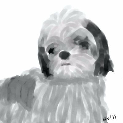
quillthephone
(May 19, 2005)
My dog, a shih tzu. I am most terribly sorry if this does not qualify for the intermediate boards, I hope you forgive me for posting it here. (if that is the case)
p3ndragon (May 19, 2005)
If you put more time and effort into your art, I'm sure that it would definitely fit into the intermediate boards.The head is great, maybe the body fur could use some more definition?
quillthephone (May 19, 2005)
I know, the head went really well at first... but you are right, I just couldn't get the fur the way I wanted! |
| ||||||||||||||||||||||
|
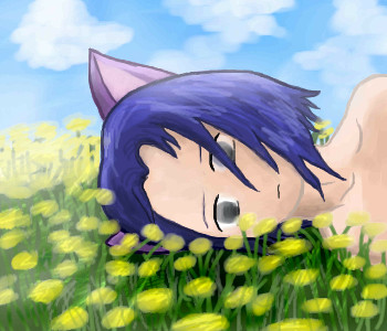
Animegirl250
(May 3, 2005)
In the field of dandelionsSwaying by and by Gold turns to grey As I wither up and die Poem randomly came into my head earlier while looking out the window.>_*
StrawberryYamichan (May 19, 2005)
you've gotten alot better since the last time i say your art. this is so pretty.
Xodiak (May 19, 2005)
Very nice catboy. (he is a catboy, right?) Very pretty, hehehehehe. I guess a girl would be turned on thinking of him. >:)|XOD| |
| ||||||||||||||||||||||
|
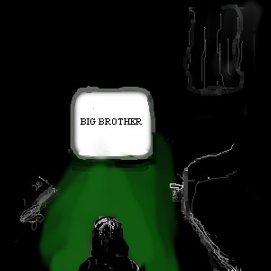
geekyshoes
(May 8, 2005)
BASED ON THE BOOKSTILL SA WORKING PROGRESS
silver_maiden (May 8, 2005)
GEORGE ORWELL ROCKS!!!!!!!!!!!!!!!!!!!!!!hello chaps and chapesses!
vigilante (edited Jun 20, 2005)
XD big brother. :D cool. |
| ||||||||||||||||||||||
|
Axil62
(May 17, 2005)
...you walk across the floor with your flower in your hand, trying to tell me no one understands...
Xodiak (May 17, 2005)
I like the dark and light in the drawing! And the big number 5 that turns the grayscale into brownscale. Hehe, great picture! >:D|XOD|
R. (May 17, 2005)
"The old get old, and the young get stronger" - not sure if that applies here. Superb composition and use of light and shadow.
Pence (May 17, 2005)
Wow, that's so cool! It reminds me of the girl and guy in "Vampires will never hurt you" music video, by My Chemical Romance.
geekyshoes (May 19, 2005)
fantastic!!love the simple colours!! |

| ||||||||||||||||||||||
|
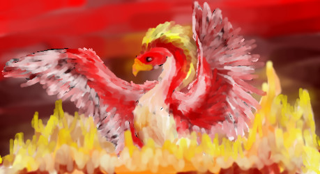
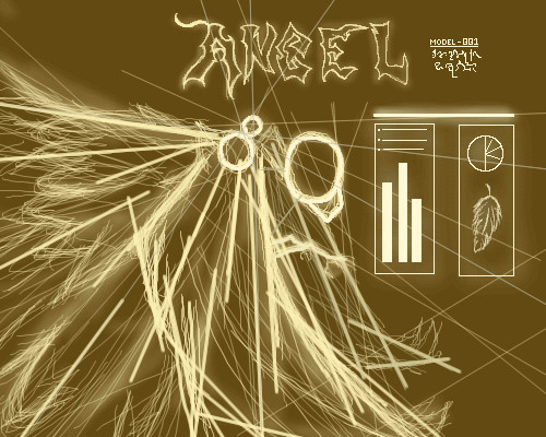
Kraisa
(May 18, 2005)
I was trying out a pallat knife type look...I think I didn't do to bad...
Kraisa (edited May 18, 2005)
I've seen far worse on this board...I will try that in a little while davinci. (I thought I spelled that wrong ^__^)
Shanghai (edited May 18, 2005)
I have no doubt that this is perfectly suited to this board. The flames look a little too quickly done but the lighter feathers on the wings are great. The way they stretch out give a sense of rising.
p3ndragon (May 18, 2005)
Good job.I'm sure that if you spent more than 30 minutes, it would have been even better. My only gripe is that pixely pencilish black behind the wings, which is most noticeable on the left one. Looks a little rushed, but the effect is great. Keep it up!
Kraisa (May 19, 2005)
The pixely lines, I see that now, I think I will touch this up when I get a chance, prolly not today though, poor baby has to get shots...its gonna be a long day. OH and how I suck at fire, any way I do it it looks cartoony, any one who wants to show me how is welcome! |
| ||||||||||||||||||||||
|
p3ndragon
(May 18, 2005)
I think it was Icats who did that Derek Hess album cover.Looked him up online... This was loosely based off of one of his stuffs. Really pretty bored. Felt like sharing that.. >_> |
| ||||||||||||||||||||||
| |||||||||||||||||||||||
| 2draw.net © 2002-2025 2draw.net team/Cellosoft - copyright details - 1.74sec (sql: 39q/1.70sec) |