| |||||||||||||||||||||||
|
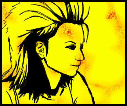
hideyourface
(Aug 13, 2005)
alll about the music. |
| ||||||||||||||||||||||
|
Graffiti871
(Sep 2, 2004)
this is L from DEATHNOTE. pinch his cheeks, i dare you!
Urei-sama (Sep 2, 2004)
nyess, the grey is rather annoying, and ive spotted alittle glitch in your checkers... two little glitches accually. besides that i like the black and white. gives it a cool feel.... i am tempted to pinch his cheeks... really
Maiko (Aug 13, 2005)
>_> damn I missed this...haha L is so cute XD but he needs to be biting his fingers or eating cake XD
sephiroth54321 (Aug 13, 2005)
This is good....
SanzoGirl (Aug 13, 2005)
L-kun! :DD *Glomps*L needs to be drinking tea! He holds the cup in a funny and adorable way. xD I love L-kun. <3 |

| ||||||||||||||||||||||
|
paccer
(Oct 27, 2004)
hope someone wants to collab. :)
spiritdweller (Dec 6, 2004)
looks real good
DeadlyBlondeArcher (Dec 6, 2004)
Great job on the dimensionality (if that wasn't a word, it is now) and achieving the metallic look... love this!
thug (Dec 6, 2004)
looks steely and bally. Good job!
Mal (Aug 13, 2005)
very well done :o) |

| ||||||||||||||||||||||
|
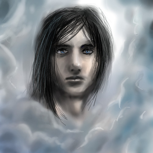
pencilhero
(Aug 13, 2005)
oh man i got to hurry dedective Monk is starting :Ohope you like it! CHEERS! ps. photo references are evil 2nd ps. [O_O] <-------Bender XD lmao
Kasha (Aug 13, 2005)
an attractive face indeed. I think it'll go better if you went over the pencil with a bigger watercolor brush size set to a low opacity to smoothen out the pixelated lines. or, whatever technique you did for the face do for the hair. No hard feelings it just feels out of place with the rest of the smooth picture.
hideyourface (Aug 13, 2005)
this is one of your best faces I think.The only thing I think you should do is practice with more colours and maybe use some references of random things to use as backgrounds, just so you're doing something new. Also, using references of faces is a food idea too since a lot of your faces are very similar. Maybe some new hairstyles too. That's just something to consider for the future.. |
| ||||||||||||||||||||||
|
kejoco
(Aug 11, 2005)
Haven't touched it in forever...lets call it done
TaCO (Aug 12, 2005)
I thought grendal was green and dead, cause Baowolf killed him???
Kloxboy (edited Aug 13, 2005)
Sweet. I've never seen him drawn realistic. I remember his new series when I was in middle school but he goes way back to 1982:wikipedia article EDIT: Sorry, I'm not big on niftyToo...unless it's completely necessary. Damned mods, I'll get you!
Zack (Aug 13, 2005)
Hah! Well, your link didn't work; it left off the _(comics) part of the link and ended up linking to the general Grendel article. No jackassery intended.
Kloxboy (Aug 13, 2005)
Sheet. Thanks Zack. I'm paranoid. |

| ||||||||||||||||||||||
|
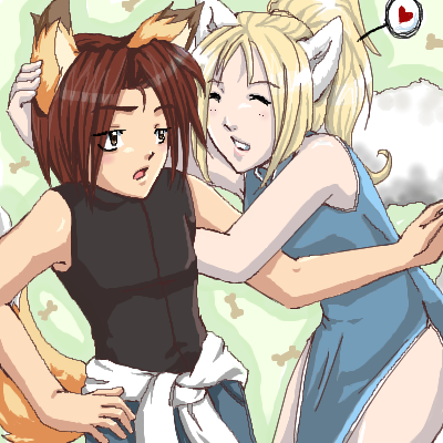
oikitsumaru
(Aug 3, 2005)
minus a few deformaties, I like it. My RP idenity and my friend 'chaddish'. (who should go back to DA! XD *grumbles*)
lycene (Aug 3, 2005)
Very cute; I love their expressions and the colors work very well together.
nyao (Aug 5, 2005)
hee hee... so cute ^^i love the ears~ and their expressions ^^
Cianteed (Aug 6, 2005)
amazing work! it looks so professional.
Urei-sama (Aug 13, 2005)
this is nice. the style is very professional although their expressions bother me alittle... |
| ||||||||||||||||||||||
|
anarie
(Aug 12, 2005)
Done! This is a character from the ca.** 1928 RP that I started. <3 Her name is Elizabeth Francis Gray aka Elle Gray.Erm. It's OK. It's hard to shade clothes with multi-colored decorations. Yes. I like the face and skin shading though! X3 Slight Referance used for the dress. |

| ||||||||||||||||||||||
|
GOODBYE
(Aug 13, 2005)
Just testing out my tablet.. i really like the result :)
brenndurdrykkur (Aug 13, 2005)
awesome!this means a new collab, i think just thought i would shade a little. and adjust stuff eheh.
Xodiak (Aug 13, 2005)
Beautiful girl, Miss Jen! >;D|XOD| |

| ||||||||||||||||||||||
|
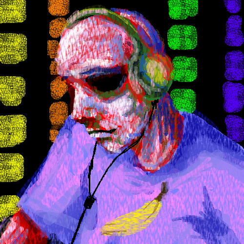
hideyourface
(Aug 12, 2005)
I felt like drawing a picture with a banana in it, and I was like, "I know!" Then I drew this. That's exactly how it happened.. ..really.
KH44N (Aug 12, 2005)
Nice. I like how u used different shades.
dip_set_diplomatic_punisher (Aug 12, 2005)
them ravers need to back off the (e) before it eats there brains like mad cow disease!
davincipoppalag (Aug 13, 2005)
This is great! I don't know what you've been eating but keep doing it...these latest ones are really terrific.
TRIP (Aug 13, 2005)
BANANANANANANANANAAAA |
| ||||||||||||||||||||||
| 10 comments – latest 4: |

| ||||||||||||||||||||||
| |||||||||||||||||||||||
| 2draw.net © 2002-2026 2draw.net team/Cellosoft - copyright details - 4.37sec (sql: 37q/4.32sec) |
he was a japanese rock guitarist/singer in the 90s. he died a few years back.
haha he kinda reminds me of Kuja in this pic >_>;