| |||||||||||||||||||||||
|
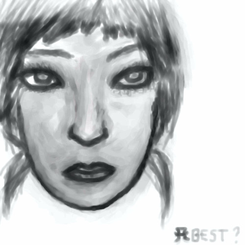
kristine
(Nov 14, 2005)
This is someone i know :P hes cool. im using a ref for this picture. |

| ||||||||||||||||||||||
|
pencilhero
(Dec 4, 2005)
loool :-p XD lolz it suckz bored in the process of doing it Z_Z.Oh man look what Dru did in his workshop 70 hours lol i cant even stand painting for 3 hours :P , the whole thing is flawless it looks exactly like a photo. Five thumbs up ,20/20,100/100 XD
Gigandas (Dec 6, 2005)
Haha, holy crap that link is amazing....I think Zack's just jealous by saying that thing about the printer :P. I have to admit myself, I'm kinda jealous now. Someone who could do work like that isn't 'just' skilled, they have a God-like eye for detail that can pick up not only the forms and alignment, but just what colors to use to give it that real sense of 'life,' which just blows me away.
Zack (Dec 6, 2005)
I'm not envious. the man has obviously spent a great deal of time investing in a skill that doesn't impress me much. time that could have been spent playing video games.
staci (Dec 7, 2005)
agreed. why would you want to (for example) pay someone to do a portrait of you that looks EXACTLY like a photo. you have the photo..it just doesnt make sense. i guess it would be cool if the subjects were original and he made them look photo realistic, but meh. my opinion.
Gigandas (Dec 7, 2005)
Well, to me, it's not so much a matter of paying him to do a portrait for me, but rather the fact he's perfected his realism to that level is amazing. Most people attempt realism and end up with something that doesn't look exactly photorealistic because they don't have the overall 'skills' to master it as this guy has. I dunno, I still think it's good to have that ability up your sleeve anyway for an artist. It's one of the basics you study in art anyway. If you think about it, it's not all about the realism either. You don't learn realism just to do realism. It's stuff like learning to pick up on forms and colors that actually help you as an artist in the future when say, you work from references or just getting a general idea of shapes of things so that you don't really even need a reference to draw something well (like if you were drawing a robot and wanted to make him metallic, and you know how the texture might look). |

| ||||||||||||||||||||||
|
asforoneday
(Dec 7, 2005)
I still have to add a neck and stuff. Suggestions? |
| ||||||||||||||||||||||
|
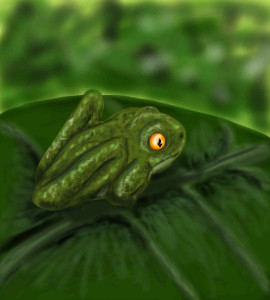
pandabarrie
(Dec 7, 2005)
umm...frog
Kraisa (Dec 7, 2005)
I like this, it has depth. I like the color too. The back leg seems a bit wonky though, like it is painted on him rather than part of him. |
| ||||||||||||||||||||||
|
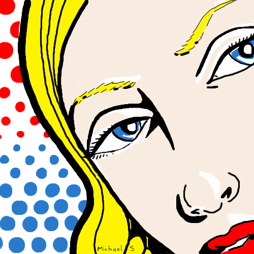
mx
(Dec 1, 2005)
wanted a pop art feel
Caddris (Dec 2, 2005)
Well, you certainly acheived a pop art feel. Very Warhol-esque.
woah_pockster (Dec 4, 2005)
THERE YOU GO. I was scratching my brain for that name. Warhol. :D <3
Zack (Dec 4, 2005)
not so much warhol as roy lichtenstein, I'd say.
mx (Dec 7, 2005)
thanks guys (and gals)*blush* |
| ||||||||||||||||||||||
|
zep
(Sep 12, 2004)
testing lascaux...
concannon (Sep 12, 2004)
That is some uber-bright green. I like his nose.
Kasha (Sep 12, 2004)
cool green. I have some eyeshadow that color but you wouldn't care. lolfor some reason he reminds me of a bug. Haha.
Aubrey (Sep 14, 2004)
Yeah you'll definitely like it once you play around with the tools Zep. It takes some feeling around I think. I still need to do that lol I think Cindy said the blender tool was down somewhere where you choose the brushes. I dunno though, I forgot about that til now, have yet ta use it.
Renderboy (Dec 7, 2005)
Hola gil! Puta que me cost� pillarte. Meh! ZEP se me iba a ocurrir!¡¡¡Tan gueno loh monito!!!! Yo tambi�n quero ser bac�n. Oye... me acuerdo que antes se pod�a ver la animaci�n de los dibujotos pero ahora no cacho por d�nde se hace eso ¿o ya no se pede? |

| ||||||||||||||||||||||
|
thug
(Dec 6, 2005)
tiquila is good
DeadlyBlondeArcher (Dec 6, 2005)
Tastes about as good as novacaine. (hah)
Axil62 (Dec 6, 2005)
Reminds me of the procrit shots I have to give my wife. (minus the worm)
Qwerty_Wittle_Fawah (Dec 6, 2005)
haha shots i get it....I love the color in the background and how you made the hands like a shadow. and yeah I don't think i've done shots like that either hehe I love this
kristine (Dec 6, 2005)
this is awesome! i really need to start thinking outside of the box O.o |

| ||||||||||||||||||||||
|
101_Torchic_101
(Dec 5, 2005)
(-_-); This took such a long time..I was distracted a little..Anywaaays..as you can see, Bakura has cat claws (duh, because he a neko)..I drew and colored in Marik really good..But I didn't do Bakura that good...Oh, and, Marik is making a face like that because Yami Bakura's..humping him..and Yami Bakura's claws are kinda hurting him..
Sasuke-fan-Sapphire (Dec 6, 2005)
WOAH! THAT'S HOT! O__O *drools*
101_Torchic_101 (Dec 6, 2005)
(^.^) Thank you, Sasuke-fan-Sapphire! (and what's wrong with anime, sneakywalter?)
SneakyWalter (Dec 6, 2005)
It's just that there has been a LOT of it lately. That's all. |

| ||||||||||||||||||||||
|
hideyourface
(Dec 2, 2005)
wrong wrong wrong
kejoco (Dec 2, 2005)
Looks like Adam Yauchlooks cool
LisaAnne (Dec 2, 2005)
Attractive and alot of attitude
davincipoppalag (Dec 2, 2005)
Looks like eminem's wimpy cousin.. great job
chan2005 (Dec 6, 2005)
looks class.. cool use of the thicker brushes |

| ||||||||||||||||||||||
|
Deino
(Dec 5, 2005)
I was bored D: |
| ||||||||||||||||||||||
| |||||||||||||||||||||||
| 2draw.net © 2002-2026 2draw.net team/Cellosoft - copyright details - 5.68sec (sql: 34q/5.63sec) |
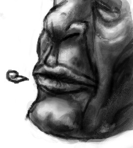
Nice job, 'specially for your first try at realism.