 |
| |||||||||
|
Shanghai
(Jan 16, 2007)
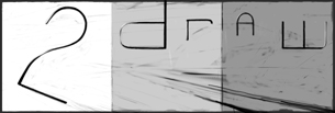
It's the 2draw ink board, get it?actually I was just thinking of different themes/skins. My vote is on this one. -I think it looks good at 75% |
|||||||||
|
still needs a lot of work... going to try for a lot of special effects.
30 comments
– latest 4:lol it is the teenage mutant ninja spark plug -- Mwaha! I'll be working some ideas on this now... ph34r. ~method3 -- gunmetar!!! feel free to continue messing around, hopefully I didn't do anything that would bother you. love the radiating lines addition. -z
dorothyblueeyes (Sep 2, 2012)
i like it, altho my tastes run to the black/white simpler "2 and robot".i guess simplicity appeals to me, but this is excellent.(i don't know how people do these,either.heh.)
Cookie2 (Jun 22, 2021)
wow. just wow.
davincipoppalag (Jun 22, 2021)
zack designs computer games now.. he's quite good
Cookie2 (Jun 22, 2021)
:0 |
|||||||||
|
15 comments
– latest 4:
Punky (Nov 12, 2005)
This makes me so happy. :)I love Zoraw. This would be a pretty cool shirt, I mean, I'd buy it (if I had money).
narutofan (Nov 24, 2005)
cool i like it
Kanuto (Nov 10, 2006)
that composition looks nice, tho I still cant find the "d"..
dorothyblueeyes (edited Sep 2, 2012)
so good. it really does say"2draw". this is a shirt?hey, here's my money!we need a 2draw t-shirt. get some large sizes, eh? (I've done lithography, i loved it. black litho crayon on stone; ecstacy.)(i know where you can get cheaper blank t-shirts,the more the cheaper;"Dharma Trading.com",but they don't do the printing.but lotsa kinds, sizes,maybe black.)cheap for just one, also(this is not an ad) yeah, do it. |
|||||||||
|
method3
(Apr 20, 2005)
Style adapted from an artist that goes by Kosi-- Someone want to give it a go, let me know. Murlocs!!!! --
Backstabbed_and_broken (Jun 20, 2006)
w0w!!
iamawalnutt (Sep 29, 2006)
thats sooo cool!!!
unique31 (May 12, 2008)
thats sick..i do some 3d pieces also....you want to collab?
TheeJamos1 (Aug 28, 2009)
3d peices thats was upSick!!! |
|||||||||
|
Fin_beast
(Apr 22, 2005)
Yea I know... It's not great. It might become something nice though.That heap o' stuff is supposed to be a two... hopefully you kinda got it. If anyone who has access Ink would like to edit this... feel free. :) grr... It's hard.
acidbath (Apr 22, 2005)
ahhhh trying to put me to shame r ya lol na this is so damn good man i love this if i could add to it i would whats access ink?
Fin_beast (edited Apr 22, 2005)
acidbath: To draw on this board you have to be allowed permission. The '2draw Ink' board is especially for the 2draw design project. You'll have to Contact Marcello or Method3 about it. |
|||||||||
|
method3
(Apr 18, 2005)
Same idea as the other one with a 2 in the background.
Anatomic_Chromaticism (Mar 28, 2008)
Really stunning technique, a little difficult to read though, but that's the thing with urban art, it tends to lean to the abstraction of common shapes, so you've really mastered that aspect in particular; overall a very nice piece.
crissulina (Apr 26, 2009)
I like it very much <3<3<3
ello (Jun 22, 2022)
Its really cool.
davincipoppalag (Jun 22, 2022)
so long ago |
|||||||||
|
TheCrimsonKing
(Apr 18, 2005)
Wanted to throw something together...relatively quick(if 57minutes is quick).Anyone who's within the board that would like to work on this is very much invited. Just say the word.
Xodiak (Apr 18, 2005)
I like this drawing. I zoom in to 100%, then zoom in a dozen more times just to make sure. I like huge things! >:D|XOD|
Asriel (Jun 5, 2005)
cool. it's all Tim Burton-like
Fulgore (Jul 28, 2005)
yea reminds me ofTim Burtons "The Nightmare Before Christmas" That hill that the 3 evil kids go over on the walking tub
lynx3jumper (May 20, 2010)
OOOO, this reminds me of The Nightmare Before Christmas.... I LOVE that movie! I haven't seen it in forever... now i really wanna dig it out! |
|||||||||
|
A 2draw logo designed for the back of a tshirt. Originally pretty faithful to the original sketch on paper with a few changes to make it more readable and hopefully less complicated. Now this monstrosity is pretty much a brainstorm of ideas. It will probably not be reproducible on a tshirt except by photographical reproductive process (not like a silkscreen).
6 comments
– latest 4:This thing is just a monster to work on. Messing with some other colors I think will help so... that's next. Also all the old layers are there in case you want to mess with them so don't worry.
Fin_beast (edited Apr 8, 2005)
Looks much better with that black surrounding. Should be insane when it's finished.Just added stuff behind (under?) the letters. What else does it need...
Some fixes to what I didn't like. But whether it's done or not... I think it still probably could use some work. Suggestions definetly welcome at this point.
|
|||||||||
|
marcello
(Aug 9, 2004)
this is so advanced skill level it pukes.
nozomii (Mar 3, 2005)
Hmmm. I still haven't figured the last word...
emmamommalag (Mar 3, 2005)
color!
nozomii (Mar 3, 2005)
Ah! Ty emma!
sarah.com (Oct 26, 2005)
Love it!>.< |
|||||||||
|
Zack
(Jun 13, 2004)
Warning: utterly enormous picture (1024x768)To see the full size image, view it individually and set the zoom to 100%. Right now the default zoom on this image is 25%. If your computer has difficulty resizing the image, go to your 2draw control panel, then the section labeled "Effects Settings," and disable the animated zoom feature. Strong enough for a T-shirt, pH balanced for a desktop. edit: I'm calling this finished for the moment in order to free up a slot in my studio. I'll work on it more later.
davincipoppalag (Jun 14, 2004)
This one reminds me of the posters for that Python movie "The Life of Brian" dunno why!
taori (Jun 14, 2004)
that's classy. very classy. i like it. i'd buy the t-shirt.
Ty854 (edited Aug 2, 2004)
It's on my desktop now.
L.Monte_Slim (Sep 21, 2008)
I agree "classy"...Stately even. hum... But, I too feel there's a certain familiarity about this work. Maybe it is the way the large centered,"golden" colored image, draws the eye directly into the vanishing point on the horizon, at the base of that dramatic "starburst" effect. Now just a cotton pickin'... Perhaps someone less biased than I should also do a side by side comparison of this work and the honored banner flown daily over the 48th state of the Republic. simular? maybe it's just me... nah. |
|||||||||
| |||||||||
| 2draw.net © 2002-2026 2draw.net team/Cellosoft - copyright details - 0.33sec (sql: 37q/0.29sec) |
I'm new here, and I have a question, how would one post on the 2draw ink board? I can only see beginners, intermediate, advanced and the live boards. Am I missing something???