|
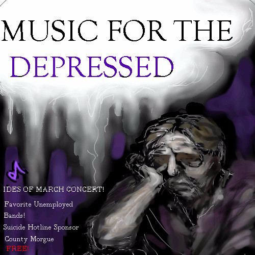
This is the first time I've used the lettering, so it's too close to the edge, darn.And I just learned how to use it, right on this poster.First time I have used computer, to do a poster(did it the old fashioned way,long ago, for newspaper ad,lettering, ect.) Yow, it's different, no paste up.It looks very unprofessional, bad margins, awkward,but it takes practice to do it this way. Oops, I forgot the number to call? for exact time?oh,you just call suicide hotline, yeah. should have put exact time on, most of the time, on poster,or number to call for it. It was not what i wanted,I wanted a different style, came out this way.Wanted a painting like van gogh, or starkly colored painting, rough, nah, came out this way. ok, wow, takes lots of practice to do this kind of thing, as for style and margins. ect. "white space." well, it was fun, even the depressed need concerts, but, heck, they can't pay for them,depressed people are poor. I should look at some real posters. Old "Jefferson Airplane" ones do not count.Old 60's do not count.They were all wierd lettering, which I like.(this is fun!)But,they were unreadble!But groovey.
|
You need to be logged in to post a comment. If you don't have an account, sign up now! | |
drawn in 2 hours 19 min