| |||||||||||||||||||||||
| Public Boards/Intermediate | |||||||||||||||||||||||
|
Dromophobic_o.o
(Jul 20, 2006)
Cuz it is. |
| ||||||||||||||||||||||
| Public Boards/Beginner | |||||||||||||||||||||||
|
Dromophobic_o.o
(Jul 19, 2006)
Quick little thing/
Dromophobic_o.o (Jul 20, 2006)
Ahahaha ALL U SASUKE HATERS xDi dont care much for sasuke. =\ i just like how he looks. Itachi is better, so i'll draw him sometime later =D
squee (edited Jul 20, 2006)
I find him sexy, and his attitude problem positively manly. But I dont like him when he gets overly serious. I'm in love with Naruto ;D His childishness is too adorable to resist. Plus when he's older he's ubertasticly sexy.
SanzoGirl (Jul 20, 2006)
Yesss! Draw Itachi for me! *D*Or Gaara, he's my first favorite in Naruto. It goes, Gaara, Itachi, Neji, Then when they're older, Gaara, Neji, Itachi
O_O (Jul 27, 2006)
OOHDRAW DA FAT MAN ;D Lawlz@fatty. OH NOOEZZ WAIT Draw Joe with his Beethoven hair. XD IM SERIOUS hahahaha |

| ||||||||||||||||||||||
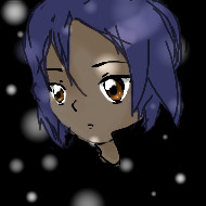
| Public Boards/Intermediate | |||||||||||||||||||||||
|
Silvair
(Jul 14, 2006)
I was only after the canvas space.. so that's why it's on intermediate. (sorry!)
xiau (Jul 15, 2006)
No need to apologize, this is definately worth intermediate!It looks just like him! I really like how you only used shades of blue :]
GermanFeet (Jul 15, 2006)
It looks a lot like him. Good job! I love the style of this picture, great use of colors! ^_^
kuramaandhiei (Jul 19, 2006)
yeah none of your picture deserve beginner they deserve better^^ |
| ||||||||||||||||||||||
| Specialty Boards/Collaborations | |||||||||||||||||||||||
|
I'm really happy with how this came out, and thanks broken-lock for accepting to do this collab with me. It was really fun.
5 comments
– latest 4:Intarweb kept failing everytime I tried to work on this. =^*x*^= Augh.
....I know it looks wonky. Just.....pretend it doesn't. <:I Agh! So much better than the last backround. I decided mine looked way too ugly to keep it the way it was. I think this can be done now. Yay! >w<
101_Torchic_101 (Aug 7, 2006)
(*X*) SO CUTE! (giggles to death) I just wanna hug them! =O
seraphtide (Aug 20, 2006)
wow, this turned out really neat. I like it a lot |

| ||||||||||||||||||||||
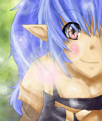
| Public Boards/Intermediate | |||||||||||||||||||||||
|
Dromophobic_o.o
(Jul 19, 2006)
i think the proportions might be off @_@;
squee (Jul 19, 2006)
Interesting approach. lol. this is pretty cool :Dbetter.
kuramaandhiei (Jul 19, 2006)
this is new...but i like it
hideyourface (Jul 19, 2006)
her body is too long and cylindrical and her head is too big. |
| ||||||||||||||||||||||
| Public Boards/Beginner | |||||||||||||||||||||||
|
FIREandSOUL
(Jul 19, 2006)
my first attempt at Lascaux... ow my hand... I need a break but I'm continuing it later... but just in case my computer crashes *submit* ^_^oh yeah, and I used a mouse too... so... ew... I need a tablet
kiketsu (Jul 19, 2006)
wow, kels. this is seriously amazing! and WOW! you're first time using this program!!! ITS JUST WOAH! hehe. WELOCME TO 2draw!!!! <3omfg... my internet just crashed so I'm saving it... NOW ^_^ just in case
using a mouse... my first time ever using this website so.. bear with me please, I know it's sloppy, I'll keep working but it's break time! Well, it's GETTING somewhere... but I still am horribly bothered by her face and hair and she just looks too blurred... it's frustrating but at least there's a developing background... PLEASE Critique in detail!
kiketsu (Aug 3, 2006)
ok. it IS a lil blurry. you can fix that up by using bolder colors. and i'm guessing that night elves dont have pupils and thats why you didnt put any there. but its looking really good so far. keep it up.oh, did you use that tablet you got? |
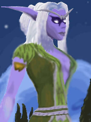
| ||||||||||||||||||||||
|
OlFrozenTearslO
(Jul 18, 2006)
^^; Any recommendations for a tablet?Because I don't know how to delete an image...and because I'm waiting for more space on two of my pics ...whoopee? The forehead is too big isn't it. >.< I wish I had a tablet, any recommendations?
Thanx XD ~<3
kuramaandhiei (Jul 19, 2006)
try best buy...i want a tablet too but ill stick to the mouse for a while
SomethingEvil (Jul 19, 2006)
I reccomend a wacom tablet. I got lots of reccomendations to get one of them and I love mine now that I got one. Nice btw ^^~ |
| ||||||||||||||||||||||
|
hiei14
(Jul 19, 2006)
xP Yu-Gi-Oh Fan Art.
kuramaandhiei (Jul 19, 2006)
good first picture..and welcome to 2draw ^_^
hiei14 (Jul 19, 2006)
xD thanks.
senshi (Jul 20, 2006)
what kurama said.hey, similar names |

| ||||||||||||||||||||||
| Public Boards/Intermediate | |||||||||||||||||||||||
|
kuramaandhiei
(Jul 17, 2006)
im getting better ^_^
kuramaandhiei (Jul 18, 2006)
weee gonna work on it nowi hope you ppl like it
pancakes_rock (Jul 18, 2006)
yesh i do like it very nice colors =3
kuramaandhiei (Jul 18, 2006)
thanks i hope you like it |

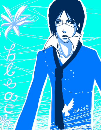
| ||||||||||||||||||||||
|
22 comments
– latest 4:
Yukita.Riku (Jul 19, 2006)
paradise kiss is very good. i've read a couple of the books, and I definatly reccomend it.
DrsFan (Jul 20, 2006)
This is very good.
taru_cha (Jul 20, 2006)
wow! her outfit is TOO cute!!! you draw so amazingly x3
julianapegas (Oct 17, 2006)
It's a great outfit! I also like very much the presentation, this unusual color scheme... neat idea :DAbout Paradise Kiss, read the manga. The anime is not very good if you compare it to the manga... the mood of the manga is much more definite, and some situations and jokes appeared a tad distorted *for me* in the anime ^^ I'm not saying the anime is bad, but the manga is 1000 times better :D |

| ||||||||||||||||||||||
| |||||||||||||||||||||||
| 2draw.net © 2002-2024 2draw.net team/Cellosoft - copyright details - 0.34sec (sql: 42q/0.19sec) |
IT'S MAGIICC
ya knowwww~~