| |||||||||||||||||||
| Specialty Boards/Elite Bastards | |||||||||||||||||||
|
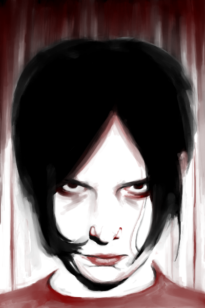
staci
(Jan 5, 2008)
i saw this kid on tv that looked like jack white so i used a ref of jack white to draw this even though it doesnt look like him. the end. |
| ||||||||||||||||||
| Public Boards/Intermediate | |||||||||||||||||||
|
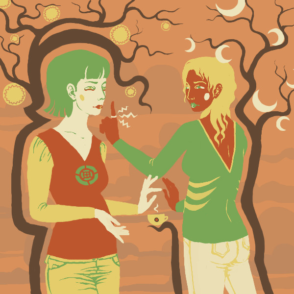
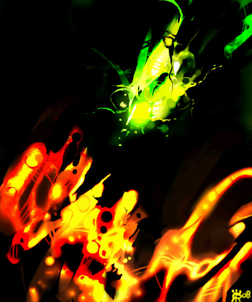
patienceisoverrated
(Jan 21, 2008)
pacifists fighting over a cup of expresso
davincipoppalag (Jan 21, 2008)
These pictures are so unique and creative!
forgotten-memory (Jan 21, 2008)
I love the colour scheme and your proficiency with solid colours!
clover_pocky (Jan 21, 2008)
Yes. I would fight someone for coffee. *nods* Especially in my 9:00am anthropology class. Such pretty colours. I love the definition of folds in the pants. |
| ||||||||||||||||||
|
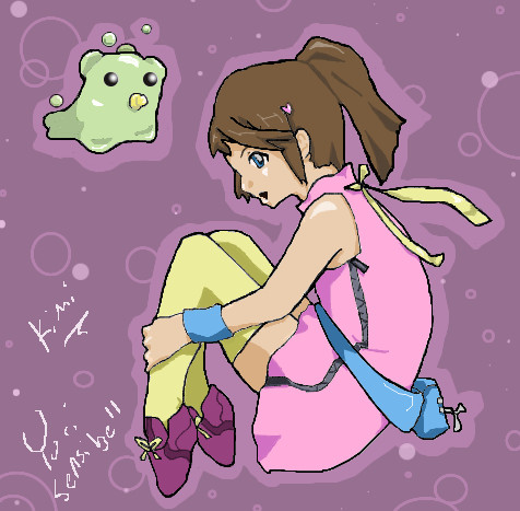
Ruthallia
(Jan 18, 2008)
Oh goodness, yet another original character. Minus the Digimon in the corner. And yes, I'm one of those people that leave the computer for hours. But is that really a good excuse? No, not really. I really think this would be more appropriately placed in the "Beginner" section, but as the canvas is too large, I cannot. D: My apologies, everyone.
clover_pocky (Jan 21, 2008)
This is really cute. :) It is obvious you put effort into this, - I don't really see it being a problem up here on this board. The people who do not belong on intermediate are the ones throwing out shitty anime drawings that took them 5 minutes. The colouring scheme is really very nice. I like the muted lavender in combination with the character's colours. However, I have some qualms with her anatomy - her feet should be as long as the space between her wrist and the crook (bend) of her elbow. Right now they're very tiny, and I'd be surprised if she could walk on them at all. :) Also, with the way the blue armband is arranged, her arm looks like it... o_o;; does something odd around her wrist. It doesn't stay straight. Sometimes (and I always try to do this when I'm thinking) - it helps to draw the figure, then the clothing, which I see you sort of did, but remember that the human body has definition as a collection of shapes. You achieved that really well on the belt, but it feels like you got a little bored on the smaller details. I personally would like to see more definition of lineart and dynamic contrast in the shading, but trust me, that's something everyone's working on, so you're off to a good start. :) <3clover
Ruthallia (Jan 26, 2008)
Thank you so much for the detailed crit <3 It really does help. I didn't notice the other issues until you stated them, except for the feet (I noticed, but admittedly got lazy D: ). The next time I draw Kimi, and while drawing in general, I'll be sure to keep everything you've said in mind. Thanks ~! <3 |
| ||||||||||||||||||
|
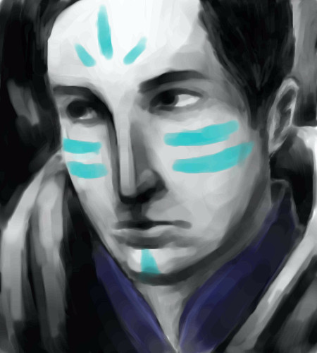
pokey
(Jan 19, 2008)
i really suck at titles... hum hum. no refs, yo. hope you all enjoy. :9 i am tired of staring at this!
davincipoppalag (Jan 19, 2008)
You're doing pretty good with these for no refs.
lori (Jan 20, 2008)
yeah I think so too, I certainly can't draw faces this well without a ref. They all come out looking like losers
clover_pocky (Jan 20, 2008)
Hee, I like this character of yours. His nose is rather long, but for some reason it fits him nicely. Hooray for blue tattoos. :D |
| ||||||||||||||||||
|
jpjp1052
(Dec 11, 2007)
photo ref
davincipoppalag (Jan 20, 2008)
Dolls are kinda creepy aren't they.. this is great
clover_pocky (Jan 20, 2008)
*hides* That -is- a bit creepy. That one with its eyes closed is gonna eat me once it gets a body. >>; |

| ||||||||||||||||||
|
Roytje
(Jan 20, 2008)
..my mind.
KuteDymples (Jan 27, 2008)
To me it looks like an abstract dancer. I love the colors and the black background. I can see so much action exerting from this. Messing around :)
NOVEMBER93 (Jan 28, 2008)
These colors are awesome. Very nice :]
Sweetcell (Jan 28, 2008)
Looks like my own, chaotic, which is a good thing.... sometimes. X} |
| ||||||||||||||||||
|
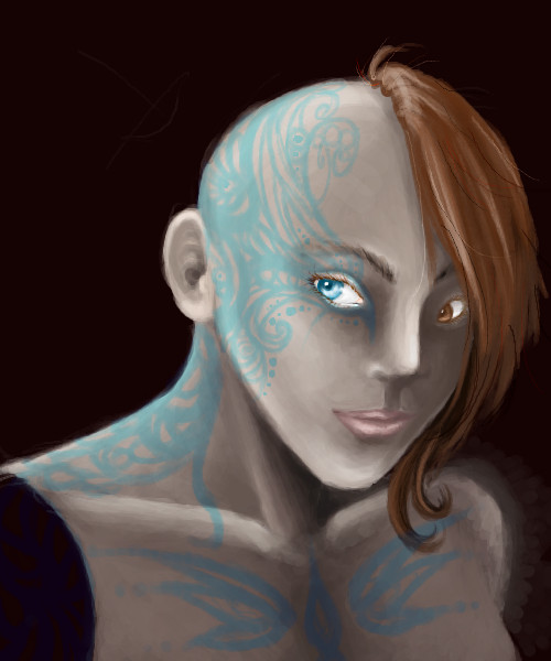
clover_pocky
(Jan 19, 2008)
This is Allicit, again.
davincipoppalag (Jan 19, 2008)
What an interesting character.
penpen (Jan 20, 2008)
I like how her eyes are different colors, and her hair is sweet :D
Wraith (Jan 20, 2008)
Awesome character! She looks pretty even bald.
clover_pocky (Jan 20, 2008)
Thanks. :) That's actually not a fashion statement, she's that way for a reason - however, you'll have to read the book she's in to find out why. |
| ||||||||||||||||||
|
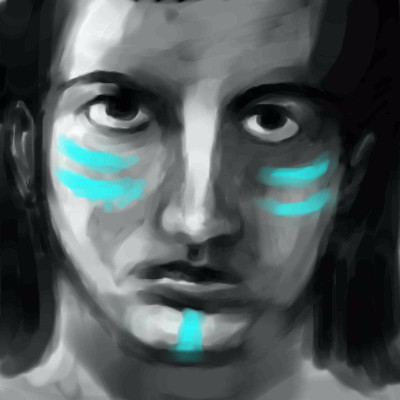
pokey
(Jan 19, 2008)
no refs! i was working on something exactly like this on opencanvas, but i kind of broke it... i'm frustrated cos' i don't wanna buy OC and it's the easiest thing to use for me. so i go here, and finish what i wanted to friggin' draw... whoopee! i'll fix this a bit later on if i feel like it (construction/shading errors) and uhhh, i hope y'all like this. it's 6 AM and i have to sleeeeeeep and i'm going crazyyy saflskfg.
lori (Jan 19, 2008)
I like it. I think it came out great, looks real without a ref. can't beat that
davincipoppalag (Jan 19, 2008)
This is really good for no ref
clover_pocky (Jan 19, 2008)
Good contrast, I love the bright blue on the grey. :) |
| ||||||||||||||||||
|
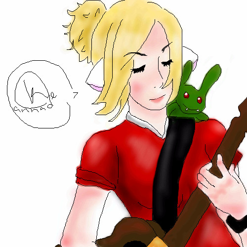
Hotaru-chan
(Jan 19, 2008)
Avatar art for gaiaonline. I can't believe I spent this much time on a freebie. :/I can't really think of a background idea, anyone have any recommendations?
Hakkai (Jan 19, 2008)
Soooooo gewd.
clover_pocky (Jan 19, 2008)
Before you add a background, I'd recommend improving the quality of your lineart, finding a definite source of light for your shading and adding detail to the piece as a whole. It's a cute concept, but the colouring seems sloppy. Even if something is free, you should ensure that whoever gets the image gets something of quality. Just my two cents. |
| ||||||||||||||||||
| Public Boards/Beginner | |||||||||||||||||||
|
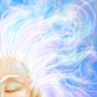
perchance
(Dec 4, 2007)
This is my first time using oekaki (though I have used GIMP before.) I did this by mouse.
clover_pocky (Dec 6, 2007)
Dunno why no one said anything before; this is really, really gorgeous. I love the blue in the eyelid. The character is very pretty - even with the us of the burn tool all over the place, it's still very light and pretty. (Sorry, eloquence esapes me, it's 2 in th emorning here, and I like this vey much. ) |
| ||||||||||||||||||
| |||||||||||||||||||
| 2draw.net © 2002-2024 2draw.net team/Cellosoft - copyright details - 0.28sec (sql: 36q/0.11sec) |
He also looks like he's about to bust a cap on someone's ass. Lovely impact. :)