| |||||||||||||||||||||||
| Public Boards/Intermediate | |||||||||||||||||||||||
|
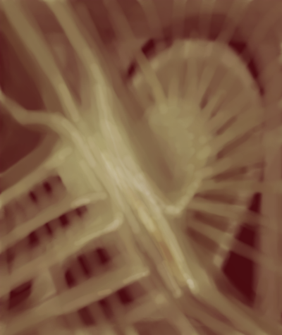
candy flipping jaw
Kloxboy
(Dec 14, 2006)
[.[.[.[.
a_blue_orange (Dec 15, 2006)
oo neato
nekopon (Dec 15, 2006)
thats pretty cool :D *poke*
HunterKiller_ (Dec 15, 2006)
I dunno what 'candy flipping' is but this is a nice painting. What attracts me most are the uh... what would you call 'em... grids?
Sweetcell (Dec 16, 2006)
I don't know what it is about this picture that's attractive, the colors you used or the wonderful shell like object above right, but it's one of my favorites. Makes me think of candy sculptures. |
| ||||||||||||||||||||||
|
15 comments
– latest 4:
Miss_DJ (Dec 30, 2006)
really a nice draw. Warm and rich looking.
davincipoppalag (Dec 30, 2006)
Well done , and welcome!
cmb (Dec 30, 2006)
stunning use of colours, beautiful.
djramz99 (Dec 31, 2006)
Amber is pretty. Nice painting and welcome! I haven't gotten used to Lascaux yet, but it looks like it has a lot to offer. |

| ||||||||||||||||||||||
|
Juni_gatsu
(Dec 10, 2006)
Yeah.
hideyourface (Dec 20, 2006)
just because comments are negative doesn't mean they're not decent. If this is a style, its a crappy one because the torso looks flat and the arms look like tubes.
Juni_gatsu (edited Dec 21, 2006)
It was a real reference, for you information. And given that my "crappy" style happens to be mostly manga-ish, it would infact, make sense to use a manga reference, would it not? And how about, instead of being childish and insulting, you actually take the time and post something constructive, like suggestions.
Dromophobic_o.o (Dec 21, 2006)
This is not "crappy" at all.i absolutely love it.
Yugo (Jan 1, 2007)
Yeah, no need to be a wanker. D:I likes it. XD |
| ||||||||||||||||||||||
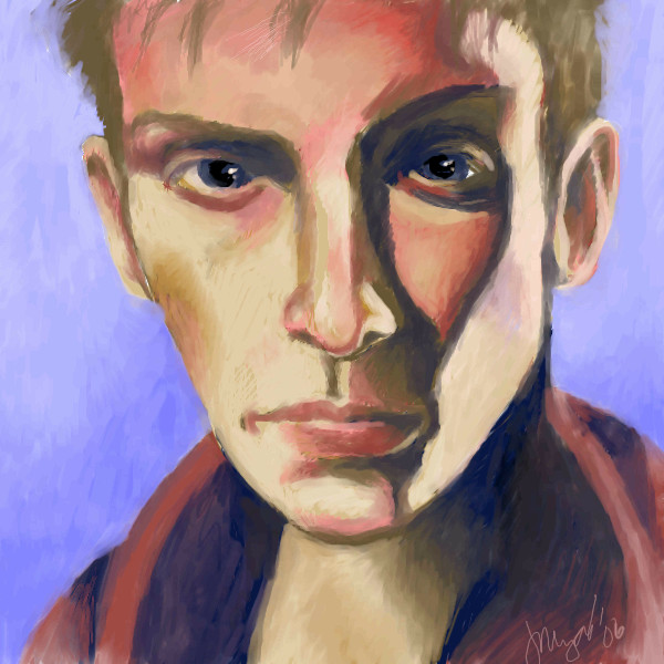
|
jooniper
(Dec 14, 2006)
i guess i'm going to have to call this done because it's becoming a monster of a file.
serhatkurt (Dec 19, 2006)
wery good!
davincipoppalag (Dec 19, 2006)
This is so well done! Nice work!
Sweetcell (Dec 19, 2006)
The red reflections in his skin is wonderful. Love how you painted this. His eyes maybe need a bit more light in them but other than that, fantastic. Don't know if I ever welcomed you so.... welcome.
friend (Dec 19, 2006)
Holy wow! Great snozberries! |
| ||||||||||||||||||||||
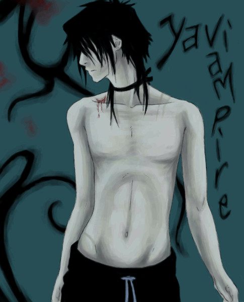
|
Kloxboy
(Dec 13, 2006)
-+-+-+-+
Pseudonymous (Dec 14, 2006)
Wow...I'm stunned. Those teeth...The realism and yet fantastical nature of this...the hideousness and beauty...the juxtaposition of all the various elements that make this so unique...I'm dumbfounded.
IkariIreuL (Dec 15, 2006)
that is some of that pics from you that have this weird and evil atmoshere, not just the character but the entire pic ... w/ this 'blur' and stuff.
cianteed2 (Dec 16, 2006)
This is SOOO gross. I mean it's an awesome AWESOME drawing but it's probably going to give me nightmares.
Sweetcell (Dec 16, 2006)
To me for some reason, maybe because of the red lips, he looks like an evil skeletal clown. Ya, nothing worse than an evil skeletal clown. Love the wierdness that comes out of your head. |

| ||||||||||||||||||||||
|
thesolarwinds
(Dec 9, 2006)
shaking too much to finish.
davincipoppalag (edited Dec 10, 2006)
Oh I really like this one ! This is pretty!!!
Sweetcell (Dec 11, 2006)
Love it, love horses. You can feel the motion in his stride. Will be sweet when it finished.
Qwerty_Wittle_Fawah (Dec 13, 2006)
this is really beautiful...I love the stance on the horse...very nice
a_blue_orange (Dec 14, 2006)
wow this is great, I have really seen horses take off like that too and I think you really captured it :]I hope you stop shaking soon :[ |

| ||||||||||||||||||||||
| Public Boards/Advanced | |||||||||||||||||||||||
|
zep
(Dec 12, 2006)
...
frootcake (Dec 13, 2006)
such beautiful colours, love your work
a_blue_orange (Dec 14, 2006)
oo I LOVE the background!
solve (Dec 14, 2006)
I gotta agree with ornage. I am liking the distorted perspective of the background. Its disorienting for the subject, Im sure.
Alter.Native (Dec 16, 2006)
Fragments of a story untold. I like the muted colors and the expression in those eyes. |

| ||||||||||||||||||||||
| Public Boards/Intermediate | |||||||||||||||||||||||
|
voodoomoonwolf
(Dec 13, 2006)
HE IS NOT MJ RAR......
a_blue_orange (Dec 13, 2006)
rar
voodoomoonwolf (Dec 14, 2006)
yeah...it was the weird angle of the pic and such...really i was experimenting with blocking out color first then do everything since i ussually go with the line art first
jooniper (Dec 15, 2006)
I gotta agree that it doesn't look like Davey. He's got a belly and a freakishly large head. Haha. I love the drawing regardless, though. It's more attractive than it's intended subject. :)
cianteed2 (Dec 16, 2006)
I could tell it was a davey drawing right away - good job, sweetie. |

| ||||||||||||||||||||||
|
Axil62
(Oct 4, 2006)
. |

| ||||||||||||||||||||||
|
The_Chosen
(Dec 12, 2006)
from Meteor Methuselah/Immortal Rain refs used :that was harder than I thought it would be O.o erk! *Zzz... Left: The Immortal Rain Jewlet Right: Yuki/Y's reborn eternaly
solve (Dec 14, 2006)
Well done :D
Angel_Artist (Dec 28, 2006)
your lineart is excellent and because there is not any apparant small details that stick out, it keeps the piece to the theme that you wanted. i say again, jen is the queen of lineart! all hail her!
TheInfamousFlatline (May 2, 2007)
bah! I love Immortal Rain!! T-T (with many many hearts I love it)
Great_white (May 2, 2007)
The style is amazing!Nice work on this one! |

| ||||||||||||||||||||||
| |||||||||||||||||||||||
| 2draw.net © 2002-2024 2draw.net team/Cellosoft - copyright details - 0.20sec (sql: 35q/0.09sec) |