| ||||||||||
| Specialty Boards/2draw Ink | ||||||||||
|
sci-fi style
still needs a lot of work... going to try for a lot of special effects.
30 comments
– latest 4:lol it is the teenage mutant ninja spark plug -- Mwaha! I'll be working some ideas on this now... ph34r. ~method3 -- gunmetar!!! feel free to continue messing around, hopefully I didn't do anything that would bother you. love the radiating lines addition. -z
dorothyblueeyes (Sep 2, 2012)
i like it, altho my tastes run to the black/white simpler "2 and robot".i guess simplicity appeals to me, but this is excellent.(i don't know how people do these,either.heh.)
Cookie2 (Jun 22, 2021)
wow. just wow.
davincipoppalag (Jun 22, 2021)
zack designs computer games now.. he's quite good
Cookie2 (Jun 22, 2021)
:0 |

| |||||||||
|
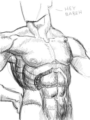
Zack
(Jun 13, 2004)
Warning: utterly enormous picture (1024x768)To see the full size image, view it individually and set the zoom to 100%. Right now the default zoom on this image is 25%. If your computer has difficulty resizing the image, go to your 2draw control panel, then the section labeled "Effects Settings," and disable the animated zoom feature. Strong enough for a T-shirt, pH balanced for a desktop. edit: I'm calling this finished for the moment in order to free up a slot in my studio. I'll work on it more later.
davincipoppalag (Jun 14, 2004)
This one reminds me of the posters for that Python movie "The Life of Brian" dunno why!
taori (Jun 14, 2004)
that's classy. very classy. i like it. i'd buy the t-shirt.
Ty854 (edited Aug 2, 2004)
It's on my desktop now.
L.Monte_Slim (Sep 21, 2008)
I agree "classy"...Stately even. hum... But, I too feel there's a certain familiarity about this work. Maybe it is the way the large centered,"golden" colored image, draws the eye directly into the vanishing point on the horizon, at the base of that dramatic "starburst" effect. Now just a cotton pickin'... Perhaps someone less biased than I should also do a side by side comparison of this work and the honored banner flown daily over the 48th state of the Republic. simular? maybe it's just me... nah. |

| |||||||||
| Public Boards/Beginner | ||||||||||
|
Zack
(Jun 4, 2006)
He's happy!
tandrew971 (Jun 12, 2006)
hes very cute.
SneakyWalter (Jun 12, 2006)
Perhaps its the Only thing he knows.Or maybe he Doesn't have a brain the size of a walnut.
TheCrimsonKing (Jul 9, 2006)
ooo pretty shading
Qwerty_Wittle_Fawah (Jul 29, 2006)
I love this...how could I have missed it? |

| |||||||||
|
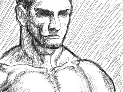
Zack
(May 22, 2006)
Another Burne Hogarth ref. The guy has an interesting way of constructing the body.
tehnoogin (May 22, 2006)
you know your anatomy :)
davincipoppalag (May 22, 2006)
Good study, Zack..
Pseudonymous (May 22, 2006)
Good one, Zack. Interesting way of drawing the figure...it makes it look like it was cut out of something.
safescene (May 23, 2006)
The dialogue! Brilliant. |
| |||||||||
|
Zack
(May 22, 2006)
used a couple of Hogarth references. the torso looks odd partly because I had to crop it at a strange spot.
NOVEMBER93 (May 22, 2006)
very interesting...i say intermediate
Sweetcell (May 22, 2006)
November Zack is an Elite Bastard, I think he can pretty much draw where he wants. The only real difference for most of the boards is size.The only thing for me Zack are the collar bones, otherwise *yowza*.
davincipoppalag (May 22, 2006)
Yea..the collar bones look a little odd. Good study though |
| |||||||||
|
Zack
(Aug 17, 2005)
people are so difficult. sheesh.
KH44N (edited Aug 17, 2005)
This is really nice. I like the colours u used. Good job!
LisaAnne (Aug 27, 2005)
Interesting...brings about mixed feelings...but overall I like it.
Zack (Aug 27, 2005)
something about the eyes seems weird to me. too wide?
LisaAnne (Aug 27, 2005)
Yeah, I think on the Left the eye might be a little wide, because of where her head would start to round the "corner", but I mean I didn't notice till you said something.Still a nice piece. |

| |||||||||
|
Zack
(Aug 16, 2005)
thirsty
davincipoppalag (Aug 16, 2005)
Zack is entering his "green period" lots of greens..
renire (Aug 16, 2005)
Wow this is amazing! I love dark green :D it looks like some toher planet or something... *gives Zack a drink*
SneakyWalter (Aug 16, 2005)
I like the background on this. The tree looks very real.
TaCO (Aug 24, 2005)
O.O Simply beautiful |

| |||||||||
|
8 comments
– latest 4:
Zack (Jul 2, 2005)
Thanks! I just finished the one-point perspective tutorial, it is viewable here. Two-point will be next. I would love to see more activity on the 2draw Wiki, as it could become a fantastic resource.
Renuar (Jul 2, 2005)
This is very smooth and clear cut zack, impressive.
DeadlyBlondeArcher (Jul 2, 2005)
I like the way it's kind of misty towards the back, and it feels like you could just walk into it. I'll definitely be checking out the tutorials.
DelicateDerelict (Jul 2, 2005)
the tutorial is very well done. thank you |

| |||||||||
|
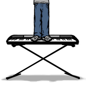
Zack
(Jun 3, 2005)
indescript
davincipoppalag (edited Jun 3, 2005)
This is "sole" music , isnt it? (It would make the concept of playing a step higher..a little easier to understand)
Kraisa (Jun 3, 2005)
he he he its a keyboard stand...
WhoopsieDaisy (Jun 3, 2005)
that is adorable...simple, clean, nice. the a sharp to the right of his feet is funky though >< |
| |||||||||
| Public Boards/Intermediate | ||||||||||
|
4 comments
– latest 4:
Zinc (May 30, 2005)
such a way with pictures...
The_Chosen (May 30, 2005)
I really like this. The brown line art looks great.
Cordelia_Pink (May 30, 2005)
Nice!!!! It's cool that it's a bathtub that's she in rather than a ship. hehe it's about time someone invented bathtub helicopters.
davincipoppalag (May 30, 2005)
I think Leonardo DaVinci and Igor Sikorsky got together with the backing of the American Standard fixtures company to build this for her. I particularly like the landscape below. This is a fun picture Mr. Zack.(now did you write down that minuet yet!! Get over there and Do it!...Quit stalling~!) |

| |||||||||
| ||||||||||
| 2draw.net © 2002-2024 2draw.net team/Cellosoft - copyright details - 1.20sec (sql: 30q/0.71sec) |