| ||||||||||||||||
| Specialty Boards/Elite Bastards | ||||||||||||||||
|
Look
(Jan 27, 2004)
A fan art of Yuna from final fantasy X2 as a white mage. She's praying |
| |||||||||||||||
| Public Boards/Beginner | ||||||||||||||||
|
juliamandapanda
(Jul 1, 2004)
were never to be!
lp_phaery (Jul 2, 2004)
Yeah this is really good. I especially love her hair and the clouds look so puffy.
ObeseityKills (Jul 2, 2004)
I like the coloring! It purdy.
davincipoppalag (Jul 2, 2004)
Very nice colors and shading.
Knockoff (Jul 3, 2004)
Oh wow. Your art rocks! I love your style, and the the colors are great. Nice beach background. |

| |||||||||||||||
|
Mido-chan
(Jun 24, 2004)
^^ I'm new here. No background because searching for colors made me tired... x_XAnyways... Asura says "Hola!".
MD_Anonymous (Jun 24, 2004)
Hi! Welcome to 2draw! As always, even the picture is finished I can't help making suggestions1 ^^ Maybe if you did some highlights and more shadows and cleaned up the lineart more. Otherwise, nice job and welcome!
WildMageDaine90 (Jun 24, 2004)
Heya! I saw the name of the piece and instantly needed to see it! "Asura" (if you pronounce it properly) are demons in Hindu mythology...o_O did YOU know that? LOL. It's really good for a first attempt ^^'' WAY WAY better than me! ~WMD90
Mido-chan (Jun 24, 2004)
Had no idea. o_o; I would of did better but colors are difficult to find, or atleast the ones I want. :/
Ryuusei (Jun 24, 2004)
Welcome to 2draw.net! ^_^ You're awesome!! I love her face! *.* |

| |||||||||||||||
|
Paranoidkittie
(Jun 18, 2004)
needs colorhope you like it?
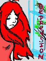
MD_Anonymous (Jun 19, 2004)
Yes. I like. I think you could do even MORE shading to give it even MORE depth, and maybe clean up the lines. Unless you think the sketchiness adds to the depression (thats a compliment ^^). Nice job!
WildMageDaine90 (Jun 19, 2004)
it's pretty...she looks like I felt for a while this week. Good job. ~WMD90
badgervince (Jun 22, 2004)
*sniff sniff* soooo sad... |
| |||||||||||||||
|
KiLi
(Mar 18, 2004)
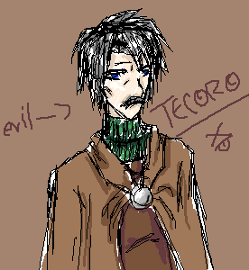
sketch of a chara from manga my friend and i are doing...Sameeeera, if u reading...issa this a decent sketch?
SaheraNights (Mar 18, 2004)
XP nice.. i like it...haha...good enough sketch for meh..since meh char sketches look like crap all da way
bluesky (Mar 18, 2004)
ooh i didn't hear bout him for your manga... ^^ gotta update me lol... yes decent sketch i can't sketch on the comp...
WildMageDaine90 (Mar 20, 2004)
issa very decent sketch. don't belittle your skillz, dude. u rock. you actually have skillz. thanx. he such a shifty chara...bwahahaha! this iz gonna be sooo funny...muahahaha --Sim
bumpinthenight (Jun 16, 2004)
funkay.... the lines and colors could be neater, but this is an interesting character... XD wooooot... yaargh.... i have a science provincial tomorrow! |
| |||||||||||||||
|
WildMageDaine90
(Jun 13, 2004)
Meh...well, it's something. I was bored and listening to depressing bloody music. Annyway...13+ for the blood, I guess. Don't flame me...at least I'm trying...
ladylime (Jun 13, 2004)
hmm thats creepy.,like with the eyes they starin at you! :P neway its jeanne
mangaflip (Jun 13, 2004)
i don't why but this picture seem's to be very interessant (colour choice ...line etc....)
davincipoppalag (Jun 14, 2004)
I kinda see Michael Jackson when I look at this...
WildMageDaine90 (Jun 15, 2004)
lol...you guys...it was supposed to be a girl....o well. thanx for the comments |

| |||||||||||||||
| Public Boards/Intermediate | ||||||||||||||||
|
Gigge
(Jun 11, 2004)
I drew another outline for a picture that was mostly glass and then I realized I had never actually drawn glass. Not as bad as I thought it woulc be. Things I learned this draw.....keep blurring, keep blurring, keep blurring....
davincipoppalag (Jun 12, 2004)
Blur is good..but you also need sharp edges.. use the antialias setting and a small brush..and then blur the inside edge (it helps to enlarge when you do this part) with the sharp outlines the rest will look ever so much more real...the top of the clear glass vase is off a bit in perspective I believe. The front edge needs to be a bit higher, it seems to drop too low? This is a good job! I particularly like the blue one!
emmamommalag (Jun 12, 2004)
I love that blue one. Nice job on all of it. :)
WildMageDaine90 (Jun 13, 2004)
that's pretty good! i agree with davincipoppalaq on the need of more defined edges, but it's cool. i like.~WMD90 (LOL)
Gigge (Jun 13, 2004)
Yup...I agree too! The problem started after version two when I decided to add a background so you could actually see the glass. That didn't work at all. The clear glass got so over worked it wasn't worth salvaging. Better to take the comments and try to incorporate them into another picture. Thanks for the tips though. :) |

| |||||||||||||||
| Specialty Boards/Collaborations | ||||||||||||||||
|
Meet Flavius...A common Jack-a-lope with a uncommon pineapple. (he's a smart jack-a-lope! yup)
9 comments
– latest 4:I'll make the sketch darker and not so sketchy later!! Can't wait for you to work on this knockoff!!! it'll be coool ;)
amuy (Mar 18, 2004)
hehe two eyes.. oh wiat four .heheWell this is all I could get done today. I'll try to do some more tomarrow! I suck at lightening so Knockoff if you want to do redo, fix or add stuff then by all means PLEASE DO!
Knockoff (Jun 9, 2004)
It looks good! Very nice clouds, If you want, continue and put a few more clouds! (Like one more cloud more down to the ground.)
amuy (Jun 10, 2004)
yah, i think that would look better too ! *runs off to put an extra cloud* |

| |||||||||||||||
| Public Boards/Beginner | ||||||||||||||||
|
strawberry
(May 23, 2004)
edit: mite call this finished =\
Ty854 (May 23, 2004)
Nice Lineart. you are improving. I look forward to seeing this one done. ^^
Fluffysheep (May 23, 2004)
Awww, cute puppy ! Very nice :3
dragontamer13 (May 24, 2004)
OOOHHHHH..... O.O CUTEIEPIE!!!! very nice work...
WildMageDaine90 (May 28, 2004)
ish sho coot!~WMD90 |

| |||||||||||||||
| Specialty Boards/Elite Bastards | ||||||||||||||||
|
method3
(Sep 27, 2003)
Tripping the light fantastic...-------------------------------- The first edit went over the 800kb limit on the advanced board, so it is therefore ending up on the elite bastard board because I really don't have a choice. At least it seems submittable, although notably still abstract and un-interesting for the most part.
dixielandcutie (Mar 10, 2004)
lol, davinci. i do like what you're doin with it! keeeep it up!
ProjectZeppher (Mar 11, 2004)
this sucks...
Maiko (Mar 13, 2004)
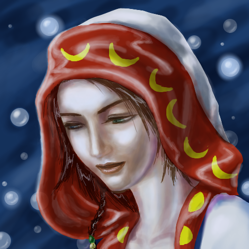
teh head's a bit big O_O;; an' her body is kinda scary ^^;;but i like the lineart, very smooth
bumpinthenight (May 25, 2004)
Woah.... Good anatomy.... Interesting headpiece you got there, too! (or is it a headpiece... :P) |

| |||||||||||||||
| ||||||||||||||||
| 2draw.net © 2002-2024 2draw.net team/Cellosoft - copyright details - 0.25sec (sql: 40q/0.12sec) |
--WildMage