| |||||||||||||||||||
| Main Forums/The Post Board | |||||||||||||||||||
 |
Pantera (edited Oct 3, 2007)
Here you go people, anyone that wants to argue about anything, please do it here instead of peoples drawings, if you need a referee I am be there :) PS forgot to mention that a drawing has been deleted and I believe it was because of the arguments that had been started on it, so please people I dont want to see anymore deletions k? this is the place to "argue" in :)
140 comments
|
||||||||||||||||||
| Public Boards/Intermediate | |||||||||||||||||||
|
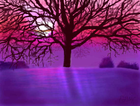
elly
(Nov 22, 2007)
=) |
| ||||||||||||||||||
| Public Boards/Beginner | |||||||||||||||||||
|
Purple_Misery
(Nov 22, 2007)
Hi :3I'm new I think the image can't be seen? Or can it? T_T Did I work for nothing? Anyway,I don't like the programm I drew this in. I like Shi-Painter better. But on Kupika.com it's functionating alot better. I mean,I can't find the multiplylayer option in Shi-Painter. Or am I just blind? Oo;
UnWanted (Nov 22, 2007)
The new server move seems to have caused alot of this.. your image is there don't worry. Just a few kinks to work out me thinks? hell I dunno, I'm not Marcello :"PCheck your applet options in the control panel for your profile.. there's a 2nd layout for Shi- it might have what you're looking for there.
Sweetcell (Nov 22, 2007)
I can see it no problem, I think Marcello got the kinks out. Nice first pic, welcome.One thing, the guy on the left looks weird, like his face is distorted. I think because his eye's are really low and too close together in comparison to the size of his head. But otherwise, gain, nice picture.
Kyuubi_Bear (Dec 7, 2007)
Naruto looks really cute! And so does Sakura! But Sasuke's mean in the manga, so I never like him >_> |

| ||||||||||||||||||
|
njoubert
(Nov 21, 2007)
We just finshed moving stuff
marcello (Nov 21, 2007)
wee!
UnWanted (Nov 21, 2007)
If you zoom in enough you can see satan smiling :")
davincipoppalag (Nov 21, 2007)
Glad it finally worked |

| ||||||||||||||||||
| Public Boards/Advanced | |||||||||||||||||||
|
Axil62
(Nov 10, 2007)
and purple
PS (Nov 11, 2007)
Great work, I like the lighting and the canvas size/composition.
Arique (Nov 11, 2007)
your work is really inspiring, and your not afraid to just whip out a sketch either. just sweet.
Miss_DJ (Nov 13, 2007)
contemplating something? this is nice.
UnWanted (Nov 21, 2007)
.. Did he bite his tongue maybe? :"P the lighting is nice |

| ||||||||||||||||||
| Public Boards/Intermediate | |||||||||||||||||||
|
vapor
(Jul 13, 2006)
jack nicholson as the joker. used a reference.
JK-Arts (Nov 18, 2007)
damn... thats good
lori (Nov 18, 2007)
way good, I'd never seen this one
UnWanted (Nov 18, 2007)
Whoa! I love both Jack Nicholson and The Joker.. and both of them together was like.. ecstatic X"DThis shouldn't of been merely intermediate.. small but very nice :")
shell (Apr 2, 2010)
great work |

| ||||||||||||||||||
|
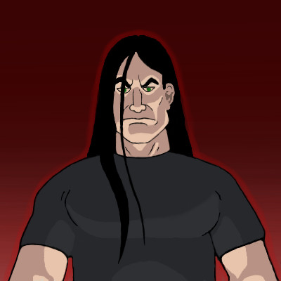
Axil62
(Nov 18, 2007)
Oh my god, I really am the greatest man that ever lived!
lori (Nov 19, 2007)
yeah you really are stackin', good for youI apologize for takin' out some of my stress on you fine portrait
xwindflyer (Nov 19, 2007)
Hey dude, I remember this picture. Good job buddy.
Miss_DJ (Nov 22, 2007)
Dan, that would be a better option, huh?
shell (Apr 6, 2010)
nice |

| ||||||||||||||||||
| Public Boards/Advanced | |||||||||||||||||||
|
clover_pocky
(Nov 11, 2007)
Crit, please. I'm going to do this linelessly coloured, but I am not exactly sure how to begin at it with a lined-drawing. I almost had a heart attack, the internet in my dorm here lags very badly sometimes, and so the applet hung for awhile while it was uploading. Woo.
Maiko (Nov 19, 2007)
She looks a bit masculine. I think it might be because the neck is too thick and her face is too angular. More definition on the nose, since it looks somewhat flat right now and the shoulders should be bigger.
davincipoppalag (Nov 20, 2007)
test comment
Sweetcell (Nov 21, 2007)
The eyes seem a little high. I feel they should be lowered a bit. And I agree the neck seems too thick. And the lips seem small in comparison. But looking good otherwise. Loving the detail.
Purple_Misery (Nov 22, 2007)
I like it,the lineart is very clean and the skin tone is perfect. ^^It's not even finished and it's already beautiful. Good job. I have a problem btw. O_O how do you make the layer multiply. I can't find it in the shi-painter. |

| ||||||||||||||||||
| Public Boards/Intermediate | |||||||||||||||||||
|
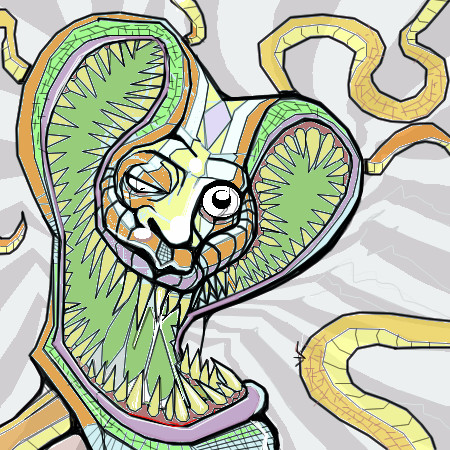
JK-Arts
(Nov 15, 2007)
...
Sketcher_V (Nov 16, 2007)
nice, as always, the composition is very well balanced, yet effective and very motion like. the grey shapes around the snake makes the picture move. So i like itColorful cobra
UnWanted (Nov 17, 2007)
A cobra once bit Chuck Norris' leg. After 5 days of excruciating pain.. the cobra died
Myuuzie (Nov 18, 2007)
This was cool when it was black and white, but it's looking extra sweet now. Love the teeth. |
| ||||||||||||||||||
| Public Boards/Beginner | |||||||||||||||||||
|
Wraith
(Oct 11, 2007)
DO YOU FOLKS LIKE COFFEE? http://www.youtube.com/watch?v=ZInM3r_OtDo&feature=fvw
Sweetcell (Nov 11, 2007)
Turned out great Wraith. I'd suggest flames in the bg (can't have them without something burning) but this is fine as is.Now do the others.
Axil62 (Nov 11, 2007)
Zappa invented the tour bus.
UnWanted (Nov 17, 2007)
No.. the background need something brutal.. cuz that's totally Nathan Explosion..Brutal..
mayfield84 (edited Dec 20, 2011)
Haha nathan explosion is epic!This is a goodin! |
| ||||||||||||||||||
| |||||||||||||||||||
| 2draw.net © 2002-2024 2draw.net team/Cellosoft - copyright details - 0.43sec (sql: 38q/0.23sec) |
Oh, meant to say, Happy Thanksgiving all you Yanks. :D