| |||||||||||||||||||||
| Public Boards/Beginner | |||||||||||||||||||||
|
Knockoff
(Apr 1, 2003)
Just a sketch. might delete. bleh |
| ||||||||||||||||||||
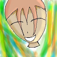
|
Knockoff
(Apr 2, 2003)
Just mesin around with layer. I like the effect.
quintessence (edited Apr 2, 2003)
Cute smile. ^^
Azelrellon (edited Apr 2, 2003)
Aww, he looks so... Happy. ^_^Interesting background!
darkk_angel (edited Apr 2, 2003)
yeah,... i like this one! not too shabby! but the hair is plastered to his head.... XP
Azelrellon (edited Apr 11, 2003)
Wonder why he's so happy? Maybe it's the sugar in today's foodstuffs. ^_^ |

| ||||||||||||||||||||
|
Knockoff
(Apr 2, 2003)
Somethin different. I like useing skin tone more than black for the out lining.
Knockoff (edited Apr 4, 2003)
Thats ok. I could see how you got the thought of a fish.
Azelrellon (edited Apr 11, 2003)
This eye style is... Interesting. Just needs white parts to it.Nice though.
dragon_suicider4u (edited Aug 16, 2003)
what happened to the eye brows??
Knockoff (edited Aug 16, 2003)
good god dont say that. |

| ||||||||||||||||||||
|
Knockoff
(Apr 3, 2003)
Well i think it pretty good. Cept for the out line on the shirt. Forgot to erase is.>.<.
darkk_angel (edited Apr 3, 2003)
tis ok, but the face isnt too well shaped, the eyes have no pupils and the hair is too high up...
quintessence (edited Apr 3, 2003)
Nice shirt.
Knockoff (edited Apr 4, 2003)
Thanks!
Azelrellon (edited Apr 11, 2003)
Sideburns or maybe sidestrands would add some special touch to it... |

| ||||||||||||||||||||
|
Knockoff
(Apr 4, 2003)
Just pract. Somethin a little diff from what i usally do.
Knockoff (edited Apr 4, 2003)
Thank for the comments.=)
Tesia-chan (edited Apr 6, 2003)
It's not bad at all, but is the back of his head shaved?
Knockoff (edited Apr 6, 2003)
Yea I know the hair is meesed up.
Azelrellon (edited Apr 11, 2003)
All hishair needs are some sideburns and maybe a bit showing at the bottom of his head, not too much though. |

| ||||||||||||||||||||
|
Knockoff
(Apr 4, 2003)
=) The shading on the face is messed up, But who cares? =)
Tesia-chan (edited Apr 6, 2003)
I love the colour of her hair.
Knockoff (edited Apr 7, 2003)
O me too.=) Thanx.
Azelrellon (edited Apr 11, 2003)
Heh. You changed it. For me? I am so honored! Thanks to all the little people! WAIT! THOSE ARE ANTS!!!! AAAAAAAGHH!!!!!!!!
Knockoff (edited Apr 13, 2003)
Lol, Azel. And yes i changed it for you, O and every one else.^_^ |

| ||||||||||||||||||||
|
Knockoff
(Apr 5, 2003)
Im very bored........ Using two thickness line is hard then one to me.
Knockoff (edited Apr 5, 2003)
O thanks.=) I forgot to say hes my only character.=) His name is Flair and on paper he looks 10x better.=)
darkk_angel (edited Apr 8, 2003)
good hair, dont like the eyes too much, but the way that you textured them is nice! IT NEEDS FRICKIN EYEBROWS THOUGH!!!! WHEN WILL YOU ADD EYEBROWS?!??!!
Azelrellon (edited Apr 11, 2003)
This is one of your better pics, KO.
Knockoff (edited Apr 15, 2003)
Thanks. |
| ||||||||||||||||||||
|
Knockoff
(Apr 5, 2003)
I cant stop drawing,.=) Smacks hand and pulls the mouse out.
Kazukie (edited Apr 5, 2003)
Instead of drawing a bunch of people heads why don't you try spending a lot of time on a drawing of a full body? No offense but I'm getting tired of seeing floating heads and big glossy eyes.. o_0;;
Tesia-chan (edited Apr 6, 2003)
EEP.
darkk_angel (edited Apr 8, 2003)
shading is ok, but your eyes are quite bad and you have no eyebrows... to top it all off, the hair doesnt look realistic.... people dont have things that jut down in the middle of their foreheads like that....
Azelrellon (edited Apr 11, 2003)
No body... o__oThe skintone should be a bit more realistic... People that are that color are unhealthy. XD Getting better tho, KO. |

| ||||||||||||||||||||
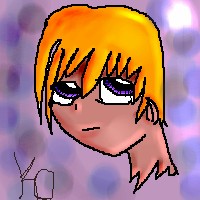
|
Knockoff
(Apr 6, 2003)
My character flair again.lledit 1ll Cleaned it up. lledit 2ll Fixed the nose.
Tesia-chan (edited Apr 6, 2003)
That's pretty cool. Maybe try to neaten up the white around his shirt and hair and the line art, it'll look great.
Teej (edited Apr 6, 2003)
The eyes are really cool....but the hair is kinda...blah...maybe a little more detail in it.
Belleza (edited Apr 6, 2003)
the foremost few chunks of hair scare me. his right eye should be a bit smaller, and his nose is a straight line (?:o) that looks offcenter to me.
Azelrellon (edited Apr 11, 2003)
Sooo many edits. Not the most I have seen, but lots just the same.The hair could use a BIT of work, but most of it is fine. (The whites of the eyes shouldn't have such a solid line accentuating where it meets the skin, if any line at all) |

| ||||||||||||||||||||
|
Knockoff
(Apr 6, 2003)
I like the bg. Sorda funky and evil looking. 0_o. I like the shading on here.lleditll Sorry Kazukie, Was in a rush and almost didnt get a ride.
forgotten-memory (edited Apr 7, 2003)
This is actually one of your better drawings,as far as I'm concerned (although my concerns really can't be amounted to much, if one were to look at what I put out..:p). It's cute with a unique backround...makes me think either funky wallpaper or psychadelic dance lights...
darkk_angel (edited Apr 8, 2003)
pretty good pic...... but eyebrows, just as kazukie said it, are reallly needed..... aaaack... you never have eyebrows!!!!
Knockoff (edited Apr 10, 2003)
I have eyebrows.
Azelrellon (edited Apr 11, 2003)
This one is nicer than the headless ones. ^_^The eyes could use some opening though. ^o^ |

| ||||||||||||||||||||
| |||||||||||||||||||||
| 2draw.net © 2002-2024 2draw.net team/Cellosoft - copyright details - 0.44sec (sql: 26q/0.13sec) |
And it's easy to see that you're on the practice board. Not many people use 200x200 size pic-windows. =p
I can't remember what it is like using the practice board... Not too well, anyhow.
I only used to use this one, and at rare occasions, large and others.
Now I rarely use Practice... I kinda miss it... But my pics need more room to breathe, since my stupid lineart is too thick, and whatnot... Sigh.