 |

|
Felistorm (Dec 20, 2005)
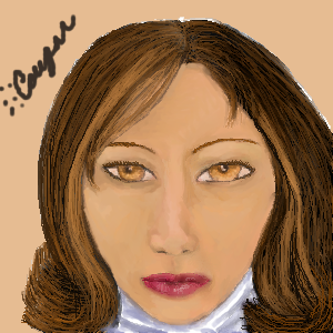
Need critique...as far as I can see the eyes are too large (or well the one is) nose may be a bit crooked up top and yes her hairstyle sucks. Needs more shading/highlighting...where? Cheeks? brighter on the chin?
|
|||||
| 2draw.net © 2002-2026 2draw.net team/Cellosoft - copyright details - 0.15sec (sql: 15q/0.12sec) |
drawn in 1 hour 25 min
-go lighter and darker even more on the skin tones. much more. then when you think you've gone too far, go farther.
-try using opacity and flow more to your advantage. i like the 150ish settings for both personally.
-the hair is good :) try using lower opacity on the strands though to get it smoother, if you wish. also, the airbrush is helpful.
-there is a lot that is good here. just keep at it.
Overall it's very nice. ^__^