|
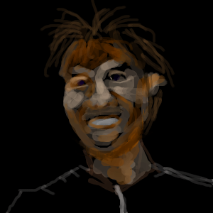
I don't really have a set formula, but for things like this one I flood the "canvas" with black to start and then I like to activate the anti alias, blend and dynamic brush size options. Then I slide my opacity down to around 150, 160 somewhere in there, I usually slide the flow to around the same setting, doesn't need to be exactly the same, just somewhere fairly close. During the process there will be times when an area feels like it may need a bit more opacity (like if I need to cut into color to shape a form) other times I feel I need even less opacity than the 150, 160 range because it seems to "mix" better with the other colors (when blend is activated that is). Oh, and the brush I use is the round bush set fairly large so that when the dynamic brush size option is activated I have a large range of variation in the size of the brush strokes (depending on how hard I press of course.) Not being overly concerned about preconceived notions having o do with what my brain tells me is how something is supposed to look helps with the "loose" style an can produce some very interesting little surprises, it can also fuck things up so there always needs to be a certain degree of control, an understanding of form and light in general and the ability to draw in the first place.
|
You need to be logged in to post a comment. If you don't have an account, sign up now! | |


drawn in 12 min
you should fill in the area that you're drawing the face with the skin colour, then add the shading and lighting on after. This is cool though. Very demented looking.