|
Turtlebuster (May 31, 2003)
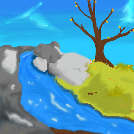
XD thanks to some good tips from some good people, i've worked on this and made it a little more to my likeing.1) cleaned up some 'too soft areas' so they look like rocks instead of marshmellows 2) made a brand new tree that doesn't quite look real, but i like much better. 3) worked a little on the sky for shading i couldn't seem to lighten the shading in the back anymore than this, so i will have to make sure i do that from the start from now on. refresh to see changes ^^
|
|||||
| 2draw.net © 2002-2026 2draw.net team/Cellosoft - copyright details - 0.08sec (sql: 19q/0.07sec) |
drawn in 0sec
One general problem with this piece is while you have good local shading, you need to focus on the overall shading of the piece, from end to end. In order to give your piece more perspective, you should consider the gradual lighting from back to front, in addition to local shading.
In the case of the tree, I think you have the general idea down, and the leaves don't look terrible. Perhaps more concentration on the structure of the tree. For example, how big do you imagine the entire tree? What type of tree are you trying to draw? The shape of the base and branches will be governed by the answers to these questions.
For shading the tree, for one, I would not use smudge on the bark, it totally ruined the beginning of what could have been good shading in your animation. Again, of course, it depends on the type of tree, birch for example has quite different bark than most trees. But for a stereotypical tree (lol), I would use a combination of diffused brush, vertical strokes of good contrast, and then an overall shading from edge to edge over that.
For leaves, well, what you have isn't terrible, perhaps a little more differentiation...
Anyway, it's not really a bad piece, and the animation didn't corrupt so you could edit it further. :-)
drawn in 0sec